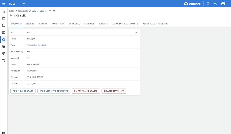
Navigation Update - Right-Hand Sidebar
To improve user experience, Adestra will be removing the right-hand sidebar from the user interface. This move will provide more space for performing tasks and reduce cognitive overload by removing visual distractions.
To prepare for the removal of the right hand side-bar, many of the functions accessed through the sidebar have already migrated to other areas of the application, e.g. side cards, header bars, and tables.
Remaining items will be relocated during the final phase of this improvement, e.g. the support links will move to a new menu in the top bar, represented by a question mark icon.
Contacting Adestra support from within the platform
To access support after the removal of the right-hand sidebar.
-
Locate and press the question mark icon in the app top bar.
-
Select the required support option, i.e. view manuals and videos or email the Adestra support team.
Previously implemented changes
The following are some of the changes already present in the UI as part of the removal of the right-hand sidebar.
Items in side cards
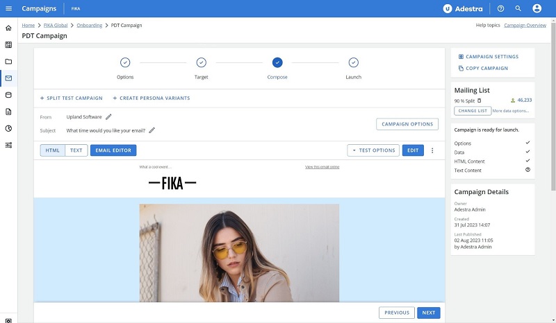
Some items previously in the right-hand sidebar now appear as side cards on their appropriate pages, e.g. the campaign details are now presented in a side card.
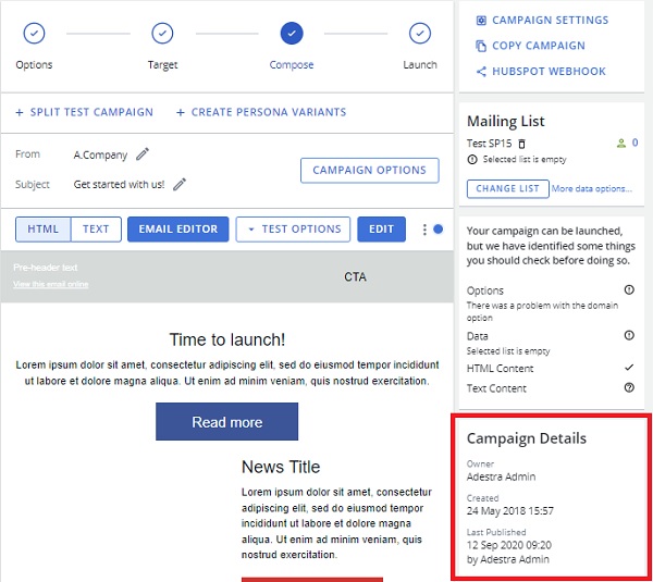
Items in header bars
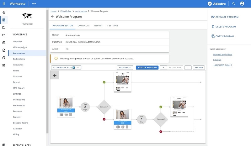
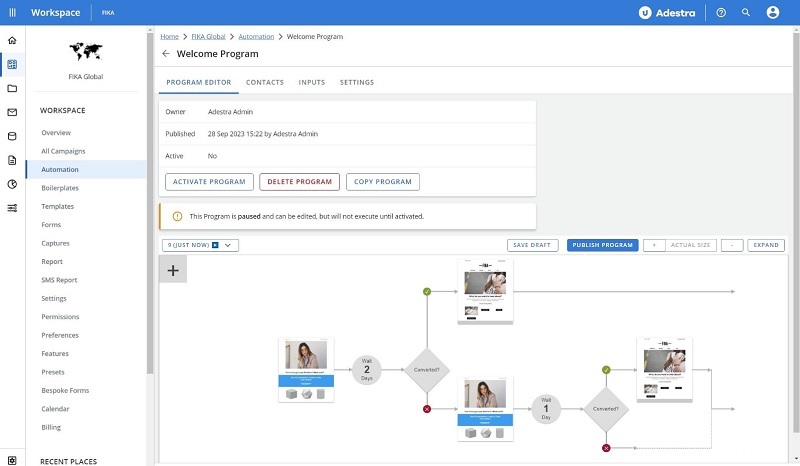
Some functions previously in the right-hand sidebar now appear as buttons on the appropriate pages, e.g. you can now create a project using the button at the top of your projects list.
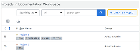
Items in tables
Some information previously in the right-hand sidebar now appears in a summary tables above the content you are working on, e.g. message details appear in a summary table above the message you are composing.
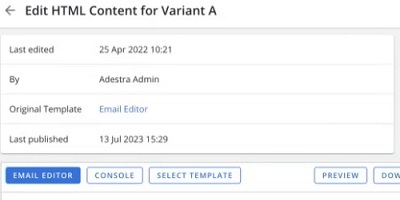
New UI preview
The following before and after screenshots illustrate some of the upcoming changes to the UI.
Current compose page (campaign details already migrated to a side card):
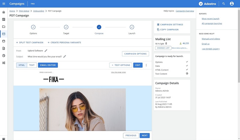
Compose page without sidebar, increasing width to preview your message:
Current automation page (with left-hand navigation menu pinned open):
Automation page without sidebar, adding buttons below the summary table and increasing the space available to map your automation:
Current list details page (with left-hand navigation menu pinned open):
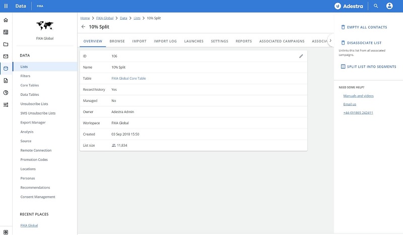
List details page without sidebar, adding buttons below the summary table:
