Customizing the Dashboards
For assistance with any of the following, please contact your Customer Success, Sales or Support Representative.
All Dashboards
The following can be applied to any dashboard as required:
Max Groups Displayed
One minor tweak available across many of the dashboard widgets is to change the Max Groups Displayed setting: where widgets are based on grouped reports, this can affect the number of items displayed. On widgets where it may make sense to adjust this setting, this has been noted in the widget footer text.
Recent Plan Update Widgets
Each of the dashboards has a widget showing a table listing opportunities or accounts by their number of recent plan updates, and highlighting those with zero updates in red.
For large numbers of opportunities or accounts, an aggregated display might be preferable. Using the same underlying reports, alternative widgets which show an aggregate view of activity can be created, allowing the number of opportunities or accounts to be sliced by ‘Update Status’ in a donut chart.
User Activity Widgets
Similarly, each of the dashboards has a widget showing users listed by their view and update activity. For large numbers of users, an aggregated display might be preferable. Using the same underlying reports, alternative widgets which show an aggregate view of activity by product can be created e.g. a donut chart based on # Users, sliced by Page or Area.
The following sections suggest product-specific customizations.
Account Dashboard
Single Plan Type Account Dashboard
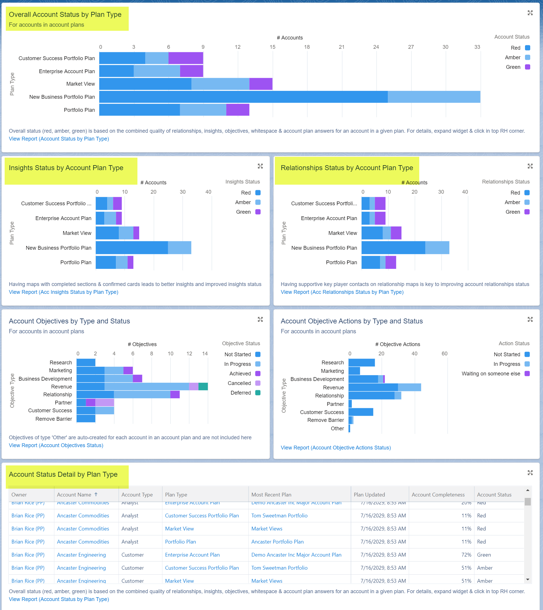
Widgets on the account dashboard are largely account-centric, but various plan status values are further split out by plan type (for a given account, its status is reported separately for each plan type that has a plan including that account). The relevant widgets are highlighted below.

If customers are only using a single plan type or want to create a dashboard specific to a given type, they will need to make changes to these status widgets, replacing bar charts split by plan type with donut charts, with # Accounts grouped by status. Additional filtering may also be required in the underlying reports to restrict to a single plan type.
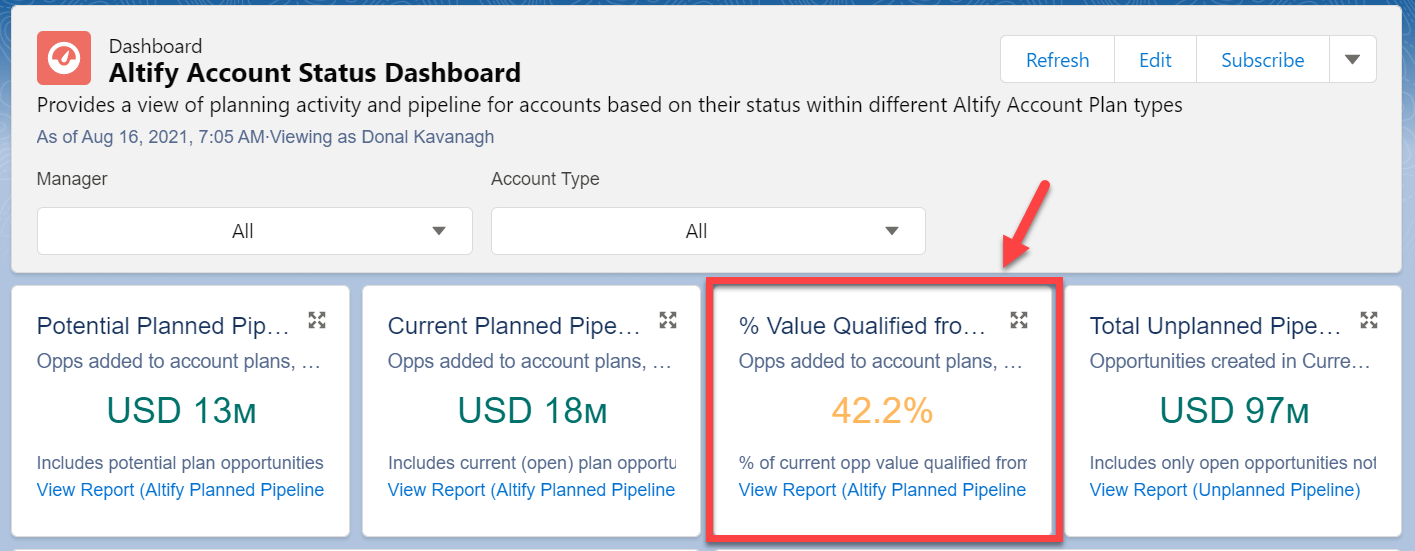
% Value Qualified from Potential
For AM users, if qualification from potential is not in use, it makes sense to remove the ‘% Value Qualified from Potential’ widget (indicated below) from the account dashboard.

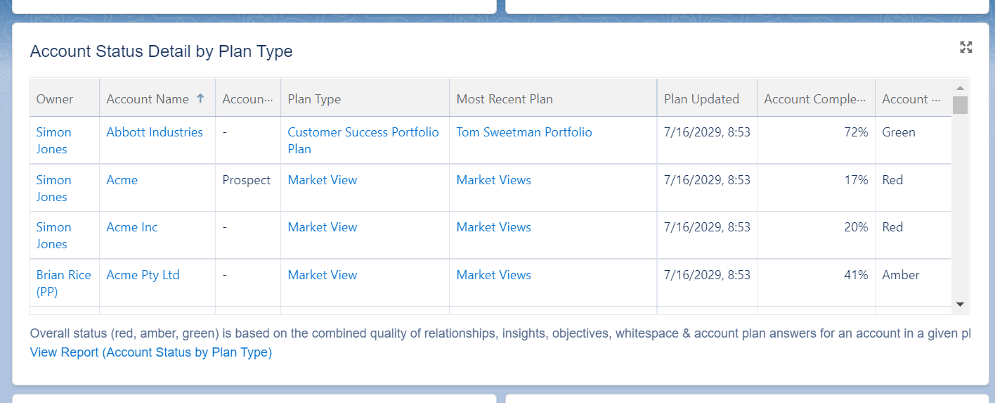
Account Status Details
This table widget (shown below) can be customized to display the most relevant set of fields for the customer.

Fields not already available in the underlying report type will need to be added there.
Planned Pipeline/Opportunities in Plans
Widgets showing charts of Planned Pipeline and Opportunities in Plans currently only include potential and current opportunities. The filters in the underlying reports could be updated to include won and lost opportunities, giving a view of all opportunities on opportunity maps.
‘Was Qualified’/‘Not Qualified’ Terminology
Widgets showing potential and current planned pipeline split current values into ‘Current (Was Qualified)’ and ‘Current (Not Qualified)’, depending on whether the opportunities were qualified from potential opportunities or not.
You can update the terms ‘Was Qualified’/‘Not Qualified’ to distinguish them from other possible interpretations of ‘Qualified’. This can be done by updating the formula for the Qualified Opportunity Type custom field on the Altify Account Opportunity object.
Opportunity Dashboard
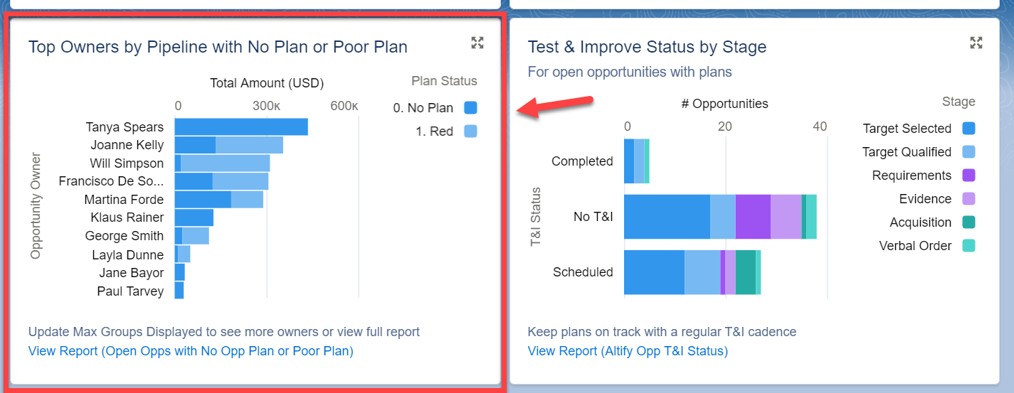
Owners by pipeline value with no plan/poor plan
This widget (indicated below) shows individual opportunity owners in descending order of the total value of their open opportunities that either have no plan or a poor plan (red status).

As an alternative, the underlying report filters could be changed to show a leader board of owners based on pipeline associated with good plans (amber or green status).
Sales Process Dashboard
TeamView Reporting
The sales process and opportunity dashboards do not include reporting on TeamView activity. However, the package includes a sample TeamView usage report which can be used to support a TeamView widget if required.