Dashboards are one of many tools that Cimpl offers to users to make tasks easier to accomplish. The Return on Investment (ROI) dashboard is one of several.
Example of the ROI Dashboard. Click to enlarge.
This dashboard allows you to see the actual dollar value that your investment and trust in Cimpl brings to you and your organization. It shows you your:
- Percentage of inventory confirmed (where the more is confirmed, the better your inventory is optimized for cost efficiency).
- Potential cost savings from actions yet to be taken.
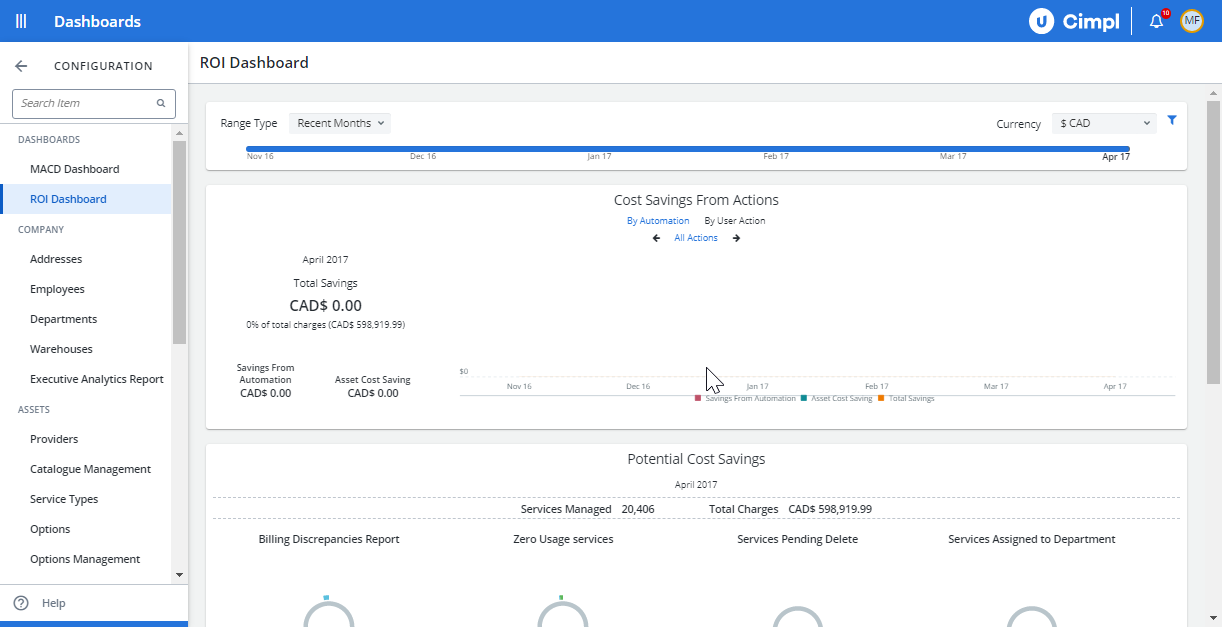
This dashboard shows multiple representations of your achieved and potential cost savings from using Cimpl.
The displayed achieved cost savings include those from adopting automated workflows through Cimpl and from efficiently using or re-purposing your IT assets.
The displayed potential cost savings include Cimpl's findings of your under or unused services for which you are nonetheless paying full fees.
You can use the timeline to change the time window of your displayed data. The timeline allows you to choose one of three types of time windows, i.e., time windows based on:
- Recent months
- Calendar year
- Fiscal year
Adjust the timeline:
- Click Range Type.
-
Select Recent months, Calendar Year or Fiscal year.
Note: For fiscal year, you need to select Q1, Q2, Q3, Q4. To configure your fiscal year, go to Modify your fiscal year.
- Click on the arrows to adjust the timeline further.
- Click on a month to have the pane display the values for that month.
Filter the dashboard:
Cimpl lets you filter your dashboard’s display by service type, provider, and department.
- Go to Configuration > Administration >ROI Dashboard.
- Click on the filter icon. A menu opens with:
- A drop-down for service types
- A drop-down for providers
- A search field for departments
- Scroll through the drop-down menus to find the service type and provider whose data you wish to display and click on them.
- Enter the department name into the search field.
- When finished, click Apply.
Cimpl will adjust the dashboard to show only data corresponding to your selections.
Inventory Accuracy Confirmed Graph
Part of what makes Cimpl so useful is the fact that it enables everyone in the organization to confirm the possession and usage of their own IT and telecom services. When everyone has done so, it becomes that much easier to plan your budgets and to optimize the usage of assets.
Go to Configuration > ROI Dashboard.
The Inventory Accuracy Confirmed graph (and panel) are prominently shown on the dashboard, and it helps you determine the proportion of employees who have already gone through the process of validating services and devices assigned to them for the reporting period.
Note: By default, Cimpl shows the widget for your inventory accuracy, even if you are not using this feature.
View cost savings specifically from automation
Look at the "Cost Savings from Action" pane, where you can see savings from automation and user actions over the period of 1 year. This Includes the following information:
- Total Savings
- Savings from Automation
- Asset Cost Savings
There is a legend below the graph where you can click on elements corresponding to the data series to remove them.
The graph displays trends on results arising from how actions have been executed in one of three ways. The first is execution by automation type. This illustrates the trends and proportions of ways in which the actions are done:
- Full Automation
- Manual
- Semi-Automation
- All Actions
Highlight the set of data by clicking on its legend.
The graphs also display results arising from different user actions:
- All Actions
- Activate
- Disconnect/Return to Warehouse
- MACD Disconnect
- MACD Dispose
- MACD Edit
- MACD Password Reset
- MACD Port
- MACD Repair
- MACD Spare
- Transfer to Another Employee.
You can select any of the options for display by clicking them.
Potential Cost Savings
To see this information at a glance, you must consult the Potential Cost Savings pane of the ROI dashboard.
Go to Configuration > Administration > ROI Dashboard.
The Potential Cost Savings widget shows:
- Billing Discrepancies by Total Services and Wireless.
- Zero Usage Services viewed by:
- Total Services (i.e. all zero usage services)
- 3 months or less (i.e. no use for 3 months or less)
- Between 3 and 6 months
- 7 months or more
- Services Pending Delete viewed by Total Services and Services Assigned to (Employees) Pending Delete.
- Services Assigned to Department viewed by Total Services and Services Assigned to Closed Organizations.
In addition to displaying statistics and ROI trends, the ROI dashboard also allows you to navigate to other places in the platform to obtain more detailed views or reports. This is what you can access from this dashboard:
- Under Total Cost in Billing Discrepancies: Cimpl will navigate to the "Billing Errors Report," where a preview of the most recent month’s data is displayed.
- Under Total Cost in Zero Usage: Cimpl will navigate to the "Zero Usage Base Report" and display a preview of the most recent month’s zero usage services.
- Under Total Cost in Services Pending Delete: Cimpl will navigate to the "Employee Transfers Report" and displays a preview of the most recent month’s data on employee transfers.
-
Under Total Cost in Services Assigned Department: Cimpl will navigate to "Invoice Base Report" where a preview of the most recent month’s data on service assignment by department is displayed.