The way dashboards appear to users depends on the role that each individual user has. Employee users have access to an Employee dashboard whereas Manager users have access to a Manager dashboard. The two dashboards share many similarities, with the manager-specific dashboard differing by providing access to considerably more data. In both cases, Cimpl's dashboards clarify complex data and make useful information transparent.
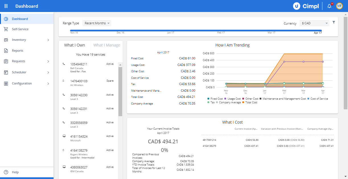
Example of Cimpl's Dashboard. Click to Enlarge.
Configuration Dashboards
Your Configuration dashboards are more specialized dashboards that are intended to help out either the MACD manager or person who manages IT budgets.
To navigate to the Configuration Dashboards, click Configuration > Dashboards and Report Management.
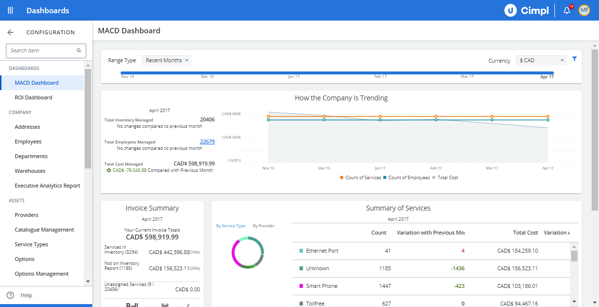
Example of the MACD Dashboard. Click to enlarge.
The two dashboards are:
- The MACD dashboard displays key stats and figures on all MACD activity in your organization. Much like in the ROI dashboard, all of this data is displayed as easy at-a-glance summaries (many of which are graphical).
- The ROI dashboard allows you to see the actual dollar value that your investment in Cimpl brings to you and your organization. Among other things, this dashboard shows you the cost savings directly attributable to Cimpl. It also shows the potential cost savings from actions that Cimpl may direct you to take. All of this data is displayed as easy at-a-glance summaries (many of which are graphical).
In both cases, these Cimpl dashboards clarify complex data and make useful information transparent. In this way, any user of these dashboards can quickly make decisions regarding their use of Cimpl and the MACD process.
Red and green numbers
When looking at the numbers in the Dashboard, you will notice green or red numbers.
The colors indicate whether or not the costs have gone up or down as compared to the previous month.
Because Cimpl is an application to control your costs, seeing green is "good" - it indicates your costs have lowered compared to the previous month.
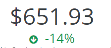
Seeing red? Your costs have increased. These should be looked at more closely to ensure that the increase is a valid one.
Examples of valid increases would be a roaming plan added to your line or, a hardware upgrade where the device was charged to the service's invoice.
Certain widgets will show both red and green when costs are broken down:
![]()
Click to enlarge.