Your Employee Dashboard displays information on your services, costs, usage, trends, and rule violations. It contains a sliding timeline which can be used to adjust the display period of dashboard data.
The widgets available to you are:
Timeline
The Timeline in the dashboard is used to adjust the time frame for the data to be displayed.
You can choose one of three types of time frames:
- Recent months
- Calendar year
- Fiscal year
To select one of the three types:
- Click on the Range Type drop-down menu above the timeline.
- Click on the arrows on either end of the timeline to scroll through months.
-
See the values of a particular month by clicking on the month on the timeline.

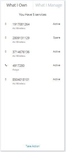
What I Own
The What I Own widget shows you a summary of all the services and assets assigned to you.
View your items along with the Service ID, Provider, and Used For information.
You can click a service in the widget and the rest of the dashboard's widgets will change their displays to only show data associated with the service you've selected.
Take Action will redirect you to the Self-Service module, where you can take action on any listed service.
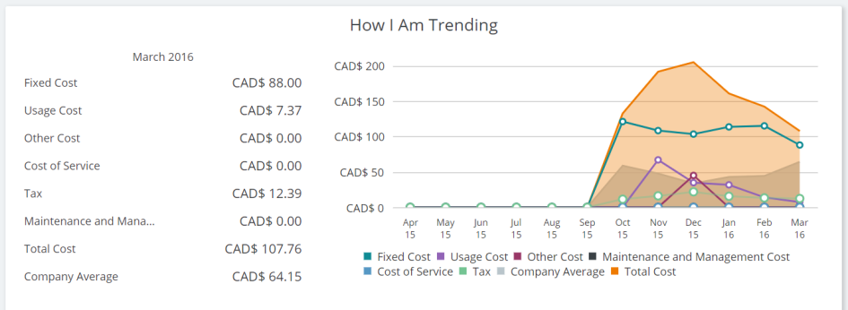
How I Am Trending
The How I Am Trending widget shows your cost and usage trends over the span of the last 12 months (you can adjust the time window using the Timeline).
You can see the current month’s Recurrent costs, Usage costs, Other costs, Service costs, Maintenance and Management costs, Taxes, Total costs, and Company average.
You'll also see the 12-month trend for all these values.
A legend is located below the graph. You can "turn off" graph elements by clicking them in the legend, to view trends on a more granular level.
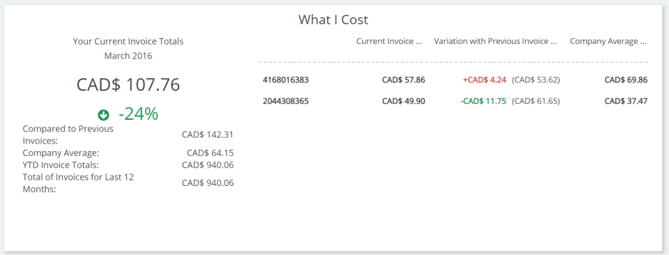
What I Cost
The What I Cost widget shows a summary of the costs the services assigned to you have incurred, along with a comparison with the previous month.
You can see the current monthly invoice total as compared to the company average and previous month’s.
See a summary of values of the previous 12 months’ invoices, YTD invoices, and company average.
Click on a service entry and you can see invoice breakdowns by service, along with comparisons to previous month’s values and the company’s average.
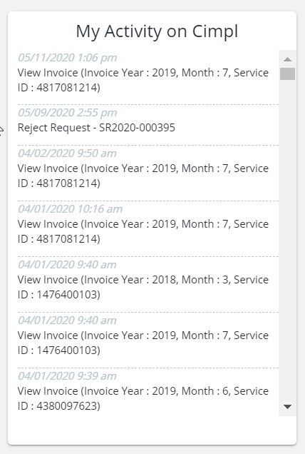
My Activity on Cimpl
The "My Activity on Cimpl" widget shows you a log of all activity that you have done in Cimpl. This includes actions such as viewing invoices or contesting charges.
You can scroll through and view a summarized log of all your activities in Cimpl itself.
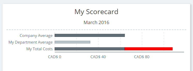
My Scorecard
The My Scorecard widget shows you a comparison of your usage against the average usage of your department and company.
You can see a color-coded view of your current monthly compliance with your company’s usage rules. The color code means the following:
- Green: Compliance
- Yellow: Approaching defined limits
- Red: Limits have been exceeded (i.e. rule has been broken)
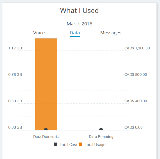
What I Used
The "What I Used" widget shows you a summary of your usage by type for the selected month.
You can also access a statement that displays a detailed list of your services (and their costs, where available).
You can see a summary of your total usage of:
- Voice services: domestic, roaming and long distance
- Data services: domestic and roaming
- Text messaging services: domestic and roaming