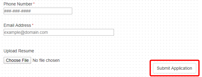
The button control allows you to add a button to a web form. There are four different types of buttons:
- Regular
- Reset
- Save

Properties
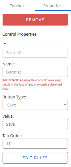
Once a button control has been added to a form, you can configure it using the options on the Properties tab.

ID: The button control ID. The ID is automatically assigned when a button control is added to a form. The value of this field cannot be edited.
Name: A name for the button control. This name is used to identify the button control in other forms.
Button Type: The button type. The following options are available:
- Regular
- Reset
- Save
- Save Draft - In Progress: For linked forms only, saves a user’s current work but does not enforce form validations and returns the user to the parent form with the linked form status of in-progress.
- Saved Draft - Done: For linked forms only, saves a user’s work, enforces all form validations, and returns the user to the parent form with the linked form status of complete. This also allows the user to complete the submission of the final form.
Value: The text that will be displayed on the button.
Tab Order: The sequence in which a field will be selected when Tab is pressed. For example, if the tab order for a field is set to 3, when Tab is pressed for the third time, that field will be selected.
Edit Rules: Opens the Edit Rules window where you can configure conditional rules for the control. See Conditional rules for more information.