Creating a Custom Field
Getting Started
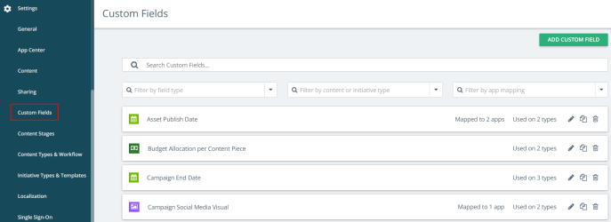
If you are setting up a new custom field or editing an existing custom field, navigate to Settings > Custom Fields from the left navigation panel.
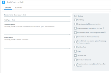
To create a new Custom Field, click Add Custom Field.
- Add a Display Name for your field. The display name of the custom field appears on your content below the body of content.
- Choose a Field Type:
- Text (Open text field, option for HTML box, option for default text)
- Dropdown (Selecting one value from the list)
- Date (Calendar date and time, only workflow task dates will display on the content calendar, custom field dates do not)
- Numeric (Entering the numeric values)
- Currency (Selecting a currency from the drop-down menu and adding a currency value)
- Image (Image upload, one image at a time)
- Multiple Select (Select one or more values from a pick list)
- File (File upload, one file at a time)
- For Text and Currency field types, you can enter a default value if necessary.
- For Text fields you may choose either multiline text, which allows the field to expand to contain many lines of text, or HTML, which allows the field to support HTML tags.
- For Dropdown and Multiple Select fields, add field values if necessary by clicking +New Value as many times as you need to. (Find further instructions below in this section on how to create multiple values at once.)
- Enter an optional Field Description if you want.
- Select the Field Options that applies to your custom field. (Find further instructions below in this section on the field options.)
- Click Save to confirm your changes.
Note: If a user changes the field type, then the system takes only the first value of the previously tagged field value and the other field values will be lost. For example, if the user wants to change the field type from multiple select to single-select, then even if the content records were previously tagged with multiple values it takes the first value and removes the other values.
Adding Field Values
To add field values to multiple select or drop-down custom fields:
- Choose an existing custom field or follow the above process to add a new custom field.
- In the Field Type, select multiple select or drop-down option from the drop-down menu.
- Click on Add a Value.
- Enter the values that can be selected for this field and click Add.
To add multiple values at once:
-
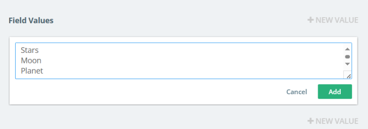
Click on Add a value, then enter each value in a new line and click Add.
-
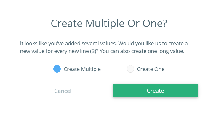
You will see a pop-up dialog box with the option to Create Multiple or One?
-
If you select Create multiple, then each line entered is created as a new value.
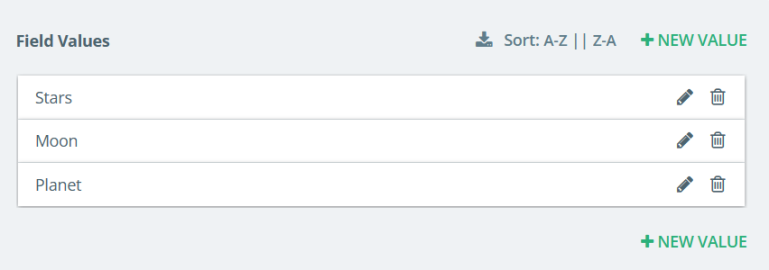
In a Dropdown or Multiple Select custom field, you can:
-
Sort the values alphabetically from A-Z or Z-A by clicking the Sort button if there are multiple field values.
-
Export the values to .csv file by clicking on the
 icon.
icon.
-
-
If you select Create One, then each line entered is created as one value.

Field Options
- Mandatory adds a red asterisk to a field name to help users recognize mandatory custom fields for new submissions. A pop-up will appear to warn users if a mandatory field is not filled out before publishing content or progressing an initiative. If you want to completely prevent users from publishing or submitting content, ideas, or progressing initiatives without filing out these fields, you can adjust this setting in the content settings page.
- Only viewable by Editors and Admins restricts the field so that only Kapost Editors and Admins can see the field in the content assets or catalogs.
- Prevent members from editing this field should only be used for fields that will be set by the API and therefore should not be edited by other members.
- Prevent field value from being duplicated restricts when content or initiative containing this field are duplicated. Values on this field will be left blank on the duplicated content or initiatives.
- Show in Studio Preview and Gallery determines if a custom field and its value will display in the Preview Pane as well as be available in Gallery as a custom filter.
- Show this field as a filter for catalog and calendar pages determines if the custom field name will be made available in the filter for content or initiative catalog and calendar pages.
- Show this field as a column option for catalogs and custom reports determines if the custom field name will be made available in the menu under the column selector icon in the content or initiative catalogs as well as custom reports. Select for all multi-select and drop-down fields if you want to be able to filter by them throughout the system.
- Show this field as an option in the insights dashboard determines if the custom field is shown on various insight chats within the dashboard.
- Allow floating point numbers allows you to enter decimal values up to 3 digits. This checkbox is enabled only when you select Numeric field type.
- Publish as array and Publish as hash are not in use currently.
- Display as URL will make URLs in the field value clickable across various sections of the app, including Content, Initiatives, Ideas, Gallery, Calendar, and Custom Fields. A field value can contain both normal text and URLs, but only the URLs will appear as clickable links. This option is applicable only to Text type custom fields.
Select the correct field options for all multi-select and drop-down fields as necessary. Selecting these options will allow you to use the custom field to find, filter, and report on the data. The various field options include:
Note: When you select this option, Sortable in Gallery checkbox is enabled. This allows the users to view the custom field in the sorting drop-down in gallery. Selecting the Sortable in Gallery checkbox lets you select the sorting direction (such as Ascending, descending or both).
