In-App Messaging
In-App Messaging enables admins to communicate important information directly within the platform, ensuring users stay informed without relying on email. This feature allows admins to display announcements via banners and collect user feedback through an input box, providing a centralized location for updates on maintenance schedules, new releases, and known issues.
This feature enhances engagement and adoption by promoting campaigns, driving webinar sign-ups, and sharing best practices while also supporting two-way interaction to gather insights and refine communication strategies. Admins can collaborate with their Customer Success Manager (CSM) to schedule targeted notifications by specifying user roles, pages, and timeframes. By leveraging Kapost’s In-App Messaging, businesses can streamline communication, improve user experience, and foster collaboration within the Kapost Community.
Types of Notifications
The In-App Messaging feature supports three types of notifications:
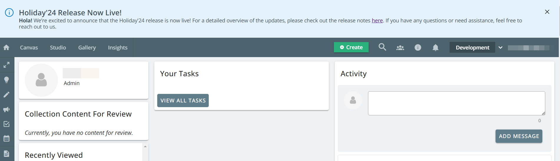
Notice
The announcement banner displays important information such as notices, alerts, or general announcements to ensure visibility. This banner is used to communicate details about upcoming feature releases or activities, scheduled maintenance, policy changes, or best practice recommendations.
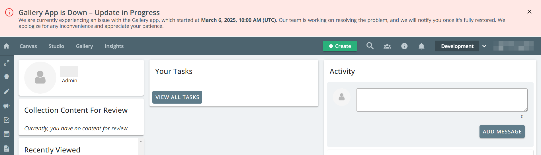
Warning
The announcement banner displays critical issues that require urgent attention or could impact system functionality. This banner is used to communicate details about system outages, security vulnerabilities, or failed integrations. The warning banner will be displayed in red to ensure visibility and urgency.
Note: If users want to access closed banners later, they can navigate to Notifications page by clicking the bell icon and select the In-App Messaging tab to view all messages. This is applicable only for notice and warning banners.
Notice with Information Capture
The feedback input box enables Kapost team to gather your feedback by receiving an email notification upon submission.

By default, the box appears expanded but can be collapsed into an icon using the X icon. Whether expanded or collapsed, the input box remains visible until the user submits their response. Users can drag and reposition the icon anywhere within the application, and clicking it will re-expand the input box for feedback submission.
