Content strategists create matrix charts in Canvas to visualize content and initiatives in a grid, featuring drag-and-drop functionality to map out your quarterly or yearly content plan.
How it helps
Build matrix charts to align key stakeholders and executives on your content strategy, provide visibility into how your content is distributed across your team, see if your planned content is mapping to a strategy, and more!
Best practices
Organize content in a matrix chart by the content owner to decide who will create which content asset, based on your team's scope and bandwidth.
See content aligned to key personas and at what stage of the content production process.
Creating a matrix chart
To create a new matrix chart in canvas, start by either creating a new plan or jump into an existing plan on your dashboard.
To set up a matrix chart:
- In Canvas, create a plan or click on an existing plan.
-
Click the Select a Chart Template button.

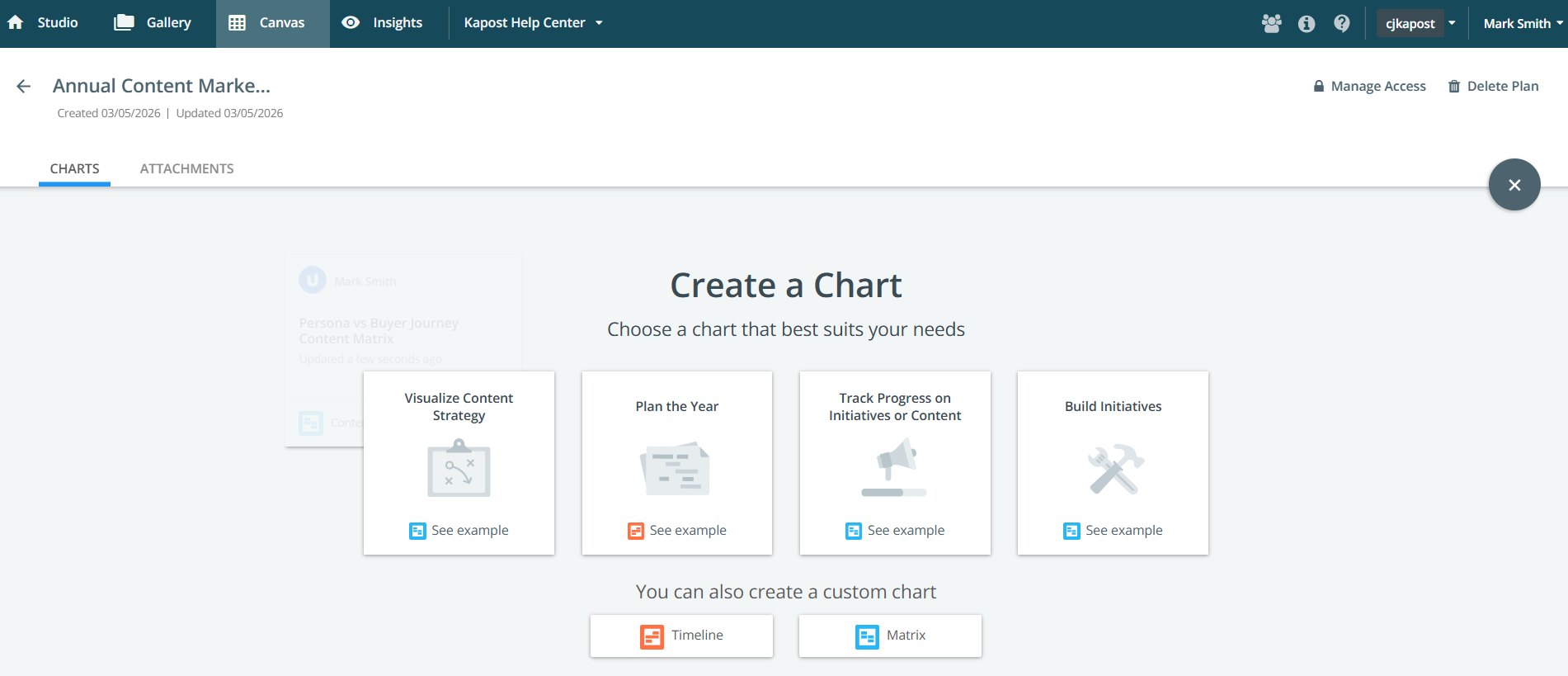
You can create a new matrix chart from one of the existing templates or create a custom matrix.
-
Click See Example to see an example of the relevant template. To close an example simply click outside the preview pane.

-
Click Create Chart when you have decided on an appropriate template.
-
Rename the title as required. The maximum length of the title is 64 characters.
To learn more about the title when you duplicate the chart, refer to Duplicating Canvas.
If you're creating a custom matrix, click the link and then choose whether you want your chart to populate with initiative or content data.
After creating your chart, it is displayed in edit mode. See Managing and Editing Matrix Charts for help with understanding your configuration options.