Report Wizard Chart Tab
The Chart tab allows you to add colorful bar, line and pie graphs to your reports.
1. Click the Chart Tab

- Click the Chart Tab.
There are multiple types of charts that can be created in the Report Wizard - Bar, Line, Pie and Gauge. The types of charts that are available will vary based on the report type and category that is selected.
2. Creating a Bar Chart
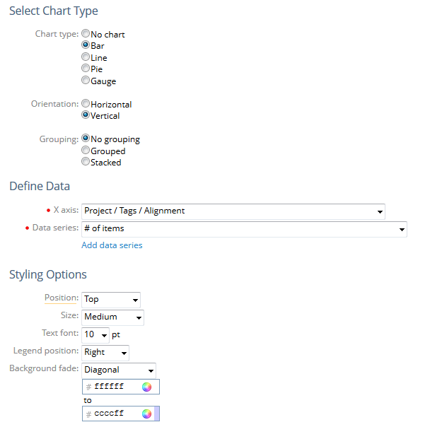
- Click the Bar radio button.
2.1. Select Orientation
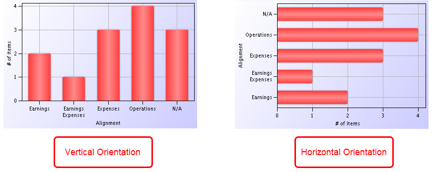
- Click Orientation, select an option.
Orientation: There are two orientation options, horizontal and vertical, that control where your X and Y axis appear. The above example shows a chart in the horizontal and vertical orientation.
2.2. Select Grouping
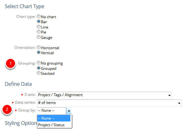
- Click Grouping, select an option.
- Click Group by, select a data element for your grouping.
Grouping: There are three options for grouping. When you select the Grouped or Stacked options you will see the Group by field appear under the Data series field. This is where you can select an additional element to display in your chart.
Note: You will only see Grouping options if you have grouped report data on the Group/Sort tab.
2.2.1. View Grouping Options
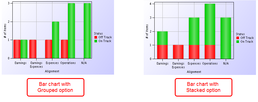
- Click the Preview link.
- View the examples of a report that is grouped and stacked.
2.3. Define Data

- Click X axis, select a column for your X axis.
- Click DataSeries, select a column for your Y axis.
- Click the Add data series hyperlink to add another column to your chart. This option will appear only if you have selected No Grouping.
- Click Data series 1, select a column for your additional data series.
- Click Groupby, select a column for your grouping. This option will appear only if you have selected a grouping option.
Draw as line: If selected, data from the additional data series will be depicted by a line on the chart.
New Scale: If selected, the chart will include a scale for the additional data series on the right side and information may be resized to reflect that scale.
2.3.1. View Additional Data Series Options

- Click the Preview link.
- View the examples of a report that has an additional data series.
2.4. Select Styling Options
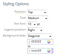
- Click to select the styling options for your chart.
Position: The chart can be placed at the Top or Bottom of the finished report or, if you want do not want to see any of the supporting data table, select Chart only.
Size: Sets the size of the chart in the report. Sizes range from Tiny to Extra Large.
Text font: Sets the size of the text within the chart.
Legend position: Sets the position of the chart’s legend as Right or Bottom. Select None to hide the legend. Note: The order of labels in the legend is based on how items appear in the bar chart from bottom to top. Because PowerSteering uses a third party software to build charts, there is no way to manipulate the order in which legend labels appear.
Background fade: Sets the background color fade direction for the chart. If using a fade, select the 2 colors with which the fade should start and end. Select None to use a solid white background.
3. Creating a Line Chart
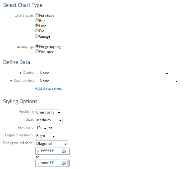
- Click the Line radio button.
3.1. Select Grouping
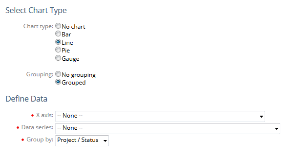
- Click Grouping, select an option.
- Click Group by, select a data element for your grouping.
3.2. Define Data

- Click X axis, select a column for your X axis.
- Click DataSeries, select a column for your Y axis.
- Click Add data series if you want to add a new column to your chart.
3.3. Add Additional Data Series

- Click Add data series to add another column to your chart.
- Click Data series 1, select a column for your additional data series.
Draw as line: If selected, data from the additional data series will be depicted by a line on the chart.
New Scale: If selected, the chart will include a scale for the additional data series on the right side and information may be resized to reflect that scale.
Note: You will only see the Add data series hyperlink if you have selected No Grouping.
3.4. View Data Series Options

3.5. Select Styling Options

- Click to select the styling options for your chart.
3.6. View Line Chart
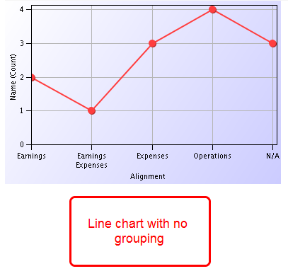
- Click the Preview link.
- View an example of a line chart.
4. Creating a Pie Chart
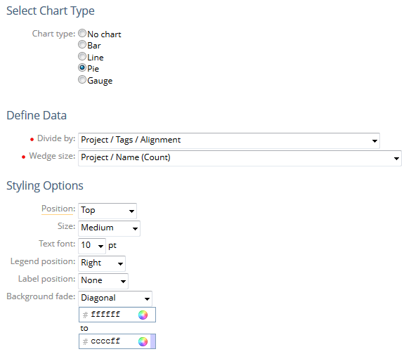
- Click the Pie radio button.
4.1. Define Data

- Click Divideby, select a column to define how you want to divide the chart.
- Click Wedgesize, select a column to define how you want to count the items you divided in step 1.
4.2. Select Styling Options
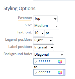
- Click to select the styling options for your chart.
Label position: Identifies whether the label for the chart will appear inside the wedge of the pie or outside the pie chart.
4.3. View Pie Chart
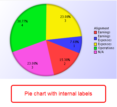
- Click the Preview link.
- View an example of a pie chart.
5. Creating a Gauge Chart
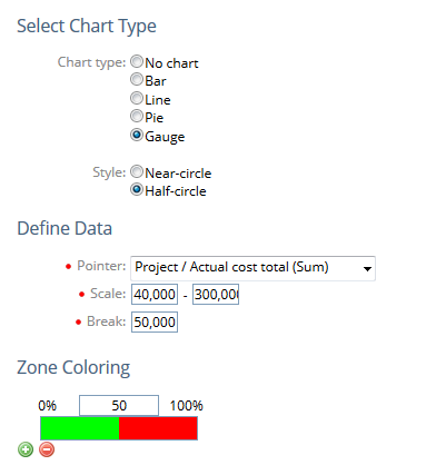
- Click the Gauge radio button.
Note: You will only see the Gauge chart option when your report includes summarized columns.
5.1. Select Style
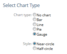
- Click Style, select the format for your gauge chart.
5.2. View Style Options
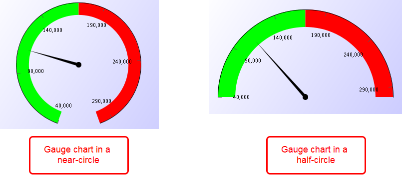
- View the near-circle and half-circle styles of the gauge chart.
5.3. Define Data
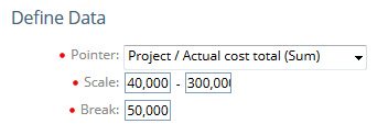
- Click Pointer, select the column that you want to use as the indicator on your gauge.
- Click Scale, type the min and max for the start and stop of your gauge chart.
- Click Break, type a number to represent where you want the tic marks to be for your gauge chart.
Note: If the range of expected values (your min and max) is from 50 to 150, you might want to put a tic mark every 20 units so you would see them at 50, 70, 90, etc...
5.4. Select Zone Coloring

- Click the green plus symbol.
- Type a numeric value for your first threshold.
- Click the white field next to the green field, select a color for your threshold.
- View new zone coloring.
- Repeat steps 1 through 4 to add additional zone coloring.
5.5. View Zone Coloring
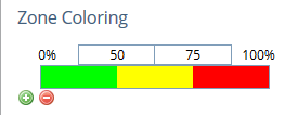
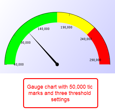
- View a zone coloring with three thresholds and colors. Based on the value of the data, color will change to yellow when the value reaches 50% of the total, and red when the value reaches 75% of the total.
5.6. Select Style Options
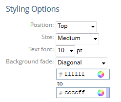
- Click to select the styling options for your chart.
5.7. View Gauge Chart
- Click the Preview link.
- View an example of a gauge chart.
6. Click Continue or Tab

- Click Continue to go to the Details & Schedule tab, or click another tab within the Report Wizard.