Data Grids
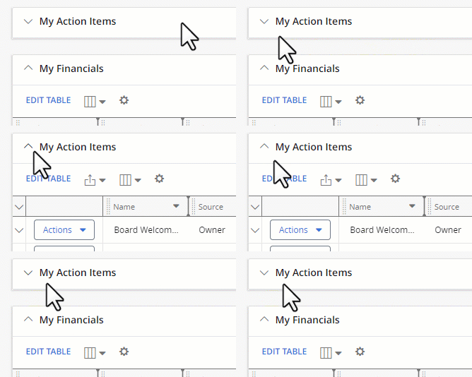
PowerSteering data grids (sometimes referred to as "modules") can be found on Work Summary pages as well as the user's Home page. They are boxes that contain a list of items (Documents, Action Items, Status Reports, Risks, etc.) that users can take actions on.
Note: Grid settings are only saved at the user level. This means that the changes you make to grids will only be seen by you, not other PowerSteering users.
For example, take a look at some of the parts of a "My Action Items" grid from a Home page:


Not all fields will be editable from the grid (like the "Source" column in the example above).
Make sure to select the Save button to confirm your changes.

Selecting Restore Defaults will automatically select the original default columns
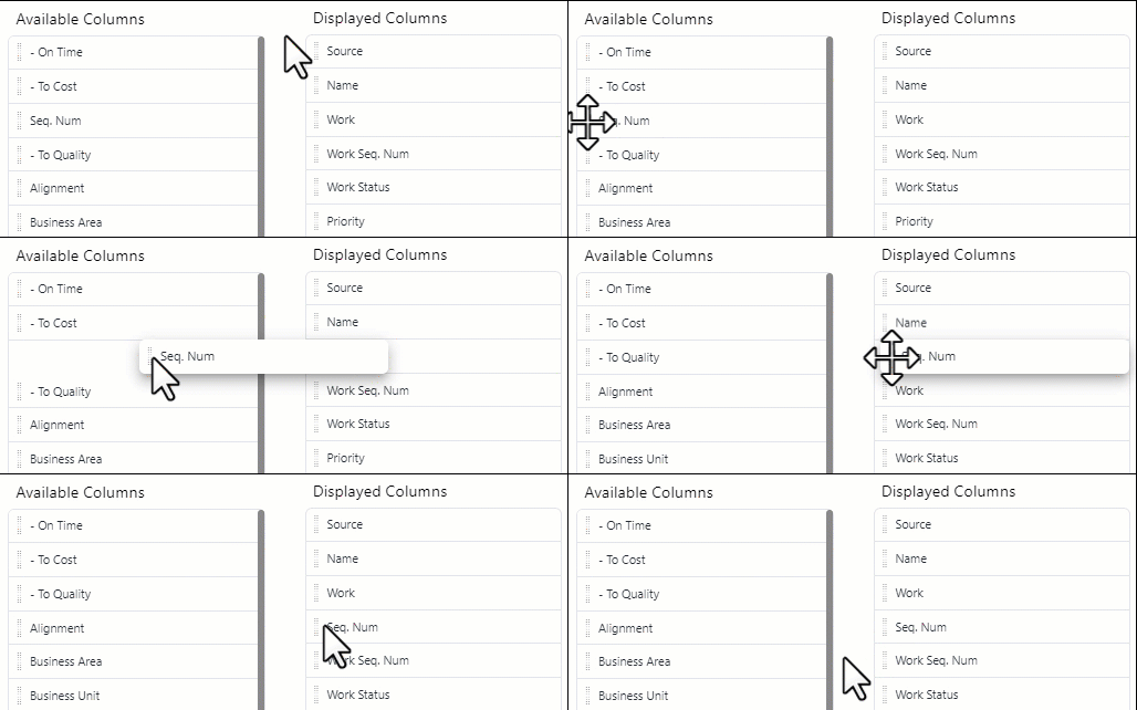
 Grid Settings: Selecting this button opens up a window that allows users to add, remove, and rearrange grid columns by dragging and dropping them around the grid.

The "Available Columns" are the columns that have not been added to the grid, and the "Displayed Columns" are the columns that are currently included in the grid. The top-to-bottom order of the columns in the "Displayed Columns" list will be reflected left-to-right in the grid.
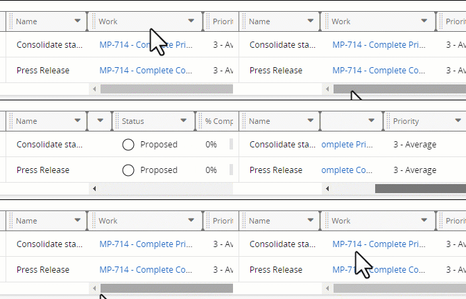
Also, users have the option to "freeze" up to three columns on the left-hand side of the grid.

When columns are frozen, they will stay still while the user scrolls horizontally through the grid.

The column containing the Actions menus will always remain frozen. It will not be counted as one of the frozen columns.

Also, users can select the Edit button in the top right-hand corner to edit the item's information.
Make sure to select the Save button to confirm your changes.


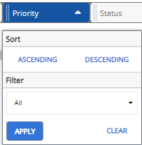
If a sort or a filter has been applied, an arrow or a filter icon can be seen in the column header.


