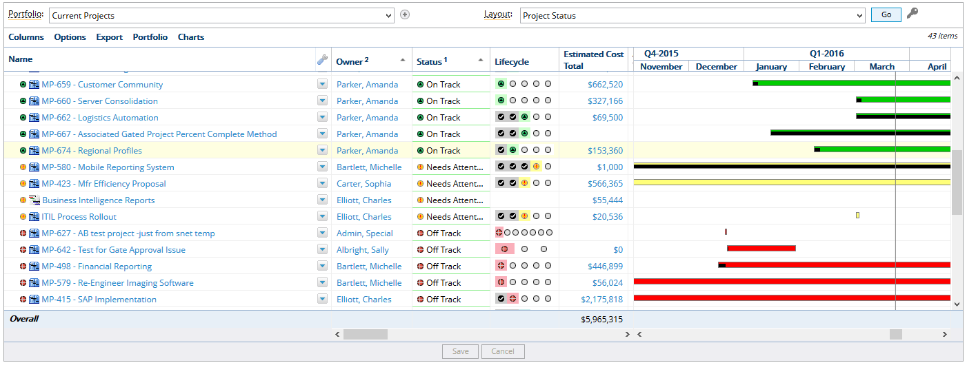
Dashboard Options Menu
The Options menu offers some handy tools that can help you maximize the use of the dashboard.
1. Click Review
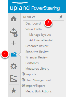
- On the Icon Bar click the Review button, then select Dashboard.
2. Click Options - Run Resizing
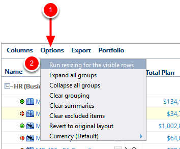
- Click Options, select Run resizing for the visible rows.
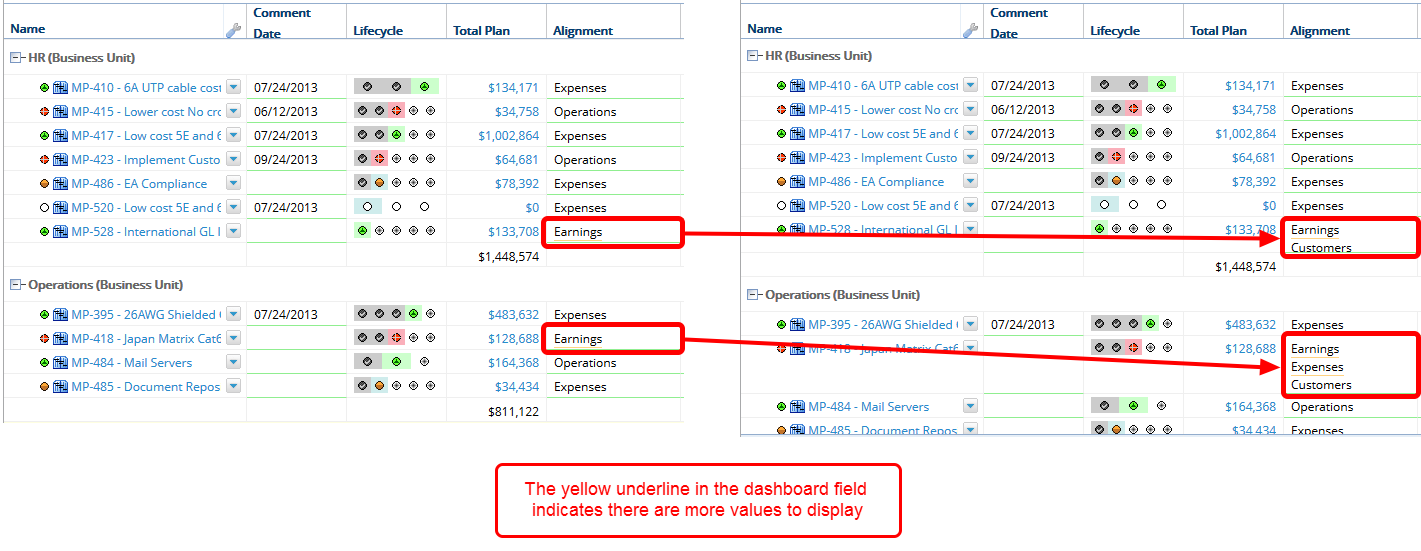
Run resizing for the visible rows: In some cases you might have columns that contain multiple tag values. By default the dashboard will only display the first value in that list but provides a yellow underline as an indicator that more information is available. Resizing changes the height of the row to display more information.
3. Click Options - Expand Groups
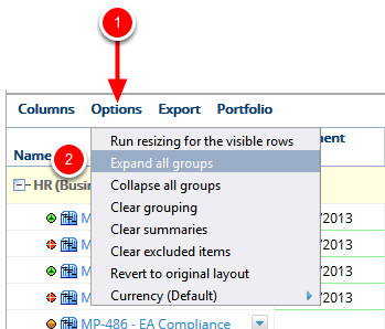
- Click Options, select Expand all groups.
Expand all groups: If you selected a column to group by, or your layout was grouped by default, you can use the Expand all groups option to expand each of the groupings in one click versus having to click each plus sign individually to expand a group.
Note: You will not see the Expand all groups menu option if you do not have any groups displayed.

4. Click Options - Collapse Groups
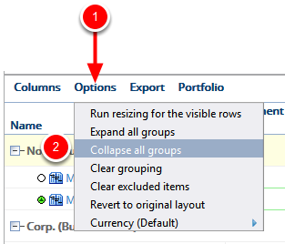
- Click Options, select Collapse all groups.
Collapse all groups: If you selected a column to group by, or your layout was grouped by default, you can use the Collapse all groups option to collapse each of the groupings in one click versus having to click each plus sign individually to collapse a group.
Note: You will not see the Collapse all groups menu option if you do not have any groups displayed.
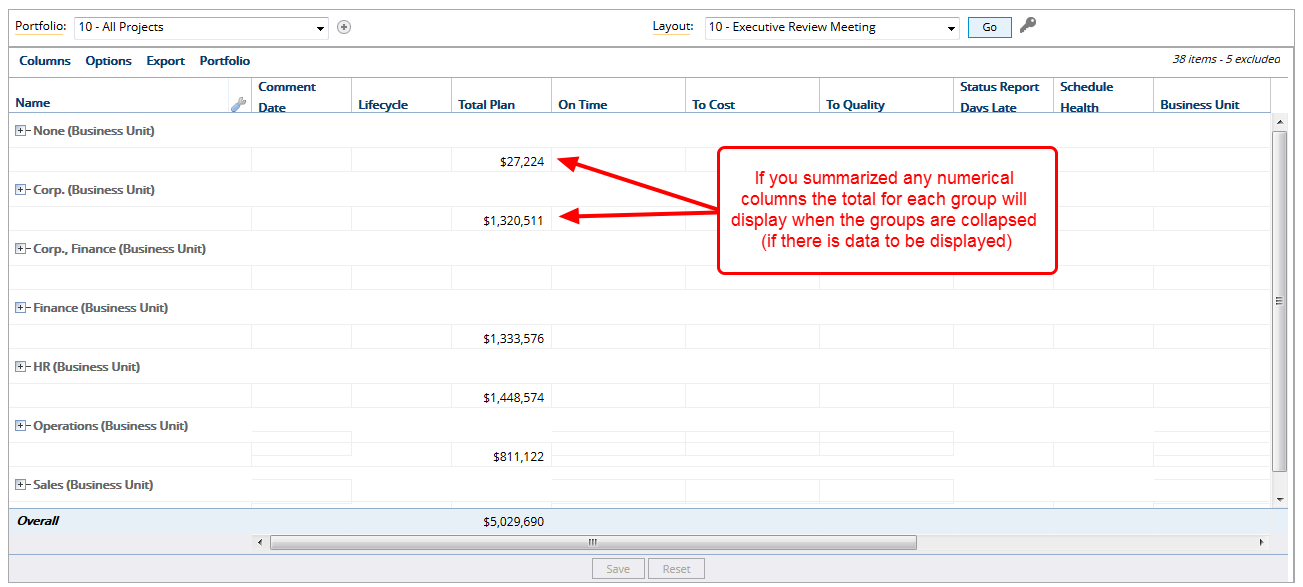
5. Click Options - Clear Grouping
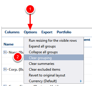
- Click Options, select Clear grouping.
Clear grouping: If you selected a column to group by, or your layout was grouped by default, you can use the Clear grouping option to remove the group from your dashboard. The data will return to the sort order of the default layout.
Note: You will not see the Clear grouping menu option if you do not have any groups displayed.
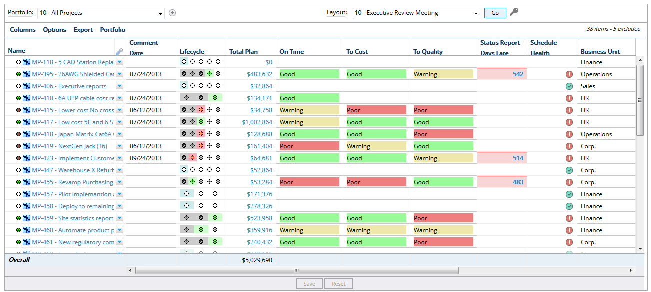
6. Click Options - Clear Summaries
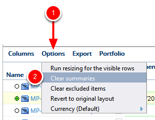
- Click Options, select Clear summaries.
Clear summaries: If you added a summary to one or more columns, or if your layout had a summary by default, you can use the Clear summaries option to remove all summaries from your dashboard.
Note: You will not see the Clear summaries menu option if you do not have any summaries displayed.
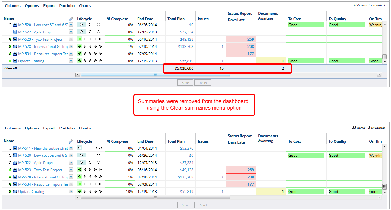
7. Click Options - Clear Excluded Items
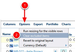
- Click Options, select Clear excluded items.
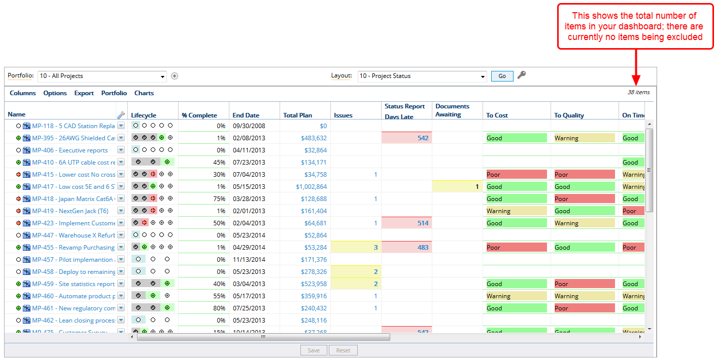
Clear excluded items: For the purpose of what-if planning, you may want to see how your data appears without certain work objects such as a specific project. You could create a new portfolio to view without those items, or you could use the exclude from summary option to temporarily remove those items from your summary totals. The impact of these exclusions will be visible in any associated charts you have displayed with your dashboard. You will need to refresh those charts after you select items to exclude.
Note: You will not see the Clear excluded items menu option if you to not have any items excluded from the summary.
8. Click Options - Revert Layout
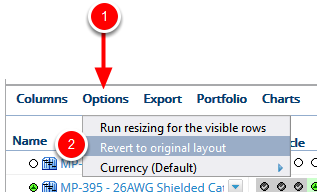
- Click Options, select Revert to original layout.
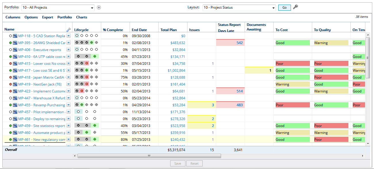
Revert to original layout: Once you select a portfolio and layout the columns are organized per the creator of the layout, usually an Administrator. Once displayed you have the option to rearrange the columns, remove columns, add grouping, add summaries, etc. If you want to go back to the starting point of your original layout as designed by the Administrator, you can use the Revert to original layout option to reset the layout.
9. Click Options - Currency
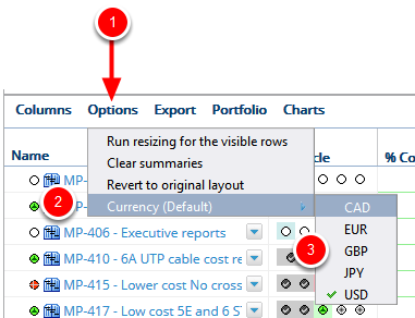
- Click Options, click Currency (Default), select desired currency for the dashboard display.
Currency (Default): Each PowerSteering site has a default currency that will display when a dashboard is displayed. The Currency menu option allows you to change the display of monetary columns to other exchange rates you have loaded into PowerSteering. If you only have one currency rate loaded you will not see any options except your default. There is also the option of loading multiple exchange rate tables. These additional tables will enable you to view different and multiple exchange rates in dashboards and reports. See Add an Exchange Rate Table to learn more about this functionality.
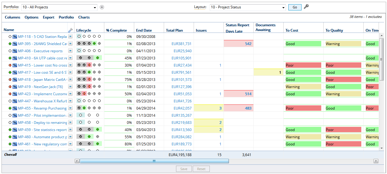
Note: Decimal points/commas used to separate whole numbers from fractional amounts are based on the user's locale. These may differ from how separators are displayed on metrics.
For Example:
- English: $1,234,567.89M/EUR 1,851,851.83M
- French: 1 234 567,89M USD/1 851 851,83M €
- Spanish: USD 1.234.567,89M/€ 1.851.851,83M
10. Click Options - Gantt
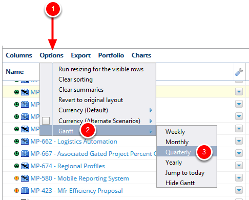
- Click Options, click Gantt, select the time period to display in the Gantt chart on the Dashboard display.
Gantt: The Gantt chart is commonly used in project management to show activities against a time scale. Each activity is represented by a bar; the position and length of the bar reflects the start date, duration and end date of the activity. This allows you to see at a glance what the various activities are, when each activity begins and ends, how long each activity is scheduled to last, where activities overlap with other activities, and by how much, and then the start and end date of the whole project.
- Weekly: The Gantt chart will be displayed by week.
- Monthly: The Gantt chart will be displayed by month.
- Quarterly: The Gantt chart will be displayed by quarter.
- Yearly: The Gantt chart will be displayed by year.
- Jump to today: Select this option to have the Gantt chart jump to today's date.
- Hide Gantt: Select this option to hide the Gantt chart.
Note: You will not see the Gantt menu option if you do not have Include Gantt selected in the Dashboard layout configuration for the selected layout.
