Create a Dynamic Slide Component
The Dynamic Slide component is used to create a slide in a Project or created document that pulls in content associated with grouped items that a user selects on the Selection Driven Content page. By adding Dynamic Slide and Selection Driven Content components that compile items onto slides, the architect does not have to create and maintain many slides to account for all the possible combinations.
Example: In the example below, a document type architect adds two groups, each with three items and associated content, to a Selection Driven Content component. Then, they add a Dynamic Slide component that includes a slide that uses those groups as sources. When a user builds the presentation, and selects the items from the Selection Driven Content Component page, the content associated with the items they selected will be added to the Dynamic Slide.
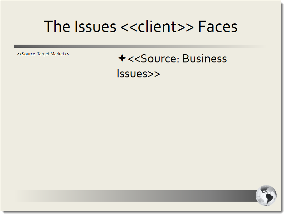
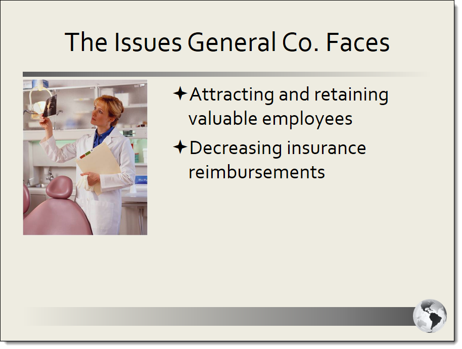
The slide as added to the Dynamic Slide component in the document type (left) and as part of the finished presentation (right).
Create a Dynamic Slide Component
- From the Toolkit, select Dynamic Slide.
- In the Properties panel, enter the name of the component. This name displays in the Navigation panel.
- Enter the display title. This title displays on the created document's Assemble tab.
- From the Actions menu, select Upload Document, click the ellipsis to browse to the desired Microsoft PowerPoint file, select the file, click Open and then click Save.
- From the Actions menu, select Edit. The file opens in PowerPoint.
- Do the following to format the slide in PowerPoint:
Place your cursor in the text shape in the slide that will contain a dynamic source and click Select Source from the Qvidian toolbar. The Slide Shape Properties dialog displays.
Note: A text shape can be any object in which you can add text, including text boxes, placeholders, and Microsoft SmartArt graphics.
- From the Do you want to repeat the slide for each selection? drop-down menu, select one of the following options:
- Repeat: Select to repeat the slide for each selection.
- Do not repeat: Select to not repeat the slide for each section. All items will be on a single slide.
- From the Selection Subsection to supply the content drop-down menu, select the Selection Driven Content component that will be the source for this slide object.
- To remove a source from a selected object, select Not Set option on the drop down.
- To remove the source for all text shapes on the slide, click Reset All Shapes.
- In the Choose one or more selection groups to include in the selected shape box, select the check box for each group that will be a source.
- Click Save. The source code for the group displays in the selected Text Shape on the slide.
- Click Save to Qvidian.
- Select one of the following options from the Include drop-down menu:
- Always: Select if you want this subsection required for completion for created documents or projects using the document type.
- Optional: Select if you want this component to be listed in the Optional Tasks panel on a created document's Assemble tab or on a project's navigational panel so that end users have the option of including the component.
- By inclusion:Select if you want this component automatically included when an optional component is included. The Component / Selection Group tree displays listing the optional component and selection groups for this document type. Check the box for the optional component with which you want to associate this component. When the user includes the associated optional component, the by inclusion component is also included. Check the boxes for each item that you want this component included with a required for completion status.
- Optional or by inclusion: Select if you want this component included either as an optional component or to be included by inclusion of a different optional component. The Subsection / Selection Group tree displays listing the optional components and selection groups for this document type. Check the box for the optional component with which you want to associate this component. When the user includes the associated optional component, the by inclusion component is also included. The component is also listed in the Optional Sections pane on the created document's Assemble tab or on the project’s navigation panel, so that users can select the component in a document build without selecting the component with which it is associated.
- Click Save.
Remove an attached content record
- Select Delete from the Actions Menu. The Confirm Deletion dialog displays.
- Select one of the options below:
- Remove link(s) to content: Select if you just want to remove all links to the content you are deleting.
- Remove link(s) to content, and, if permissioned, delete content from the Library: Select if you want to remove all links to the content and delete the content stored in the library.
- Click Yes.
Additional actions
From the Actions menu, you can perform additional tasks to work with the content attached to your component:
- Edit content: Select Edit to open the content record and check it out of the library for editing in PowerPoint. You must edit the content using the Qvidian toolbar, or your changes will not be saved.
- Cancel an edit: Select Cancel Edit to cancel the editing of a document or presentation and abort any changes made. The file must have been previously added to the component dialog from the content tray, and must be currently open via the Edit function.
- Download a content record: Select Download to download the content. You will be prompted by your browser to save the file. Downloading a file does not check it out of the library.
- View content record properties: Select Properties to view or edit the Content Record Properties for the content in the library.
- Save attached content record or bundle to the content tray: Select Save to Content Tray to save the content record to the content tray where it can be added to the content area on the Component dialog.
- Preview attached content record as an image: Click the content record title next to the Actions menu. The Preview Image dialog displays in full page view.
 Structure File toolbar
The Structure File toolbar displays when you edit a PowerPoint slide that has been uploaded to a Dynamic Slide component.
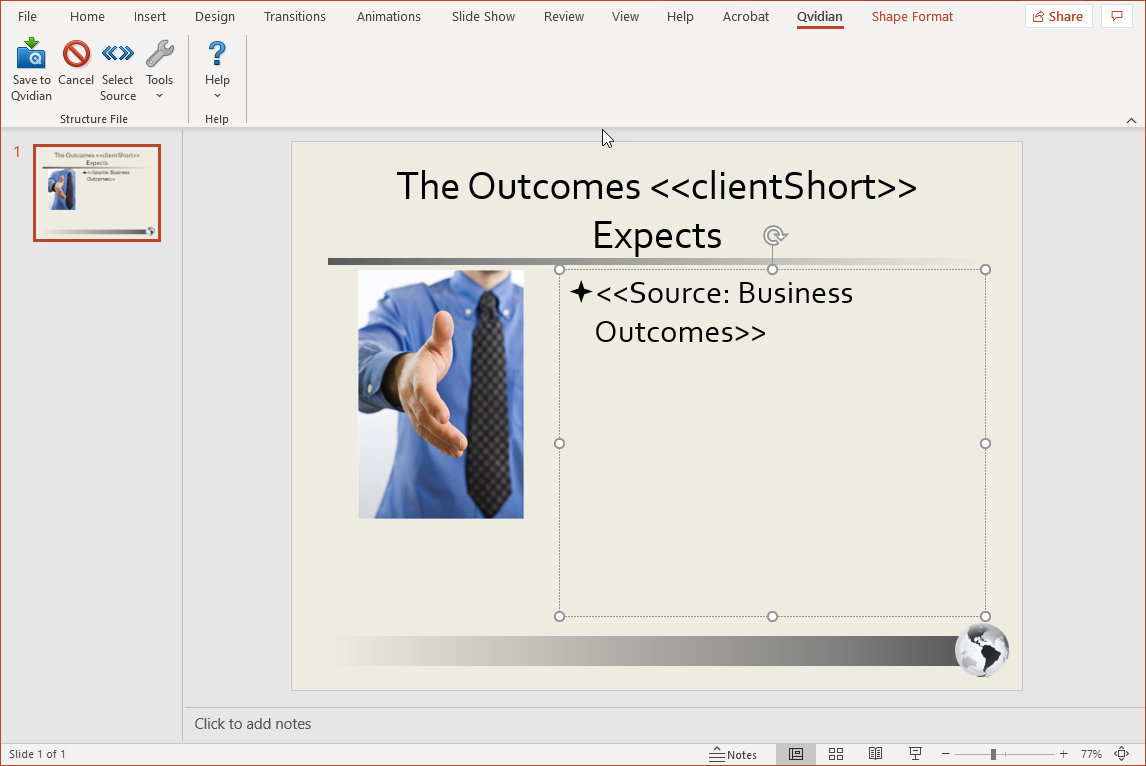
Save to Qvidian
- Click the Save to Qvidian button to save your changes after you are finished with your document. The Upland Qvidian login dialog box may display. If you are saving new content, the Submit Content dialog box displays where you can add details to the content before submitting the content to the specified folder.
Cancel / Cancel All
- Click Cancel or Cancel All to cancel the editing of the current content record or all content records and close without saving any changes.
Select Source
- Click Select Source to add content from a Selection Driven Content component to a selected shape in the slide.
Insert Field
- Click in the document where you want to insert a merge code, click Tools, and then select Insert Field to display the Insert Merge Code dialog.
- Select one or more merge codes and click Select.
Delete Temporary Content
-
Click Tools, and then select Delete Temporary Content to delete temporary content that Upland Qvidian creates when a user performs an upload or any editing functions.
Note: You may want to periodically remove temporary content to free up disk space.
Select Server
This function is provided for users who use different Upland Qvidian databases on different servers to manage content. It allows you to save the presentation to a specific server running Qvidian.
- On the toolbar, click Help then select Select Server to display the Default Qvidian Server dialog.
- Select the Qvidian Server. If the Qvidian Server URL is not listed, click in the field and type in the server's URL, verifying that http:// precedes the URL and a single slash - / ends the URL.
Change Login
- On the toolbar, click Help then select Change Login to display the Upland Qvidian login page.
Note: If you need additional assistance in the Upland Qvidian Login page, click Directions.
- Enter your user name and password. If logging in as a different user, make sure this user has a user account which is enabled in Upland Qvidian.
Note: Once logged in, you will not have to log in again when performing any operation, such as Save to Qvidian, that requires interaction with the Upland Qvidian web application from within this Microsoft Office product (Word, PowerPoint, or Excel) session.
- Select the Use single sign-on check box if your organization is using a single sign-on approach, such as Active Directory (ADSI), Siteminder, or Ping to configure your user account in Upland Qvidian.
- Select the Remember these settings check box if you want the application to remember either your explicit user name and password, or your single sign-on setting. These settings are remembered from Upland Qvidian session to session unless you log in as a different user or change your login credentials.
- When completed, click Login/Set.
Reset Your Login Credentials
- In the Upland Qvidian Login page, click Clear to reset the User Name and Password to empty, "single sign-on" to off, and close any current server connection. The next time any connection is made to the server, the user will be prompted for their login credentials.