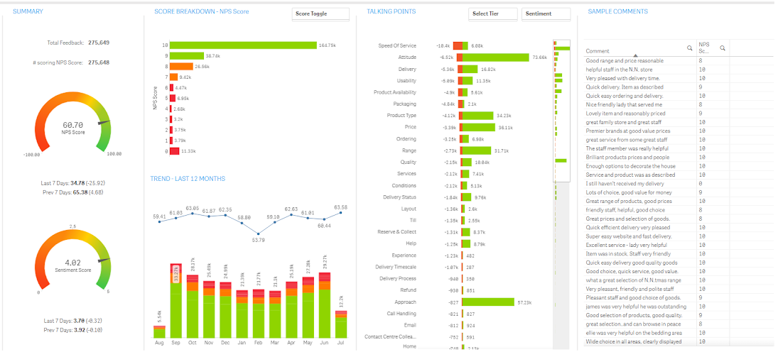
The Overview sheet provides a summary across the entire dataset you are configured to view.
To make selections and update the report:
-
Click a data point in a chart or graph in the content area of a sheet.
All associated visualisations are updated immediately. A confirmation box displays around the selection.
-
To confirm the selection, click the Tick (
 ) icon or press ENTER.

The following table describes the sections of the Overview sheet
| Section | Description and actions |
|---|---|
|
SUMMARY |
Displays the following items:
|
|
SCORE BREAKDOWN - NPS SCORE |
Displays the volume of feedback received for each given score.
|
|
TREND - LAST 12 MONTHS |
Contains a bar chart showing the volume of feedback per month (bar coloured red/amber/green to shows feedback volume for good/average/bad scores) plus a line graph showing the average given score by month.
|
|
TALKING POINTS |
Displays the first view of what customers are talking about. It displays the number of positive and negative mentions customers have made for each category of your taxonomy. This panel shows all categories in the bottom-most level of your taxonomy (that is, the most detailed level) and is ordered by categories that have the highest number of negative sentiment comments.
|
|
SAMPLE COMMENTS |
Displays a selection of comments based on the filters you have selected to ensure the in-context voice-of-the-customer is always with you. |