Discover Upgrade Release Notes
December 2024 Update
The December 2024 upgrade brings new features to the Discover module.
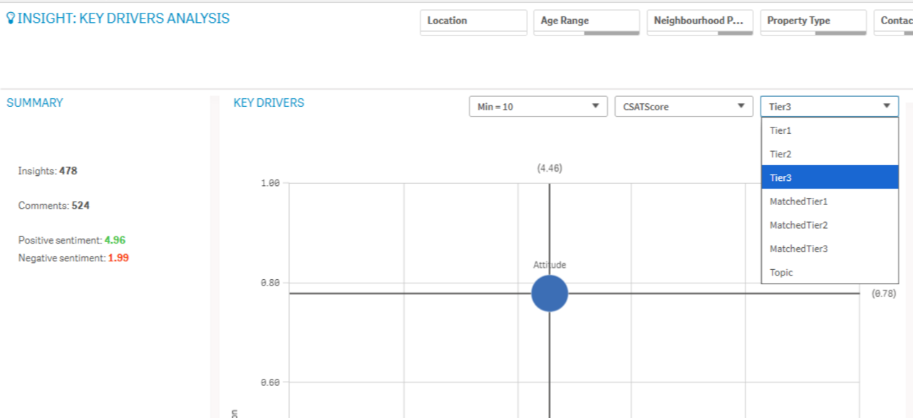
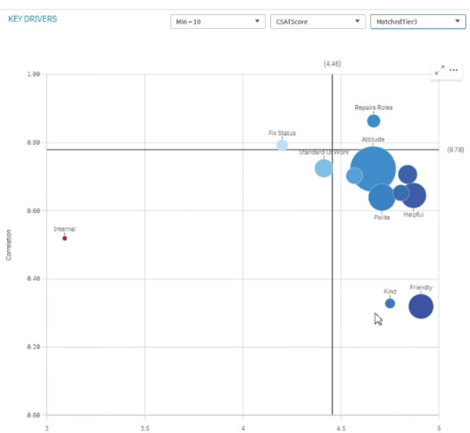
New Drilldown within Key Drivers
Users can now find a new option within Key Drivers to view Matched Tiers. This will return all the categories/topics that appear alongside the selected driver within verbatims which allows users to understand the wider context supporting a given driver.
Recover BaseSheet
A new Recover BaseSheet will appear for all clients. This will include two new fields:
-
Root Cause Description
-
Root Cause Notes
Note: If a client does not use Recover, then they will see a blank report with a message displaying that there is no data to view.

Extra Filter Options on Response Rates
All meta fields can now be used as a filter on the Response Rates BaseSheet.
Sample Comments Performance Improvements
Loading performance improvements have been made to Sample Comments.
The February 2024 upgrade brings new features to the Discover module.
New Pivot Table
The new Pivot table is here with a set of new features:
-
Dimension headers
-
Null value custom symbol, foreground and background color
-
Grid styling with width and color
-
Font styling for size, color and family for headers and cell contents
-
Totals styling and placement options: above or below
-
Column width options, set to auto, in pixels or with percentage
-
Scroll bars outside chart
-
Interactive sort of dimensions
All of the above are designed and added based on feedback from our users. The new Pivot table is launched in the Visualization bundle and will replace native pivot next year when additional features are added.
Layout Container
The Layout container is a new component in the Dashboard bundle. In the Layout container, charts can be placed in a freeform manner with or without a snapping grid. Charts can overlap, be stacked, and controlled with show conditions. The Layout container is highly versatile but especially useful for:
-
Grouping charts together
-
Combining charts into new visualizations
-
Creating composite KPIs
-
Grouping and reusing user controls and buttons
-
Creating aesthetic pleasing dashboards
Styling Grid, Funnel & Sankey Charts
The Grid chart, Funnel chart, and the Sankey chart have been upgraded with the new property panel for styling. The styling includes general settings for title, subtitle, footnote, background, border and shadow and chart specific settings for axis and value labels.
Filter Pane Styling
The Filter pane now gets more properties for styling. General settings for title font styling, background, border and shadow. Chart specific styling for header and content font styling, color settings for selection state, background color and image.
Borders and Shadows
As of today, most charts receive settings for borders and shadows. Charts inherit the border setting from the theme but the border width and color setting can now be overridden and customized per chart. The border can play a big role in how your dashboard is perceived, use it wisely to achieve your goals.
Chart shadow is a new property on charts, providing a shadow contour around the chart, with options for size and color. Shadows create a depth effect and can be used to highlight and make certain elements stand out.
Borders and shadows works very well in the Layout container where charts can overlap and be stacked.
Copy & Paste Style
You now have a new menu choice for copying style settings from one chart to another. This quality of life improvement makes it easier to style and work with charts. Especially now when all charts has many more styling settings.
Vizlib Upgrade
We are also taking this opportunity to upgrade to the latest vizlib library within Qlik which will ensure we are able to take advantage of Qlik updates as and when they are made available
New updates to the Visualization are included in this upgrade.
Label coloring with map chart
New map settings include options for label coloring allowing you to customize how labels contrast with the base map or colored areas. Set your map to automatically adjust the label coloring depending on the base map or select your preferred coloring.
Scatterplot supports regression lines
The redesigned scatterplot chart provides greater flexibility and detail. Scatterplot now supports regression lines including average, linear, exponential, and logarithmic, as well as second, third, and fourth polynomial. You can customize the regression line settings including color and type, vertical or horizontal fit, and show formula to quickly see the relationship between two variables.
KPI background color and new icons
You can add background colors to KPI charts, giving you more flexibility when customizing your visualizations.
Time series decomposition chart functions
Several new functions allow you to decompose a time series dataset into trend and seasonality. The trend function identifies direction in the data, and the seasonality function determines seasonality with a known periodicity. The residual function identifies variation that is not associated with seasonal or trend components (noise). With these functions, you now have increased visibility into the patterns and trends in your time series data so you can better plan future action.
Scatterplot displays larger datasets
You can now control the number of visible bubbles displayed in scatter plots you create. Scatter plots can be set to display up to 50,000 data points. If there are more than 5,000 visible bubbles, then bubble labels and out of bound bubbles are not shown.
New sheet grid and sheet background options
Sheets can now have custom background images and colors, allowing you to divide your sheet into sections, add images from your media library, and more. You can set a background color using the color picker, or by expression.
The November 2022 upgrade brings new features to the Discover module.
-
New chart objects
-
New chart properties
-
Sheets can now be resized
-
Changes to master measures
-
Improvements to UI
Chart objects
Several new objects have been added to the charts tab with this release, reducing the need to build custom objects.
Example: Adding and populating a container in Discover.
-
Open the charts tab and locate the container object.
-
Drag the container onto your sheet.
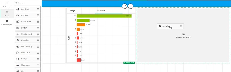
-
Drag a chart into the container.
-
Continue adding charts as required.
Note: Some items may function differently compared to custom built objects, e.g. you cannot drop a container into a container using the standard option from the charts menu..
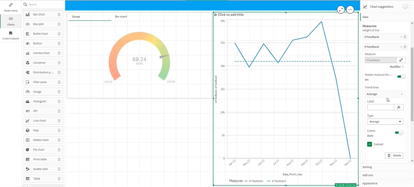
Chart properties
New options have been added to the properties tab for charts, including the ability to add trendlines and modifiers without the need for additional code.
Example: Add a trendline to a chart.
-
Select the chart to which you wish to add a trendline.
-
In the properties menu, locate and open the data tab.
-
Use the trendlines dropdown menu to select the type of trendline to add, e.g. average.
-
Add a label, as required, to aid in reading the chart.
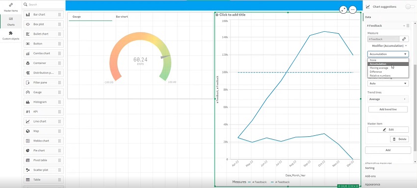
Example: Add a modifier to a chart, e.g. to add a cumulative count of responses.
-
Select the chart to which you wish to add a modifier.
-
In the properties menu, locate and open the data tab.
-
Add a second measure.
-
Use the measure modifiers dropdown menu to select the type of modifier to add, e.g. accumulation.
Sheet sizes
Within the sheet properties, you can now set the sheet size to be responsive or a custom size.
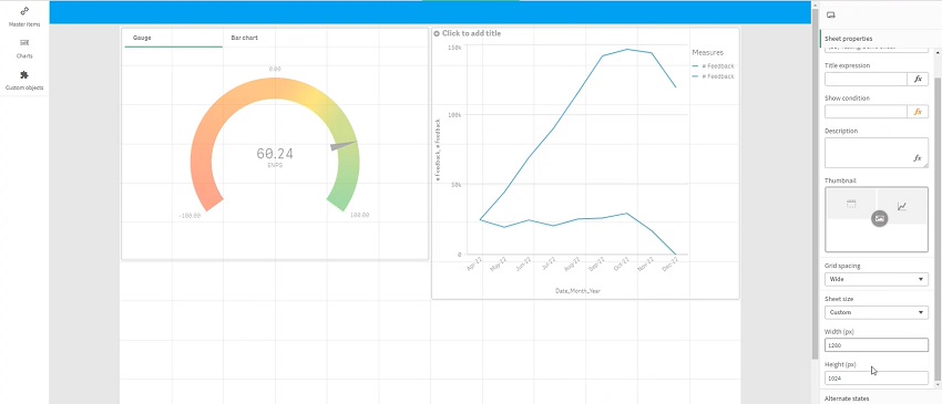
When selecting a custom size, enter pixel width and height values in the respective text boxes to define your sheet size.
In responsive mode, you can use the extend sheet slider to enable vertical scrolling.
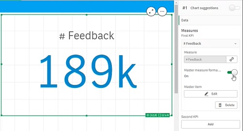
Master measures
If you're using a master measure within an object, you have to turn the master measure formatting off to be able to reconfigure how the numbers display.
User interface
This update also includes some visual improvements intended to improve readability and provide flexibility when creating sheets.
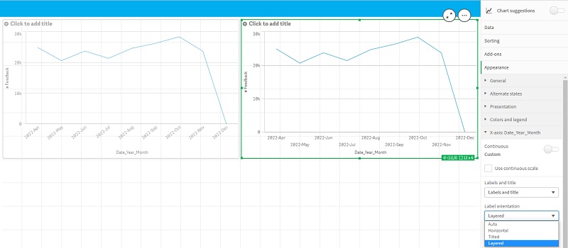
Example: Axis label options to improve readability.
Comparison - two charts with identical data but different axis label options: left - auto label settings; right - layered labels.