Color is a powerful attribute in data visualization. In a good visualization, it can focus attention and enhance meaning and clarity. When color is used poorly, it creates clutter and confusion.
Upland Analytics has a default color palette, but it isn’t always optimal or even appropriate for many charts. Luckily, Upland Analytics allows you define and use your own Color Palette which is simply a collection of colors applied to the visual elements in your chart.
Note: Each user's profile is uniquely configured and permissioned by the Account Administrator. Your view and options may differ slightly depending on the permissions granted.
Analytics Palettes
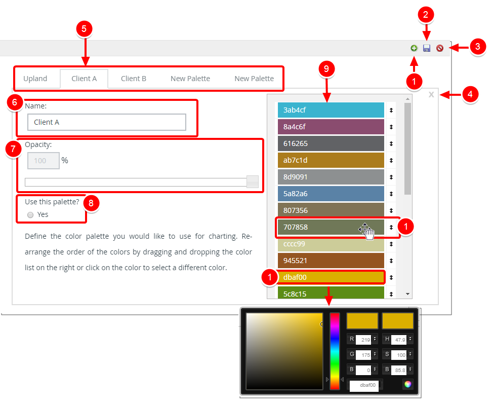
- Add: Create a new palette. Clicking this button will create a new tab called New Palette.
- Save: When the Save this record button is clicked a confirmation message will be displayed. Press OK to save your changes or No to return to previous page without saving.
- Cancel : When the Cancel button is clicked a confirmation message will be displayed. Press OK to cancel your changes or No to return to previous page.
- Remove Layout: Click this button to delete the Palette thus removing the tab. Note: The default Palette can not be deleted.
- Available Palettes: Click the tabs to view each Palette definition.
- Name: Palette Name.
- Opacity: Use the Opacity slider to change the opacity of the colors in your Palette.
- Use this palette: Select Yes to use the Palette
- A set of 24 colors define your Palette.
- Drag or use the Up and Down arrow buttons to move the desired color higher or lower in the list.
- Click a color to change it's value.
Menu