Engagement
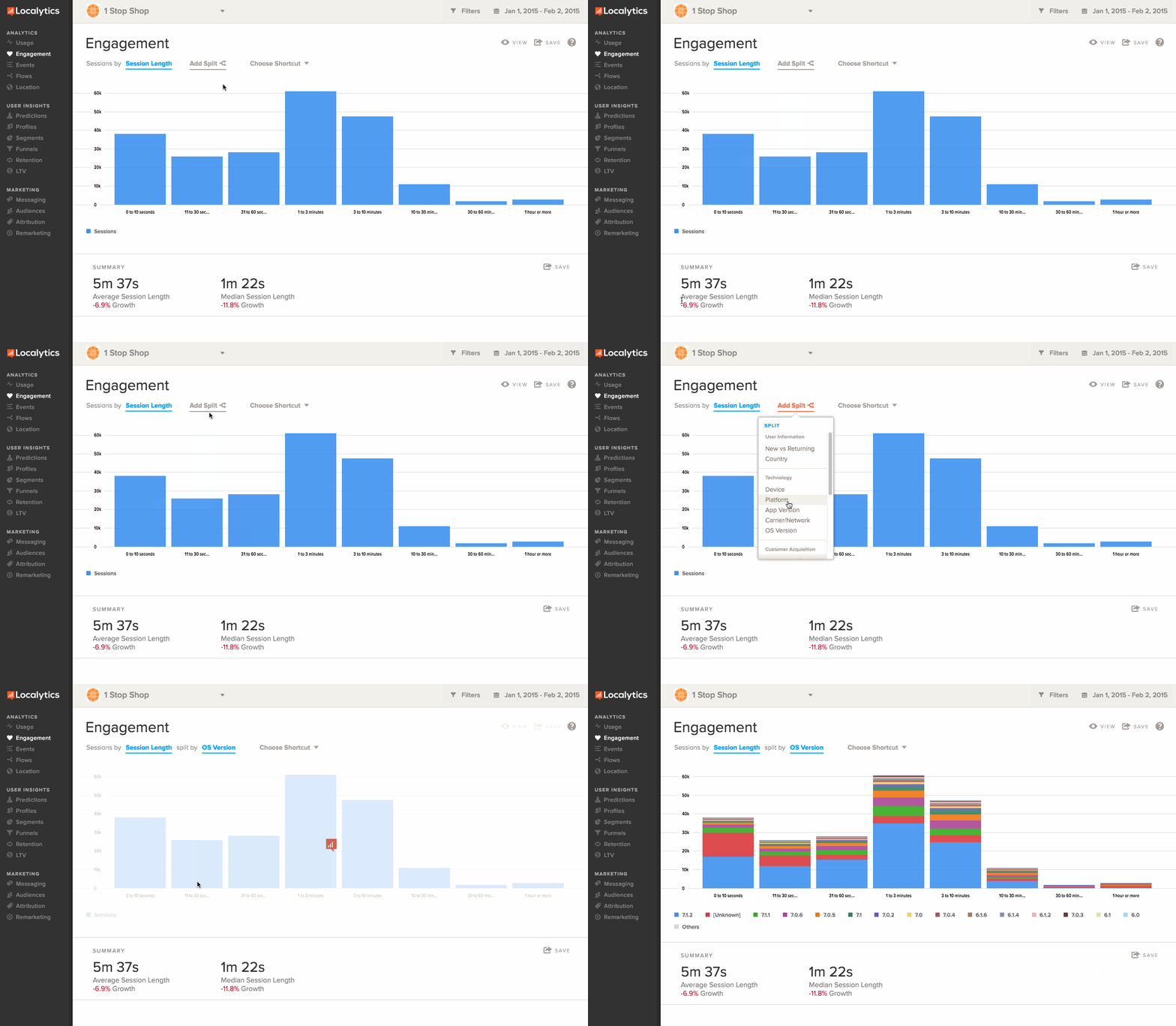
Note: The Engagement report depends on a session being closed in order to get its numbers. The Usage section of the dashboard tracks only session opens, which is why it's displaying a higher number of sessions. Often, session closes aren't recorded until the start of a new session, so once you have more information from people using the app, these numbers should start to normalize.
Using the Engagement dashboard
To work with the Engagement dashboard:
-
Go to Analytics in the left pane and select Engagement.
- Select the date range in the upper-right corner and select the specific date range to view. For more information, see Date range.
-
Select Filters to apply specific criteria to the results.
This way you can view different kinds of users and the frequency that users are returning to the app. For example, you could select the following:
- Push-enabled - To see how data on users returning whether they have push enabled or not.
-
App version - To look at users who are using a specific app version and if they’re consistently coming back to the app with this version.
Like most analytics reports, you can filter by dimension and/or profile, set a date range, change the view, save your report, apply data splits, and choose a shortcut. To learn more about these features, see Anatomy of an Analytics report.
Viewing engagement data
To change the view:
-
Under the report title, select Session Length from the Sessions by options.
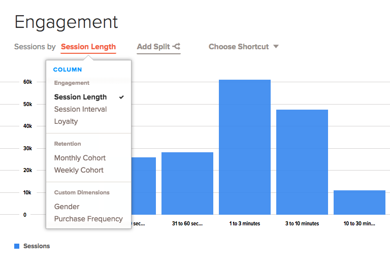
- Select one of the following options for viewing engagement data:
Session length
The Session Length view shows the number of sessions that lasted a certain period of time within the selected date range. The time periods will vary according to the engagement data.
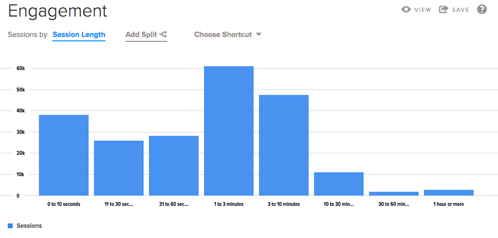
For example, in this chart, the time periods are 0 to 10 seconds, 11 to 30 seconds, 31 to 60 seconds, and so on. If the app was opened and closed within 10 seconds, it is counted in the 0 to 10 seconds column.
Session interval
The Session Interval view shows the number of sessions during each period of time within the selected date range.
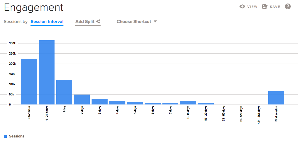
The benefit of this is to see a wider range of time and the number of sessions there have been for each range of time.
Loyalty
The Loyalty view shows the number of sessions users have opened in the app within the selected date range.
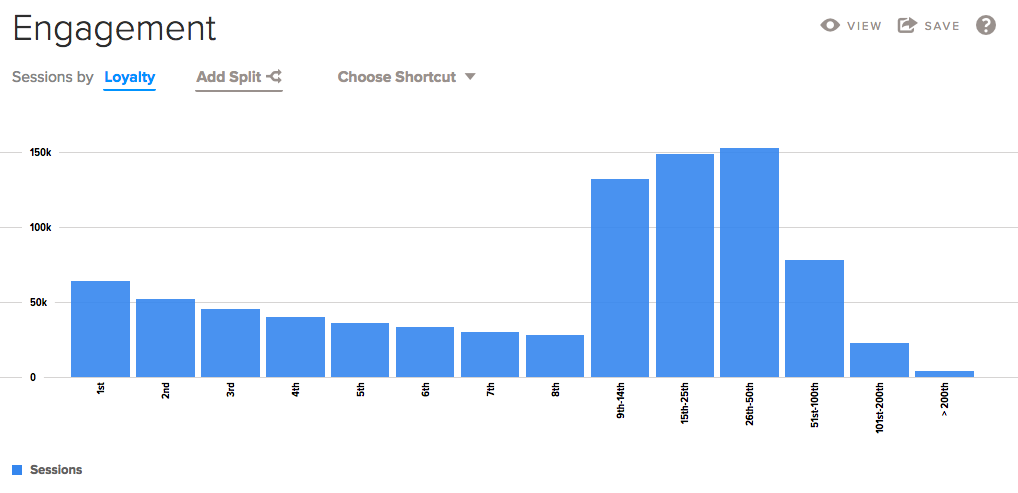
This way, you can see how many users have a lot of sessions in your app. You can also see if users are returning often. If they are, you will see more results in the groups of sessions to the right of the chart.
Interpretation of the Loyalty report is not always obvious. This reports the count of sessions observed during the selected date range, split by visit number.
For example, if a user has their first, second, and third ever sessions during the selected date range, each of these sessions will add one unit to each of the first three columns.
Note: The sessions at the right end of the chart are grouped (for example, 9th - 14th), so you may see higher numbers for these columns.
Viewing summary data
The Summary section shows the average session length and the median session length within the selected date range and for any applied filters.
