Create a Structured Content component
The Structured Content subsection is used to create content that pulls in information and content from the library, Salesforce.com, or fields users complete during the build process to fill in cells in a table, bulleted lists or paragraphs. You can design the document or slide in the component that provides a structure for the content, such as a table, but substitute codes for the actual content. When you add a Numeric or Currency field code, two local codes ( <<Code_Sum>>, <<Code_Avg>>) are created that can be included to automatically total or average the numbers upon build.
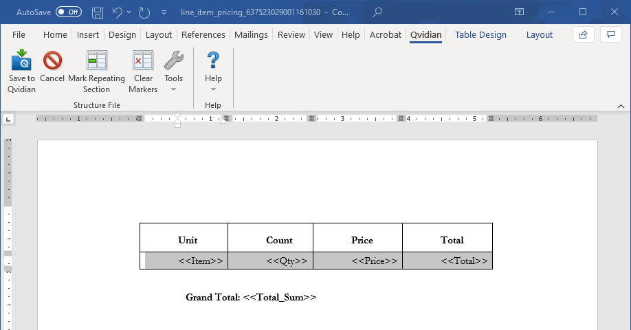
In the example below, the architect creates a Word document with a table that lists items, along with their quantity, cost, and total cost. An additional grand total is listed below the table. During the build process, a user enters item description, quantity, and price for each item. When the user builds the Project, document, or presentation, the total price for each item and the grand total for all items will be calculated.
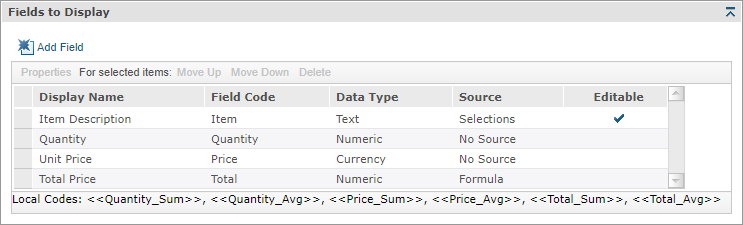
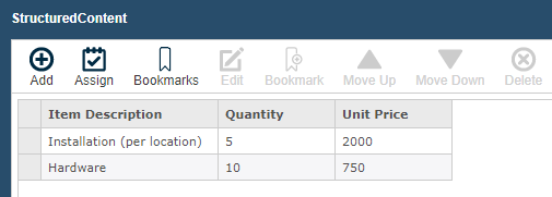
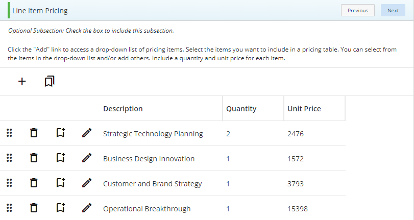
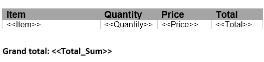
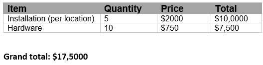
Examples of a Structured Content component used for line item pricing (top left), the page users will interact with when creating a document (top middle), the page users will interact with when creating a Project (top right), the table in the document loaded to the component (bottom left), and the populated table in the built document (bottom right).
 More Examples
Example of a Structured Content component used for references. Click to enlarge.
Example of a Structured Content component used for team members by job. Click to enlarge.
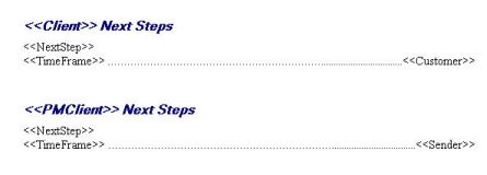
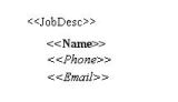
Example of a Structured Content component used for next tasks. Click to enlarge.
Create a Structured Content component
- From the Toolkit, select Structured Content.
- In the Properties panel, enter the name of the component. This name displays in the navigation panel.
- Enter the display title. This title displays in the created document workspace.
- From the Actions menu, select Upload Document, click the ellipsis to browse to the desired Microsoft Word or PowerPoint file, select the file, click Open and then click Save. You will continue formatting the document below.
- Enter the minimum and maximum entries that the user must complete for a field. If the minimum is set to 0, the user is not required to complete any entries. If maximum is set to 0, the user may complete as many entries as necessary.
- Select one of the following options from the Include drop-down menu:
- Always: Select if you want this subsection required for completion for created documents or projects using the document type.
- Optional: Select if you want this component to be listed in the Optional Tasks panel on a created document's Assemble tab or on a project's navigational panel so that end users have the option of including the component.
- By Inclusion: Select if you want this component automatically included when an optional component is included. The Component / Selection Group tree displays listing the optional component and selection groups for this document type. Check the box for the optional component with which you want to associate this component. When the user includes the associated optional component, the by inclusion component is also included. Check the boxes for each item that you want this component included with a required for completion status.
- Optional or by inclusion: Select if you want this component included either as an optional component or to be included by inclusion of a different optional component. The Subsection / Selection Group tree displays listing the optional components and selection groups for this document type. Check the box for the optional component with which you want to associate this component. When the user includes the associated optional component, the by inclusion component is also included. The component is also listed in the Optional Sections pane on the created document's Assemble tab or on the project’s navigation panel, so that users can select the component in a document build without selecting the component with which it is associated.
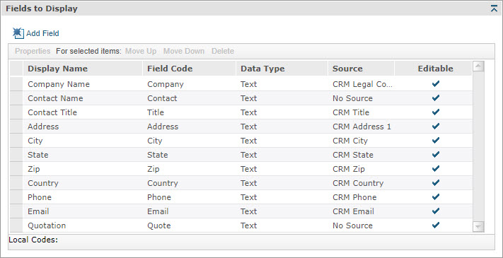
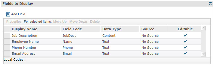
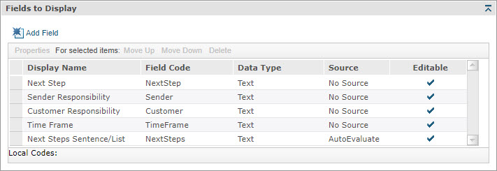
- Define the fields to be displayed in the component:
- To add a field, do the following:
- Click Add Field.
- Enter the field code name, the display name that the user will see, and a description that will display next to the code.
- (Optional) Select the Required check box if you want the field code to be required for completion by end users. If the check box is clear, users have the option of completing the field.
- Select the Data Type, which determines the type of data the user can enter in the field.
- Text:
- If you want the field to have dropdown values, click Dropdown values to display the Drop Down Values dialog and then do the following:
- Click Add.
- Enter the text to display in the field.
- Select the Is Default check box if you want this value to display as the default.
- Click Save.
- (Optional) Repeat to add additional values. Only one can be marked as default.
- (Optional) Select a value and then click Move Up or Move Down to move the value up or down one row at a time.
- (Optional) If you want users to have the option to enter text into the field instead of selecting a drop-down value, select the Editable check box.
- If you want the field to have dropdown values, click Dropdown values to display the Drop Down Values dialog and then do the following:
- Numeric: Local codes, <<code_ Sum>>, <<code_Avg>>, are automatically created. When this Data Type is selected, you can select Formula as the Data Source. Refer to the Data Source section in this help topic. The end user can enter a number with to four decimal places; the minimum is 0.
- Currency: Local codes, <<code_ Sum>>, <<code_Avg>>, are automatically created. The currency symbol, as set in Build > International Settings, automatically populates with the currency value. The end user can enter a number with two decimal places; the minimum is 0.00.
- Content: You can associate content with a Drop Down Value by adding content from the Content Tray. The end user can select content from the drop-down fields for this component for use in the Created Documents > Assemble tab. Select Content and then click Dropdown Values to display the Drop Down Values dialog.
- Text:
- Enter the number of Decimal Places, up to four, that you want to be displayed for your Numeric Data Type. The default value is zero.
- Enter the Default Value that you always want the end user to see as the field's default.
- Select the Source where the field code acquires its data:
- No Source: The source for this field code is the text or data the user enters when building the document.
- Auto Evaluate: Designed for composite field codes; for example, a <<FullName>> merge code could include the following values for the drop down list:
<<LastName>>, <<FirstName>> <<MiddleName>>
<<LastName>>, <<FirstName>>
<<LastName>>
Upland Qvidian will then select the first format for which the user has provided all values. If, for example, only the Last Name and First Name values are provided, the second choice in the dropdown is used (for example, Smith, John). Note that the drop-down entries can contain punctuation between the codes. - Formula: You can only select this Source when Numeric or Currency is selected as the Data Type. To enter a formula for the field, select Formula to display the Edit Formula dialog, and enter a formula for a Numeric or Currency field code. If the formula references a code, it must be a code that is also in this same structured content component. You may not reference a merge code, an automatically created local code, or a field code from a different structured content component. For example: CurCost-PropCost (Current Cost minus Proposed Cost), Qty*Price (Quantity multiplied by Price)
- Selections: When this Source is selected, it automatically creates a drop-down for the field populated with each item from the group that was selected by the user. The field is populated in the content with the item name, not the content associated with the item. To select the group with items containing associated content, select Selection Groups to display the Selection Groups dialog, select the box for each group containing item content, then click Save. The Add New Dynamic Content Field dialog re-displays and the groups are added to the drop down.
- CRM data sources: These field codes cause the CRM integration menu items to appear and associate the code fields with specific CRM fields that may be retrieved. This Source is typically used to pull content from CRM systems (References, Additional Parties, etc.). The CRM Contact ID must be present on a page to store data back into the CRM system.
- Select the Create sentence field code from this field check box to automatically create a Sentence Field Code from the field.
- Select the Create list field code from this field check box to automatically create a List Field Code from the field.
- Click Save. The new code will be added to the Structured Content component.
- To edit field properties, select a field and click Properties to display the Dynamic Content Field Properties dialog.
- To re-arrange the order in which users see the fields, select a field and click Move Up or Move Down to move the field up or down one position at a time.
Note: Field codes are only available within the Structured Content section where they are defined, so if you have multiple structured content sections each section will have its own Field Codes. These are different from merge codes, which can apply across different sections within a document type and are typically input in Data Entry screens.
Note: Codes for each Field in Structured Content cannot be used elsewhere, because they apply only to the repeating block of the Structured Content. Calculated Average and Sum codes for Structured Content can only be used within the structure file. Merge Codes from elsewhere in the Project cannot be used within formulas.
- To add a field, do the following:
- From the Actions menu, select Edit. The file opens in Word or PowerPoint. This option is only available if the document is uploaded to the structured content and then edited using the Edit option in the Actions menu.
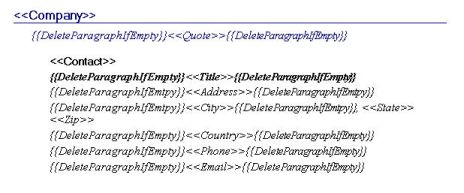
- Enter the fields you created in the previous task in the appropriate place in your Word or PowerPoint. For example, if your file includes a table with an item column and you created a field titled Item, enter <<Item>> in the first cell under the Item header.
- If using Microsoft Word, click in the row or paragraph that includes the field code(s), then click Mark Repeating Section on the Qvidian toolbar.

- (Optional) Select the Repeat items across slides check box to repeat the field code items for every slide in a created presentation. This is typically used for items like case studies or references where each line of data the end user enters will be on its own slide in the output, as opposed to rows in a table.
- Click Save to Qvidian.
Tip: If you are repeating paragraph sections, you must add a paragraph, ¶ , space after the section you wish to repeat
Tip: If you do not intend on using the Qvidian toolbar to create repeating table rows or paragraphs for your Structured Content, when you are creating a Structured Content component using Microsoft Word, apply a Word bookmark to the section(s) you would like to repeat. Select the section(s) you would like to repeat and click Insert > Bookmark and name the selection: “ss_repeat_1”. If you require additional repeating sections in the same file, select those and increment the Bookmark number: “ss_repeat_2”. Once you have completed bookmarking all your repeating Word sections, upload the file as usual. If you need assistance bookmarking repeating information, please contact customer support.
- Click Save.
Additional actions
From the Actions menu, you can perform additional tasks to work with the content records that are attached to your component:
- Edit content: Select Edit to open the file. You must edit the content using the Qvidian toolbar, or your changes will not be saved.
- Cancel an edit: Select Cancel Edit to cancel the editing of a document or presentation and abort any changes made.
-
Download the file: Select Download to download the file. You will be prompted by your browser to save the file.
- View properties: Select Properties to view or edit the title of the attached file.
- Preview attached file as an image: Click the file title next to the Actions menu. The Preview Image dialog displays in full page view.
- Remove an attached file: Select Delete from the Actions menu, select Remove link(s) to content, and then click Yes.
Add help text for users
You can create help text to display at the top of the component to help users complete the fields. In designing the help text, you can work in design mode or HTML text. You can also preview the help text. When the help text first displays, the region is in Design mode. Most users will use this mode to create the help text and use the available standard formatting functions.

- To remove any formatting that you added or that was applied to text pasted from the clipboard, select the text and click the Eraser
 icon to revert to the default Font and Size (Verdana, 10pt).
 - If you want to edit the item in HTML, click the HTML Text
 icon. The formatting toolbar will disappear.
 - To view the help text as it will display on the page, click the Preview
 icon. The help text area will change to view only.
 - To return to design mode, click the Design Mode
 icon.
icon.
Note: Hyperlinks cannot be added to the help text field.
View component usage
The Usage panel, at the bottom of the component, displays how this component is being used in all document types and sections. The associated document types and components are listed as links so that they can be opened from the Navigation panel.
Common functions
The following common functions are listed at the top of the component workspace:
- Test Build: Click to display the document type from the user's perspective and run a test build to verify it appears as you intended. For more information, see Test Build.
- Export: Click to export the document type. For more information, see Export a document type.
Structured File toolbar
The Structured File toolbar displays when you edit content that has been uploaded to a Structured Content component.
Save to Qvidian
- Click the Save to Qvidian button to save your changes after you are finished with your document. The Upland Qvidian login dialog box may display. If you are saving new content, the Submit Content dialog box displays where you can add details to the content before submitting the content to the specified folder.
Cancel / Cancel All
- Click Cancel or Cancel All to cancel the editing of the current content record or all content records and close without saving any changes.
Insert Field
- Click in the document where you want to insert a merge code, click Tools, and then select Insert Field to display the Insert Merge Code dialog.
- Select one or more merge codes and click Select.
Delete Temporary Content
-
Click Tools, and then select Delete Temporary Content to delete temporary content that Upland Qvidian creates when a user performs an upload or any editing functions.
Note: You may want to periodically remove temporary content to free up disk space.
Select Server
This function is provided for users who use different Upland Qvidian databases on different servers to manage content. It allows you to save the content to a specific server running Upland Qvidian.
- On the toolbar, click Help then select Select Server to display the Default Qvidian Server page.
- Select the Qvidian Server. If the Qvidian Server URL is not listed, click in the field and type in the server's URL, verifying that http:// precedes the URL and a single slash - / ends the URL.
Change Login
- On the toolbar, click Help then select Change Login to display the Upland Qvidian login page.
Note: If you need additional assistance in the Upland Qvidian Login page, click Directions.
- Enter your user name and password. If logging in as a different user, make sure this user has a user account which is enabled in Upland Qvidian.
Note: Once logged in, you will not have to log in again when performing any operation, such as Save to Qvidian, that requires interaction with the Upland Qvidian web application from within this Microsoft Office product (Word, PowerPoint, or Excel) session.
- Select the Use single sign-on check box if your organization is using a single sign-on approach, such as Active Directory (ADSI), Siteminder, or Ping to configure your user account in Upland Qvidian.
- Select the Remember these settings check box if you want the application to remember either your explicit user name and password, or your single sign-on setting. These settings are remembered from Upland Qvidian session to session unless you log in as a different user or change your login credentials.
- When completed, click Login/Set.
Reset Your Login Credentials
- In the Upland Qvidian Login page, click Clear to reset the User Name and Password to empty, "single sign-on" to off, and close any current server connection. The next time any connection is made to the server, the user will be prompted for their login credentials.