Stories
Upland Analytics has been improved to allow special characters for the following:
- Folder names
- Report titles
- Chart titles
- Dashboard names
- Tab names
With the addition of the ability to Create Drill downs in KPI reports, it is now possible to navigate from one level down to more detailed information thus, enabling users to answer complex multidimensional data queries.
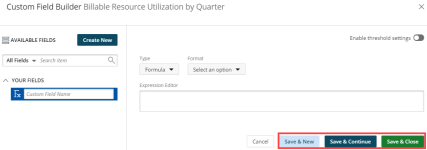
To enhance the process of creating custom fields in the Report Builder, new functionality has been created on the Custom Field tab, such as:
- Save & New - Selecting this option saves the Custom Field and allows you to create a new one. This icon replaces the Save button in the previous version.
- Save & Continue - Selecting this option saves the Custom Field and allows you to continue working on it. This is useful when working on a large formula or function.
- Save & Close - Selecting this option saves the Custom Field and then closes the Custom Field Builder. The user is then redirected to the Report Editor screen where the newly created Custom Field(s) can be used in a report.
For more information on:
The Custom Field Builder click here.
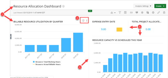
To improve the user experience, the dashboard view widgets have been updated as follows:
- The blue header has been removed from all widget containers in the dashboard.
- The Details and See More icons are only visible when users hover over the widget.
- The widget containers borders have changed.
For more information on:
Creating a New Dashboard click here.
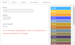
To allow you to create vibrant and meaningful graphs and charts, new colors have been added to the Upland color palette for graphs and charts.
To add your own color combination for graphs and charts, click the Analytics Settings icon and select Color Pallets.
For more information on:
The Upland Color Pallet click here.
Technical Task
Design Enhancements
This release introduces a host of styling improvements made to Upland Analytics to comply with the new UplandOne standards.
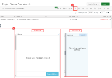
- You can now access to the Filter drawer by clicking the Filter icon on the Action Menu Bar and the icon's appearance now changes color to indicate the filter status. This enhancement makes it easier to use and identify when a filter has been applied.
-
Furthermore, the look and feel of the Filter drawer has been improved.
There are three filter statuses:

|
There are no On-Page Filters configured. |

|
One or more On-Page Filters have been configured. |

|
The filter drawer is open. |
The look and feel of the Upland Analytics dashboard has been updated as follows:
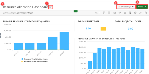
- The dashboard name now displays on a white background.
- The Information and Favorite icons now display next to the dashboard title.
- The Create icon has been moved from the secondary navigation to the page header.
- The Analytics Settings has been added to allow users to configure the module. Easily click the icon to select a setting from the available menu options.
The Action Menu Bar has been updated as follows:
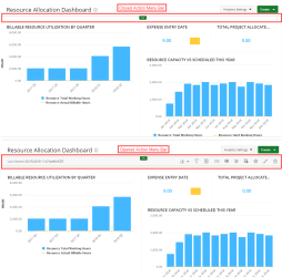
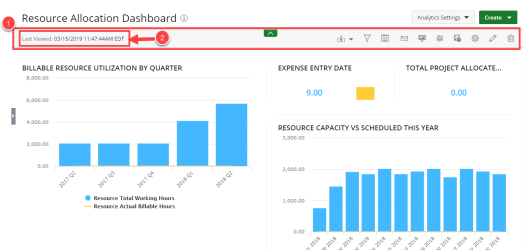
- All icons have been moved to the right hand side on the Action Menu Bar and the icons now display in the following order; the action items pertaining to the viewer display first followed by the items pertaining to the builder.
- A date and time stamp of the last time the dashboard was viewed displays on the left hand side on the Action Menu Bar.
The Edit View for dashboards has been updated as follows:
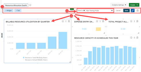
- The Action Menu Bar has been redesigned.
- The container headers no longer display in blue. This design allows your eye to find information at a glance.
- The addition of the new Save In option allows you to select the folder where the dashboard or report will be saved. Simply click the Add icon to create a new folder where your dashboard or report will be saved.
Customer Requests
Additional enhancements have been made on the subscription functionality that allows the user to receive the report directly in the body of the email for easy access on the go.
For more information on:
Subscriptions click here.
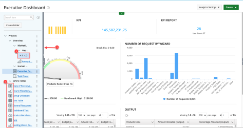
The contextual navigation is now completely collapsed by default, thus allowing for optimal usage of the available space.
Improvements were made in the Analytics Navigation menu such as:
- When expanded, the default size of the contextual menu is 20% of the content area. It can be expanded further to 50% of the content area by dragging the handles.
- Icons were added to represent each report type to easily distinguish between each report type or dashboard.
- A visual icon and count are added to the menu item(s) that are not visible within the context menu showing the number of folders or items that are not visible. Upon clicking the icon the menu will expand to the full extended size, showing the items.
