Graphs and Charts
Graphs and charts in UA are easy to create and understand. There are several graph and chart types available for selection when creating a report.

|
Report |

|
Pivot |

|
Bar |

|
Stacked-Bar |

|
Line |

|
Pie |

|
Radial Gauge |

|
Scatter |

|
Bubble |

|
Heatmap |

|
Radar |

|
Area |

|
Waterfall |

|
Sunburst |

|
KPI |

|
Gantt |

|
Control |

|
Box Plot |

|
Pareto |
Report
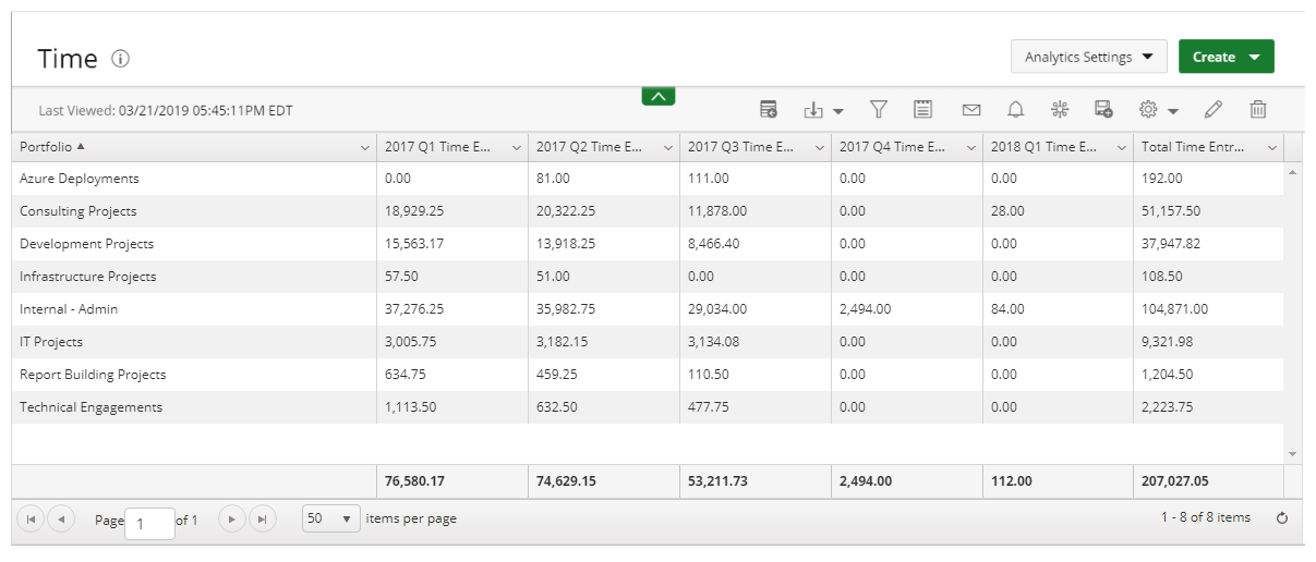
Reports are most commonly used to summarize your data fields within a summary or pivot format.
The following Dimensions are available for a Summary Format:
- Columns
- Filters
For more information on how to create a report, click here.
Pivot
A Pivot table is an interactive way to quickly summarize large amounts of data.
Use Pivot tables to summarize, sort, reorganize, group, count, total or average data stored in UA. You can transform columns into rows and rows into columns and group by any data field.
The following dimensions are available for a display format:
- Columns
- Filters
- Rows
- Measures
For more information on how to create a Pivot table, click here.
Bar
Bar graphs present your data in either horizontal or vertical bars to show comparisons of your data fields.
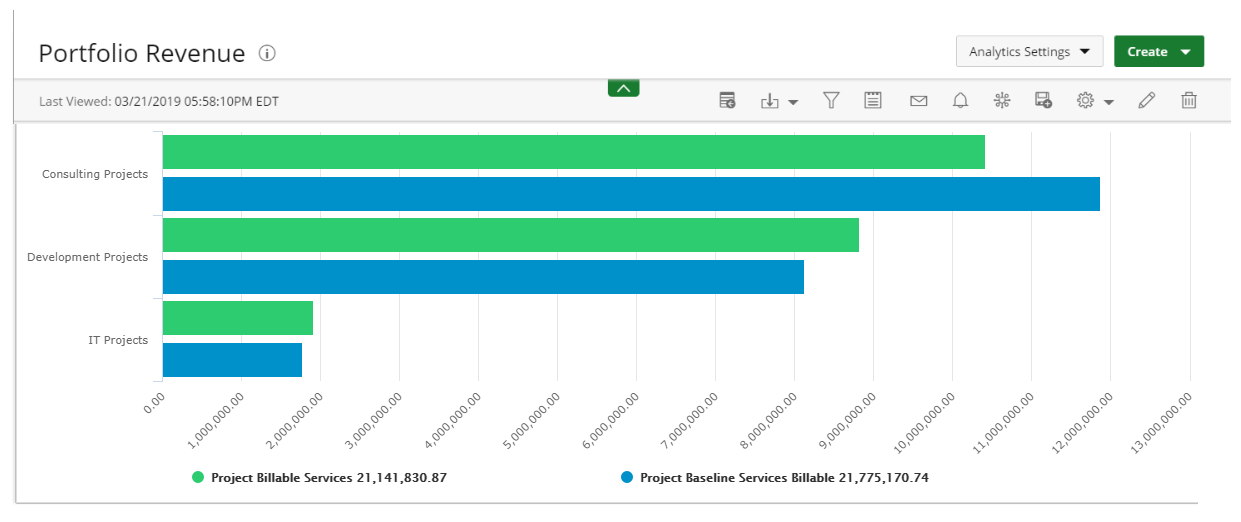
Use Bar graphs to compare things between different groups or to track changes over time. Note that when trying to measure change over time, bar graphs are best when the changes are larger.
The following dimensions are available for this display format:
- Data Points
- Data
- Filters
For more information on how to create a Bar graph, click here.
Stacked-Bar
Stacked-Bar charts allow you to compare your data fields to the whole and are divided into categories.
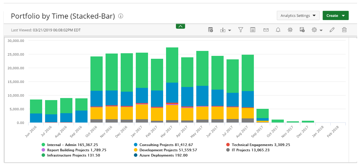
Use Stacked-Bar charts to show how a larger category is divided into smaller categories and what the relationship of each part has on the total amount.
The following dimensions are available for this display format:
- Data Points
- Data
- Stack Data By
- Filters
For more information on how to create a Stacked-Bar chart click here.
Line
Line graphs display your data within a series as points connected by straight line segments on two axes and helps determine the relationship between two sets of values.
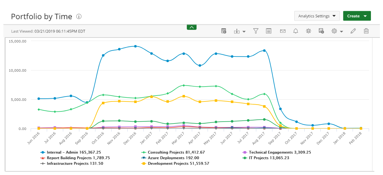
Use Line graphs to track changes over short and long periods of time. When smaller changes exist, line graphs are better to use than bar graphs. Line graphs can also be used to compare changes over the same period of time for more than one group.
The following dimensions are available for this display format:
- Data Points Data
- Data
- Group By
- Filter
For more information on how to create a Line graph click here.
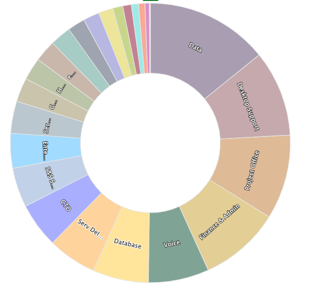
Pie
Pie charts display your data in percentages of several data fields divided in several portions to show related information.
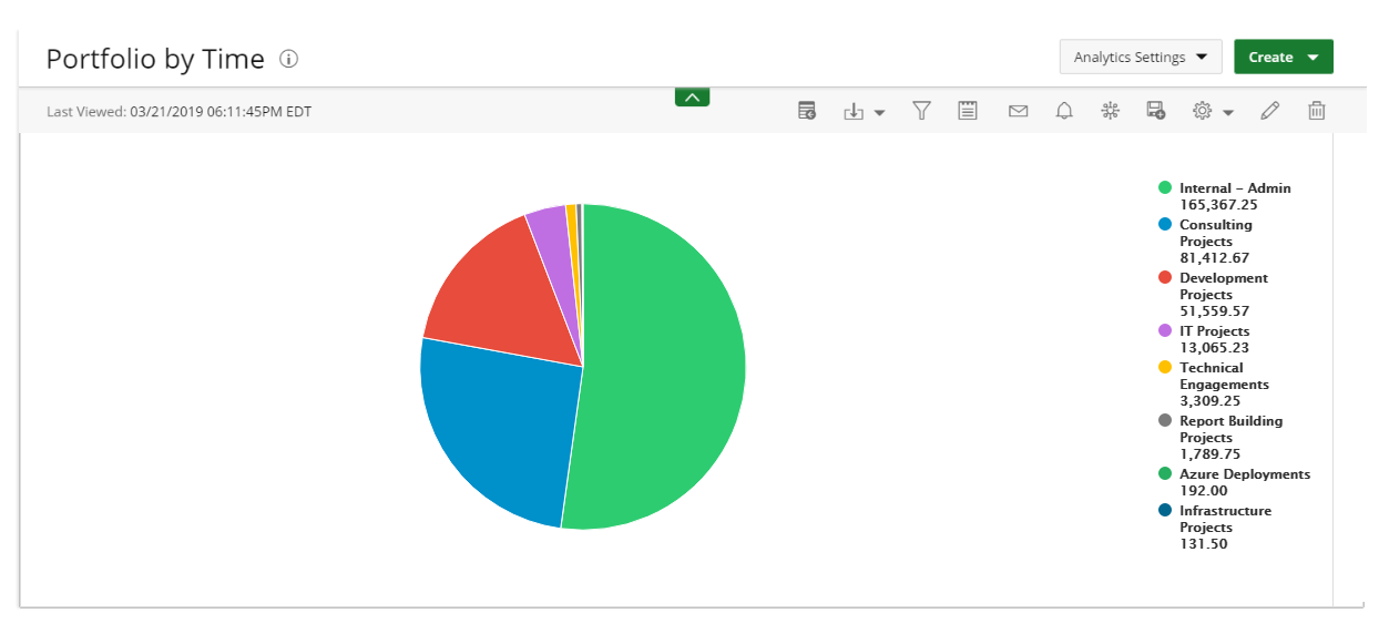
Use Pie charts when you are trying to compare parts of a whole. They do not show changes over time.
The following dimensions are available for this display format:
- Data Points
- Data
- Filters
For more information on how to create a Pie chart click here.
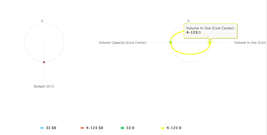
Radial Gauge
Radial Gauge charts are presented in a semi-circular scale with a needle indicator that display the maximum value of your data or key performance indicators (KPIs).
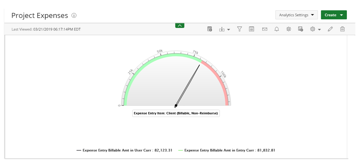
Use Radial gauge charts in single-unit data to indicate progress/activity. Values are indicated on a circular numeric scale in terms of percentage. The value of these charts must be in percentage (between 0 and 100).
The following dimensions are available for this display format:
- Data Points
- Data (Pointer)
- Data (Range)
- Filters
For more information on how to create a Radial Gauge chart click here.
Scatter
Scatter graphs display two data fields as a collection of points each having one coordinate on the horizontal axis and one on the vertical axis.
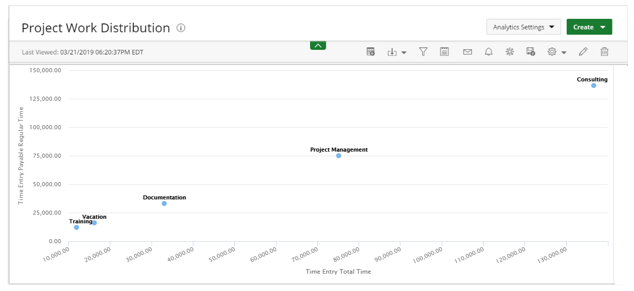
Use Scatter graphs to observe relationships between variables.
The following dimensions are available for this display format:
- Data Points
- Data (X-axis)
- Group By (Y-axis)
- Filters
For more information on how to create a Scatter graph click here.
Bubble
Bubble charts display the relationship between three data fields.
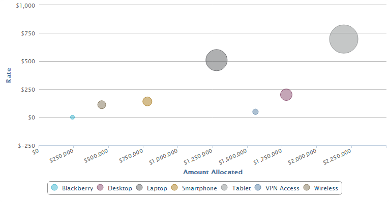
Use Bubble charts to present financial data. You can use a Bubble chart instead of a Scatter chart if your data has three data series that each contain a set of values. The sizes of the bubbles are determined by the values in the third data series.
The following dimensions are available for this display format:
- Data Points
- Data (X, Y, Size)
- Filters
For more information on how to create a Bubble chart click here.
Heatmap
Heatmaps are an interactive display that is used to view the total cost consumption in different sizes and colors.
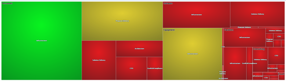
Use Heatmaps to show relationships between two variables, one plotted on each axis. By viewing how cell colors change across each axis, you can see if there are any patterns in value for one or both variables.
The following dimensions are available for this display format:
- Data Points
- Data (size of rectangle)
- Group By (color of rectangle)
- Filters
For more information on how to create a Heatmap click here.
Radar
Radar charts display a series as a circular line or area.
Use Radar charts to compare two or more items or groups on various features or characteristics.
The following dimensions are available for this display format:
- Data Points
- Data
- Filters
For more information on how to create a Radar chart click here.
Area
Area charts are basically a line chart, but the space between the x-axis and the line is filled with a color or pattern. They can be used to track changes over time for one or more groups.
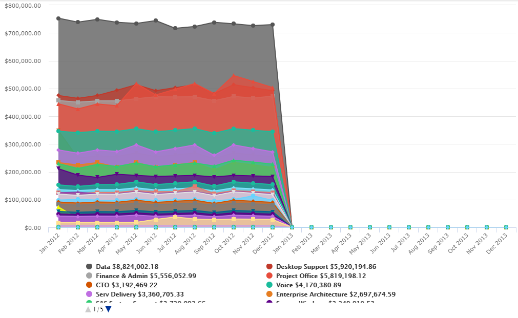
Use Area graphs when you are tracking the changes in two or more related groups that make up one whole category.
The following dimensions are available for this display format:
- Data Points
- Data
- Group By
- Filters
For more information on how to create a Area chart click here.
Waterfall
Waterfall charts are a type of bar graph, similar to a Stacked-Bar chart except that bars don't overlap and the origin of each bar starts where the previous bar ended, allowing negative values to be readily depicted.
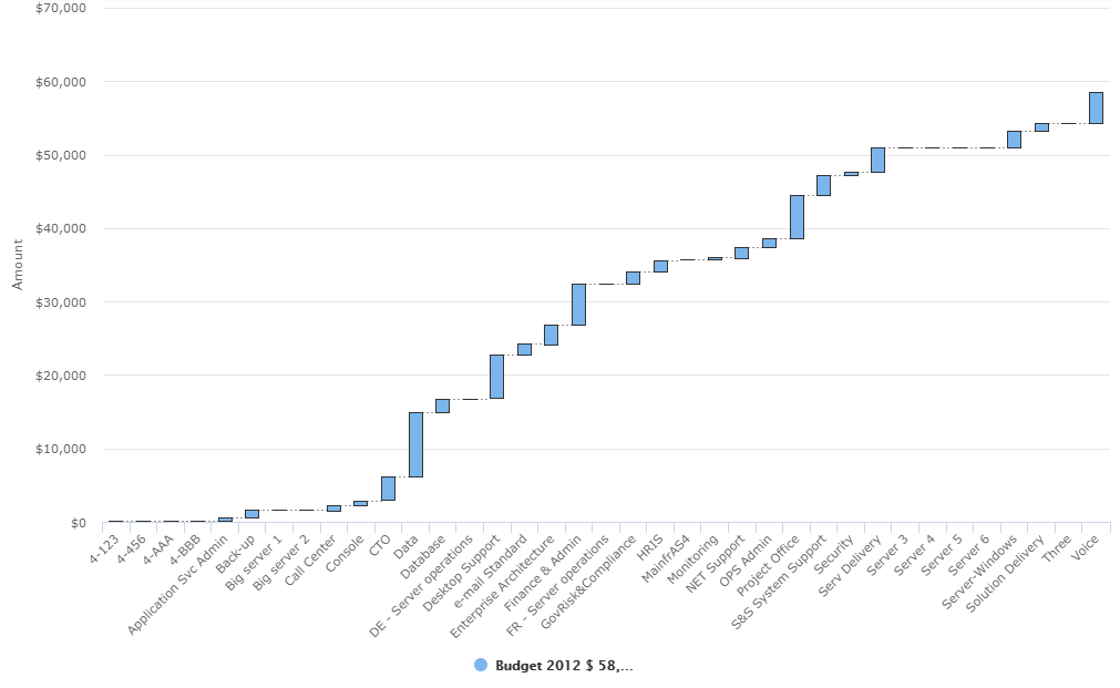
Use Waterfall charts to show changes in revenue or profit between two time periods.
The following dimensions are available for this display format:
- Data Points
- Data
- Filters
For more information on how to create a Waterfall chart click here.
Sunburst
Sunburst charts are used to visualize hierarchical data. Hierarchical data is a way to organize data with multiple one-to-many relationships. Each level of the hierarchy is represented by one ring or circle with the innermost circle as the top of the hierarchy.
The following dimensions are available for this display format:
- Data Points
- Data
- Filters
For more information on how to create a Sunburst chart click here.
KPI
Key Performance Indicators (KPI) are measurable values that demonstrate how effectively a company is achieving key business objectives.
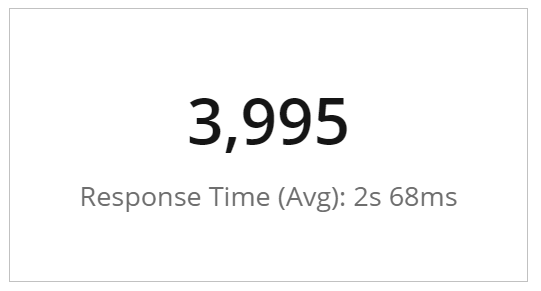
Use KPIs to evaluate your success at reaching targets. Each department will use different KPI types to measure success based on specific business goals and targets.
The following dimensions are available for this display format:
- Measures
- Filters
For more information on how to create a KPI click here.
Gantt
Gantt charts are a type of bar chart that illustrates a project schedule. This chart lists the tasks to be performed on the vertical axis, and time intervals on the horizontal axis.
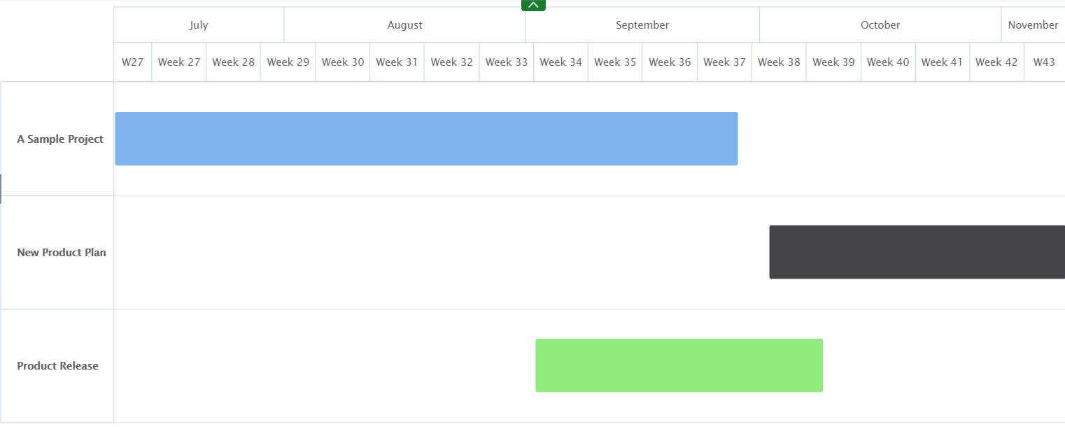
Use Gantt charts to plan projects of all sizes and they are a useful way of showing what work is scheduled to be done on a specific day. They also help you view the start and end dates of a project in one simple view.
The following dimensions are available for this display format:
- Data Points
- Filters
For more information on how to create a Gantt chart, click here.
Control
Control charts are used to filter out the probable noise (inherent variation or common cause) from the potential signals (nonrandom variation or special cause). From this, you know when and where to take action on a process.
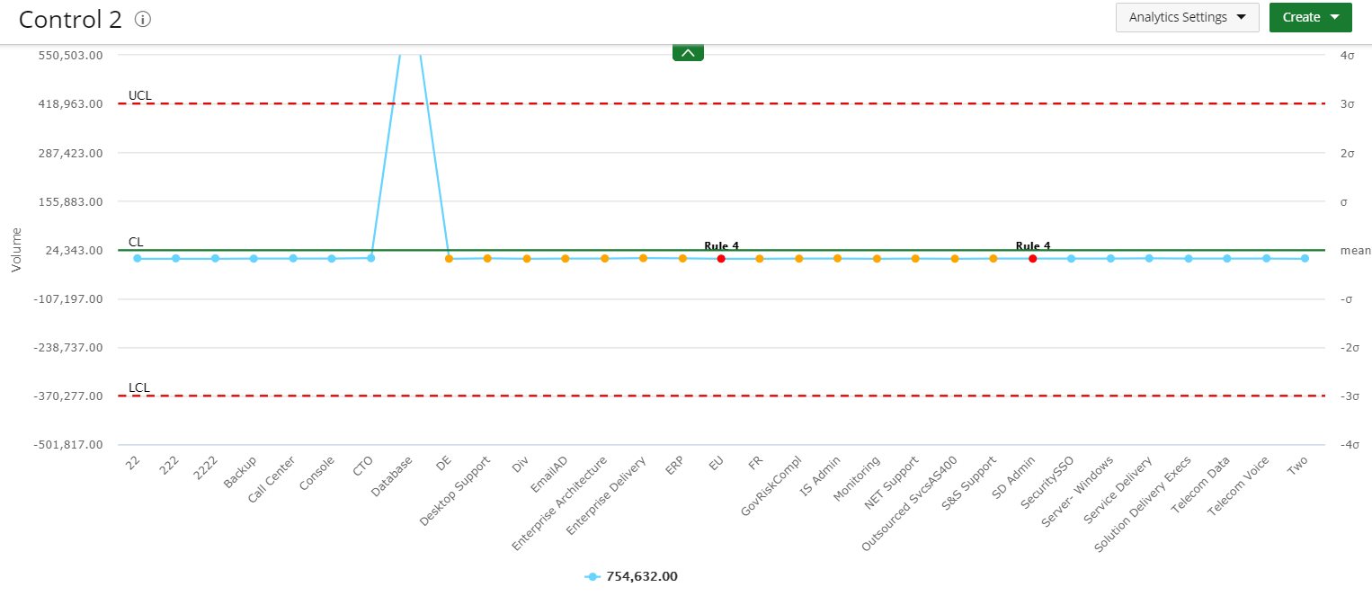
Use Control charts to monitor any sort of process you have in place so you can learn how to improve your poor performance and continue with your successes.
The following dimensions are available for this display format:
- Data Points
- Data (X-Axis Group and Y-Axis Data Set)
- Filters
For more information on how to create a Control chart click here.
Box Plot
Box Plot charts present information from a five-number summary. It does not show a distribution, but is especially useful for indicating whether a distribution is skewed and whether there are potential unusual observations (outliers) in the data set. Box plots are also very useful when large numbers of observations are involved and when two or more data sets are being compared.
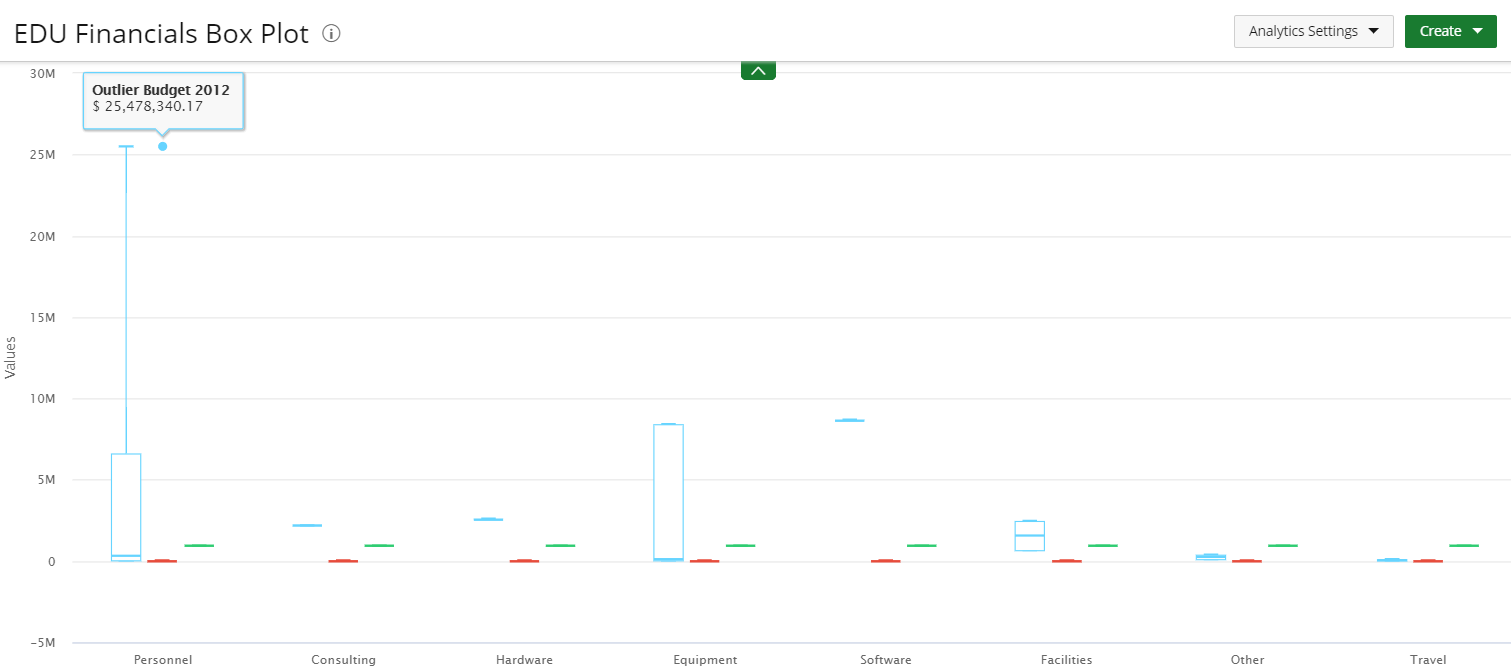
Use Box plots for comparing distributions since the center, spread, and overall range are immediately apparent.
The following dimensions are available for this display format:
- Measures
- Fields
- Filters
For more information on how to create a Box Plot chart click here.
Pareto
Pareto charts contain both bars and a line graph, where individual values are represented in descending order by bars, and the cumulative total is represented by the line.
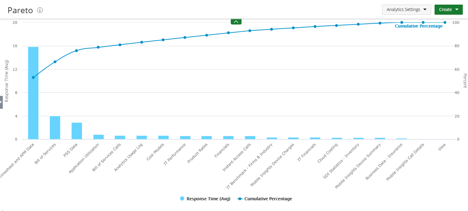
Use Pareto charts when:
- Analyzing data about the frequency of problems or causes in a process.
- There are many problems or causes and you want to focus on the most significant.
- Analyzing broad causes by looking at their specific components.
- Communicating with others about your data.
The following dimensions are available for this display format:
- X-Axis and Y-Axis Data Sets
- Filters
For more information on how to create a Pareto chart click here.