Create a bar graph
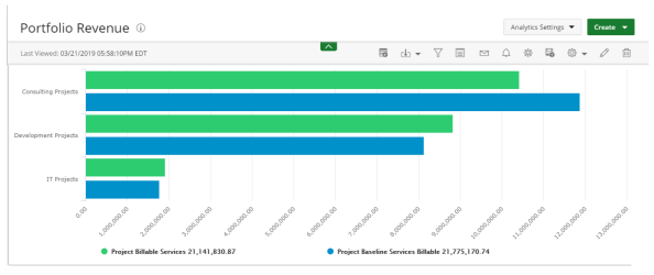
Bar graphs present your data in either horizontal or vertical bars to show comparisons of your data fields.
Use bar graphs to compare things between different groups or to track changes over time. Note that when trying to measure change over time, bar graphs are best when the changes are larger.
The following data must be selected:
- X-Axis Data: Two non-numeric fields.
- The first field (Series 1) to define the main category on the x-axis (horizontally).
- The second field (Series 2) is optional to define an additional category on the x-axis.
Note: Use the second field when you are trying to show that one data series moves in or out of sync with another data series. The reason that a second axis is required is that the measurement units for the two data series are different. If the measurement unit was the same, a simple line graph should be used.
- Y-Axis Data: An unlimited number of numeric fields to define the value range on the y-axis (vertically).
To create a bar graph:
- Click Create on the Main Menu bar.
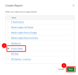
- Select Report from the menu. A list of available data sources displays.
Note: Data sources in this step are provided for example only. Your data sources will depend on the modules licensed and the permissions granted. For more information, see Data sources/views.
- Select the data source that you want to use for your report or graph/chart from the list.
- Click Next. The Report Layout page displays.
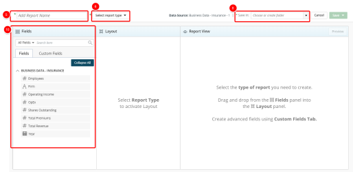
- Click Add report name box and type the name of your graph/chart.
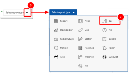
- Click the Select report type drop-down arrow.
- Click the Save in drop-down arrow and select one of the following:
- An existing folder from the list where you want to save the report or graph/chart.
- Add New Folder to create a new folder where your report or graph/chart will be saved. See Create a folder.
Note: Type values in this box to filter and find the folder where your report or graph/chart will be saved.
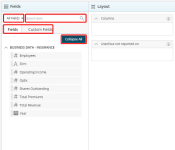
- Do the following to add fields to the graph/chart:
- Select the desired filter to apply to the list of available fields. The available options are:
- All Fields
- Dimensions
- Measures
- Date
- Start typing in the Search item box to begin searching for available fields.
- Click Expand All or Collapse All to view or hide all available options in order to easily narrow down on the desired field(s).
- Optional: Click Custom Fields to create a custom field.
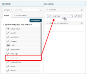
- Drag and drop the fields to add to the graph/chart from the Fields list to the Layout section.
- Click
 to add a filter. For more information, see Add a filter.
 - Optional: Click
 to add a pivot. For more information, see Add a pivot.
 - Click the Preview button to preview your graph/chart. Your graph/chart displays in View Mode.
- Click Save to open the Save context menu
- Select one of the available options:
- Save: Selecting this option will save the graph/chart without exiting the graph/chart edit page.
- Save as copy: Selecting this option will save a copy of the graph/chart. You will need to rename the graph/chart in the Navigation Menu.
- Save & Close: Selecting this option will save the graph/chart and close the graph/chart edit page. The graph/chart will then run.
- Save & send by email: Selecting this option will save the graph/chart and close the graph/chart edit page. A modal window will then give you the options to send the graph/chart. For more information, see Email a graph/chart.
- Save & Create new: Selecting this option will save the graph/chart and close the graph/chart edit page giving you the option to create a new graph/chart.
For more information on how to create and use Custom Fields, see Create and use custom fields.
Note: If you create a custom field, you must use it in your report. Otherwise, you will not be able to save the report.
Note: The elements in the Layout section change depending on the requirements of the report type you are creating.
Note: You must create at least one filter.
Note: You can preview your graph/chart at any time by clicking on the Preview button. No Data Available displays when there is no data retrieved/found.
Note: The following message displays when a report or graph/chart takes a long time to render:

Click email to send the report or graph/chart in an email or cancel to stop the loading process.
You can customize a new or existing bar graph using the available setting options.
- Open the Main Menu bar and click
 .
. - Click one of the following:
- Settings - available only to the Administrator or the graph creator.
- My Settings - available to users with access rights to review the graph.
