Add a New Dashboard Layout
A Dashboard is a powerful method for looking at information associated with a group of work objects such as Projects, Ideas or Organizations. A Dashboard can be viewed from your Home page or from the "Dashboard" page. Dashboard information can be filtered by selecting a specific Portfolio and a specific Dashboard Layout.
A Dashboard Layout maps out how this information will appear on the Dashboard itself. While creating Dashboard Layouts, administrators will determine the type of data that will appear for each listed work item in the Dashboard when a user selects the layout.
To create a Dashboard Layout:
Before You Start: Only PowerSteering administrators or users with the "Dashboard Layout Administration" Context permission can create new Dashboard Layouts.
-
Select Admin
 → Layouts → Dashboard from the Navigation Menu:
Click thumbnail to play.
-
Select the Add New button:

-
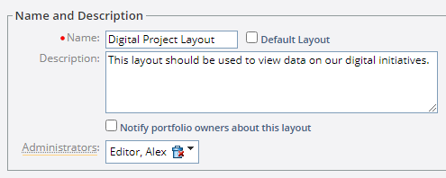
Enter the "Name and Description" details for your new layout:
-
Name (required): Enter a unique and informative name for your layout.
-
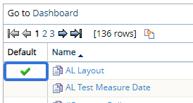
Default Layout: Select this checkbox if you would like this layout to be the default Dashboard Layout. This layout will be the initial layout that users see when they first visit the Dashboard.
Note: The Default Layout will contain a checkmark in the "Default" column on the Dashboard Layouts page:
-
Description: Briefly describe the objective of your new layout.
Note: This description will not be visible to Dashboard viewers. You should enter information that might be useful to other administrators who can access the layout through the Dashboard Layouts page.
-
Notify portfolio owners about this layout: Selecting this checkbox will send a notification to all Portfolio owners informing them that the new Dashboard Layout has been created.
-
Administrators: Select this field to search for and add PowerSteering users who will be considered administrators for the new Dashboard Layout. These users will be able to edit and delete the layout themselves.
Note: Users must have the "Dashboard Layout Administration" Context permission to be added as an administrator for the layout.
-
-
Select the Continue... button:

-
Enter the "Special Columns" details for your new layout:
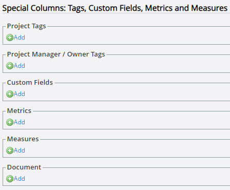
Note: You will be able to add regular Dashboard columns later on in the process.
-
Project Tags: Select Add under "Project Tags" to add a column for a Tag associated with work items. If the listed work item on the Dashboard has a value for the Tag, it will be displayed in this column.
After selecting Add, use the "Add Tag Column" window to select a Tag from the "Tag" drop-down menu. Also, use the "Column Name" drop-down menu to determine the name that will appear in the column header:
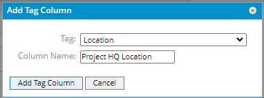
Note: Only Tags that have been attached to work types will be available from this list.
Once the Add Tag Column button is pressed, the column will be saved to the layout. It can be edited or deleted at any time:

Select the Add button to add another Project Tag.
-
Project Manager / Owner Tags: Select Add under "Project Manager / Owner Tags" to add a column for a Tag about the owner of each work item on the Dashboard. If the owner of the listed work item on the Dashboard has a value for the Tag, it will be displayed in this column.
After selecting Add, use the "Add Tag Column" window to select a Tag from the "Tag" drop-down menu. Also, use the "Column Name" drop-down menu to determine the name that will appear in the column header:
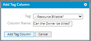
Note: Only Tags that have been attached to "Users" will be available from this list.
Once the Add Tag Column button is pressed, the column will be saved to the layout. It can be edited or deleted at any time:

Select the Add button to add another Project Manager / Owner Tag.
-
Custom Fields: Select Add under "Custom Fields" to add a column for a Custom Field associated with work items. If the listed work item on the Dashboard has a value for the Custom Field, it will be displayed in this column.
After selecting Add, use the "Add Custom Field Column" window to select a Custom Field from the "Custom Field" drop-down menu. Also, use the "Column Name" drop-down menu to determine the name that will appear in the column header. If the chosen Custom Field is a "Textfield" type, use the "Display Length" field to determine how many characters of the value will be displayed in the Dashboard column (users will be able to view the entire value on the Dashboard by placing their cursor over it):
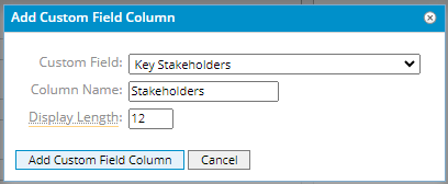
Note: Only Custom Fields that have been attached to people will be available from this list.
Once the Add Custom Field Column button is pressed, the column will be saved to the layout. It can be edited or deleted at any time:

Select the Add button to add another Custom Field.
-
Metrics: Select Add under "Metrics" to display a specific Metric value for each work item on the Dashboard.
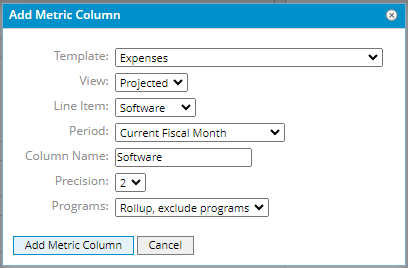
After selecting Add, use the "Add Metric Column" window to determine which Metric value will be displayed for each work item:
-
Template: Select the Metric Template that contains the value you would like to display.
-
View: Select the Metric View that contains the value you would like to display.
-
Line Item: Select the line item (row) that contains the value you would like to display.
-
Period: Select the time period of the Metric value you would like to display. If the selected period covers more than one period on the actual Metric (i.e. selecting "Year to Date" for a Metric with monthly periods), multiple Metric values will be added up to make up the displayed value.
-
Column Name: Determine the name that will appear in the column header on the Dashboard.
-
Precision: Determine the maximum number of decimal points that will be displayed for the value.
-
Programs: For layouts that are going to be used for the Program Console, define whether Metrics will be rolled up and whether or not Programs are included.
- Rollup, exclude programs: The Metric will be rolled up but Programs will be excluded.
- Rollup, include programs: The Metric will be rolled up and Programs will be included.
Once the Add Metric Column button is pressed, the column will be saved to the layout. It can be edited or deleted at any time:

Select the Add button to add another Metric column.
-
-
Measures: Select Add under "Measures" to display a specific Measure value for each work item on the Dashboard.
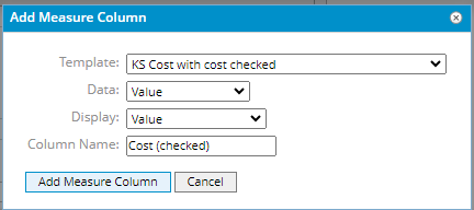
After selecting Add, use the "Add Measure Column" window to determine which Measure value will be displayed for each work item:
-
Template: Select the Measure Template that contains the value you would like to display.
-
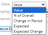
Data: Select the type of data that will be displayed in the column.
-
Value: The current Measure value.
-
% of Overall: The progress toward the goal value, expressed as a percentage.
-
Change in Period: The progress toward the goal value since the last value was recorded.
-
Expected: The expected value.
-
Expected Change: The value that is expected for the period assuming linear progress.
-
-
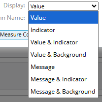
Display: Determine how the Measure data will be displayed on the Dashboard.
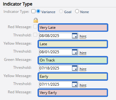
Note: Indicators, backgrounds, and messages all depend on the thresholds set while creating or editing Measure Templates.
-
Value: Only the Measure value will be displayed on the Dashboard.

-
Indicator: Only the Measure indicator icon that corresponds to the current value's threshold will be displayed on the Dashboard.

-
Value & Indicator: Both the Measure value and the indicator icon will be displayed on the Dashboard.

-
Value & Background: The Measure value will be displayed with a background color that corresponds to the current value's threshold.

-
Message: Only the threshold indicator message that corresponds with the Measure's current value will be displayed.

-
Message & Indicator: The threshold indicator message and icon that correspond with the Measure's current value will be displayed.

-
Message & Background: The threshold indicator message and background color that correspond with the current value's threshold will be displayed.

-
-
Column Name: Determine the name that will appear in the column header on the Dashboard.
Once the Add Measure Column button is pressed, the column will be saved to the layout. It can be edited or deleted at any time:

Select the Add button to add another Measure column.
-
-
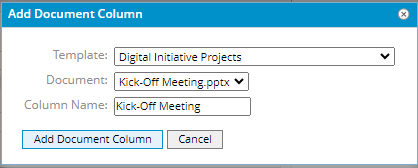
Document: Select Add under "Document" to display a link to the version of a document template that has been attached to the listed work items.
Note: The document template will need to be attached to the selected work template to be selected.
After selecting Add, use the "Add Document Column" window to determine which document will be displayed for each listed work item:
-
Template: Select a work template from the drop-down menu.
-
Document: Select a document that has been added to the work template. If the work template does not have any documents associated with it, the drop-down menu will simply state "no document".
Note: If the work template only contains a placeholder for the selected document, existing work created from that template will not display anything for the document in the Dashboard.
-
Column Name: Enter a name that will be displayed in the column header on the Dashboard.
Once the Add Document Column button is pressed, the column will be saved to the layout. It can be edited or deleted at any time:

Select the Add button to add another Document column.
-
-
-
Select the Continue... button:

-
Use the "Column Selection and Ordering" section to determine which columns (including any "Special Columns" from Step 5) should appear on the Dashboard and how they should be ordered:
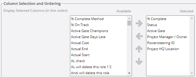
Note: Any "Special Columns" from Step 5 will automatically be added to the "Selected" box.
Tip: See Dashboard Column Options for more information on columns that can bee added to Dashboard Layouts.
The columns in the "Selected" box will appear on the Dashboard. The top-to-bottom order of columns in the "Selected" box will be reflected from left-to-right on the Dashboard:
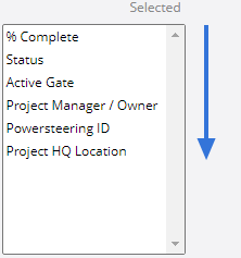

Select a column from the "Available" box and then select the right arrow
 to add it to the "Selected" box:
Click thumbnail to play.
Tip: Hold the "Ctrl" key on your keyboard while selecting columns to select multiple columns at once:

Click thumbnail to play.Select a column from the "Selected" box and remove it from the Dashboard Layout by selecting the left arrow
 :
:Click thumbnail to play.
Tip: Hold the "Ctrl" key on your keyboard while selecting columns to select multiple columns at once.
Finally, select any column in the "Selected" box and use the up arrow
 or the down arrow
  to change the order:
Click thumbnail to play.
-
Select the Continue... button:

-
Use the "Charts" section to add any Charts to the Dashboard Layout.
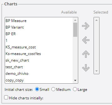
The Charts in the "Selected" box will appear on the Dashboard. The top-to-bottom order of Charts in the "Selected" box will be reflected from left-to-right on the Dashboard:
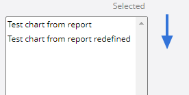

Select a Chart from the "Available" box and then select the right arrow
 to add it to the "Selected" box:
Click thumbnail to play.
Tip: Hold the "Ctrl" key on your keyboard while selecting Charts to select multiple Charts at once:

Click thumbnail to play.Select a Chart from the "Selected" box and remove it from the Dashboard Layout by selecting the left arrow
 :
:Click thumbnail to play.
Tip: Hold the "Ctrl" key on your keyboard while selecting Charts to select multiple Charts at once.
Finally, select any Chart in the "Selected" box and use the up arrow
 or the down arrow
  to change the order:
Click thumbnail to play.
Configure how your Charts will appear on the Dashboard:

-
Initial chart size: Determine how big the Chart(s) will appear on the Dashboard.
-
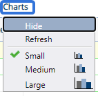
Hide charts initially: Select the checkbox if you would like the Chart(s) to be hidden when users first view the Dashboard.
Note: Dashboard viewers can always edit how they see the Chart(s) by opening the Charts menu:
-
-
Define thresholds for any non-Metric columns that can be quantified:

Note: The threshold settings will create visual cues for users (red=warning, yellow=caution). See Dashboard Column Options for an information about non-Metric Dashboard column thresholds.
-
Define thresholds for any Metric columns:

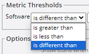
Metric thresholds on Dashboards are used to compare the value under the column to the same value on a different Metric view. Use the first drop-down menu to determine how the value will be compared:
-
is greater than: The colors will appear if the column value is greater than its counterpart on a different Metric view by one of the defined thresholds.
-
is less than: The colors will appear if the column value is less than its counterpart on a different Metric view by one of the defined thresholds.
-
is different than: The colors will appear if the column value is different (either greater or less) than its counterpart on a different Metric view by one of the defined thresholds.
Use the second drop-down menu to determine which Metric view the column's value will be compared to:

Enter the threshold amounts that will cause the cell to change color to both yellow and red:

Note: If the difference is the same as the threshold value, the cell will not change color. For example, if the first drop-down menu is set to "Is greater than" and the yellow box contains a threshold value of "50", the cell color will not change color if the value is greater than the counterpart by exactly 50. If it is greater by 51, the cell will change color.
Finally, select the "Percentages" checkbox if you would like the thresholds to be represented by percentage instead of difference from the value:

In this example, the cell will turn yellow if the value is different than the value it is compared to by 50%. If the checkbox is not selected, the cell will turn yellow if the value is different than the value compared to it by 50.
Example: Julie has added a Metric column (Step 5) to her Dashboard Layout named "Projected Software" that will capture the projected software cost for the month of March:

While configuring the threshold for the Metric column, she decides to select the "is different than" comparison and the "Actual" view (another Metric view from the "Expenses" Metric Template selected above). She enters a value of "50" into the yellow box and a value of "100" into the red box. She does not select the "Percentages" checkbox:
On the "Digital Infrastructure Five Phase Plan" project, the "Expenses" Metric has a value of "30" for the month of March on the "Software" line item of the "Projected" view: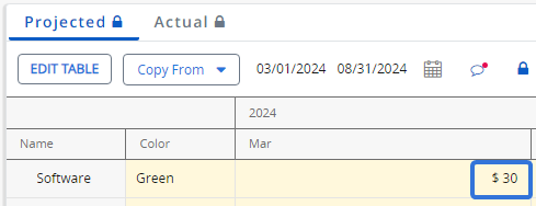
On the "Actual" view, the "Software" value for the month of March is "80":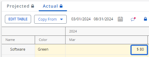
Because the difference is exactly 50, there is no threshold color on the Dashboard value:
Julie changes the "Actual" value to "81", which creates a difference of 51: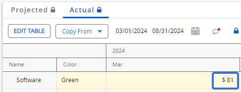
Because the difference is greater than 50, the Dashboard cell turns yellow:
She then changes the "Actual" value to "131", which creates a difference of 101: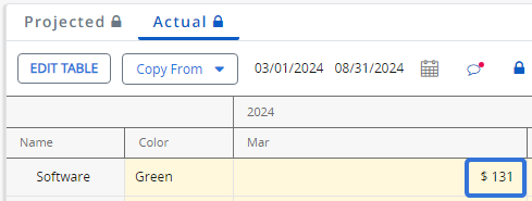
Because the difference is greater than 100, the Dashboard cell turns red:
-
-
Configure the "Options" for the Dashboard Layout:
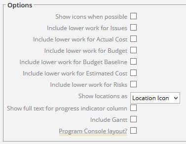
Note: Options available in this section will vary based on the columns selected.
-
Show icons when possible: If selected, icons will display on the Dashboard instead of text whenever an icon is available.
-
Include lower work for Issues: If the "Issue" column is part of the layout, select this checkbox to include open Issues from all Descendant work in the number of Issues.
-
Include lower work for Actual Cost: If the "Actual Cost" column is part of the layout, select this checkbox to include actual costs from all Descendant work in the total.
-
Include lower work for Budget: If the "Budget" column is part of the layout, select this checkbox to include the Budgets from all Descendant work in the total.
-
Include lower work for Budget Baseline: If the "Budget Baselines" column is part of the layout, select this checkbox to include the Baseline Budgets from all Descendant work in the total.
-
Included lower work for Estimated Cost: If the "Estimated Cost" column is part of the layout, select this checkbox to include Estimated Costs from all Descendant work in the total.
-
Include lower work for Risks: If the "Risks" column is part of the layout, select this checkbox to include Risks from all Descendant work in the number of Risks.
-
Show location as: Defines how the location is displayed in the Location column.
- Location Icon: Displays an icon that shows the location of the work in the Work Tree when clicked on.
- Best Parent: Displays only the name of the work's parent.
-
Show full text for progress indicator column: If selected, the "Progress Indicator" column will use text rather than icons to display progress.
-
Include Gantt: If selected, the Gantt chart will be displayed on the Dashboard.
-
Program Console layout?: If selected, the layout will be available in the Program Console.
-
-
Select the Continue... button:

-
Configure how the listed work items will be sorted in the Dashboard:

Note: Layout creators can set Primary, Secondary, and Tertiary sorting options. The Primary column values will be used to sort the items. If any listed items share the same value for the Primary column, the value in the Secondary column will be used to determine how they are sorted.
In the example above, the "Name" column will be used to sort the items in ascending order. This means that work items will be sorted alphabetically by their name. If any of the listed work items share the same name, those items will be sorted based on their current Status. If their current Statuses are the same, they will be sorted based on their current active gate. -
Determine if you would like to group the items by a particular column as well:

Note: Depending on the column you select, you may have to enter additional information. For example, if you want to group the Dashboard by a numerical column such as % Complete, you will have to enter an interval:

-
Add any summaries to Dashboard Layout columns:

Note: Summaries will appear directly below Dashboard columns:
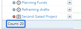
- Sum: The total of all column values added together.
- Average: The sum of all column values divided by the number of values.
- Minimum: The lowest value in the column.
- Maximum: The highest value in the column.
- Count: The number of values in the column.
- Distinct Count: The number of different values in the column.
- Median: The middle value when column values are arranged in order of magnitude.
- Variance: The variance of column values.
- Standard Deviation: The standard deviation of column values.
-
Select the Continue... button:

-
Give a custom name to any non-special columns that have been selected for the Dashboard Layout:
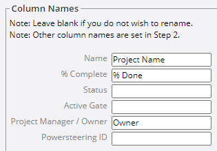
Note: Leave any columns blank that you do not wish to rename.
-
Select the Finish & Save Changes button:

After selecting Finish & Save Changes, the Dashboard Layout will be saved to PowerSteering. It will be listed on the Dashboard Layout page where it can be edited at any time.


