Create an RFP Compliance Matrix component
The RFP Compliance Matrix component is used, in conjunction with a marked RFP, to create a table that shows which RFP responses comply with the RFP's requests. In the created document's RFP workspace, users select the RFP Compliance status. The merge codes in the compliance matrix file, when created as shown below, insert the question, the compliance status, the linked page number on which the question is located, and any comments the user who selected the status added.
This subsection is only available in Word document types.
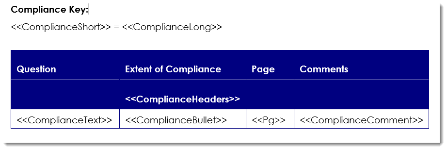
Examples of a basic compliance matrix document as uploaded to the component (left) and in a built document (right). Click to enlarge.
Tip: Download our Compliance Matrix sample Microsoft Word file to use as a starting point for creating your own compliance matrix.
Create an RFP Compliance Matrix component
- From the Toolkit, select RFP Compliance.
- In the Properties panel, enter the name of the component. This name displays in the navigation panel.
- Enter the display title. This title displays in the created document workspace.
- From the Actions menu, select Upload Document, click the ellipsis to browse to the desired compliance matrix Microsoft Word file, select the file, click Open and then click Save.
- Select one of the following options from the Include drop-down menu:
- Always: Select if you want this subsection required for completion for created documents using the document type.
- By Inclusion: Select if you want this component automatically included when an optional component is included. The Component / Selection Group tree displays listing the optional component and selection groups for this document type. Check the box for the optional component with which you want to associate this component. When the user includes the associated optional component, the by inclusion component is also included. Check the boxes for each item that you want this component included with a required for completion status.
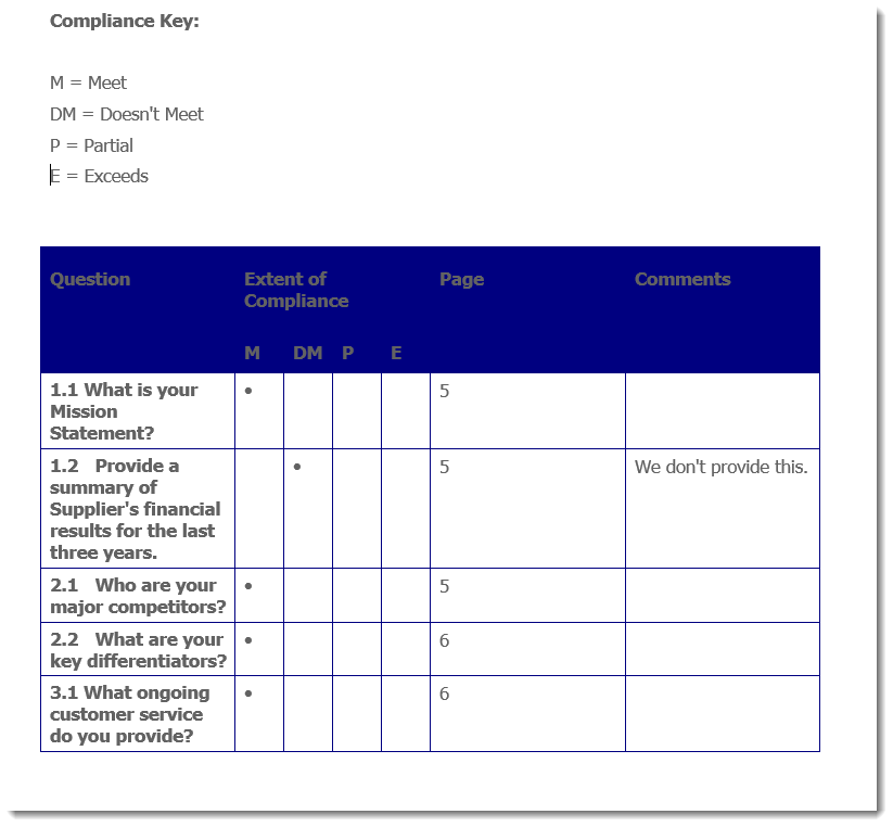
- Define the statuses for the RFP questions that will display as headers in the matrix:
- To add a status, click Add Header, enter the name and abbreviation, and then click Save.
- To rearrange the status order, select a header and click Move Up or Move Down to move the header up or down one position at a time.
- Click Save.
Additional actions
From the Actions menu, you can perform additional tasks to work with the content records that are attached to your component:
- Edit content: Select Edit to open the file. You must edit the content using the Qvidian toolbar, or your changes will not be saved.
- Cancel an edit: Select Cancel Edit to cancel the editing of a document or presentation and abort any changes made.
-
Download the file: Select Download to download the file. You will be prompted by your browser to save the file.
- View properties: Select Properties to view or edit the title of the attached file.
- Preview attached file as an image: Click the file title next to the Actions menu. The Preview Image dialog displays in full page view.
- Remove an attached file: Select Delete from the Actions menu, select Remove link(s) to content, and then click Yes.
Add help text for users
You can create help text to display at the top of the component to help users complete the fields. In designing the help text, you can work in design mode or HTML text. You can also preview the help text. When the help text first displays, the region is in Design mode. Most users will use this mode to create the help text and use the available standard formatting functions.

- To remove any formatting that you added or that was applied to text pasted from the clipboard, select the text and click the Eraser
 icon to revert to the default Font and Size (Verdana, 10pt).
 - If you want to edit the item in HTML, click the HTML Text
 icon. The formatting toolbar will disappear.
 - To view the help text as it will display on the page, click the Preview
 icon. The help text area will change to view only.
 - To return to design mode, click the Design Mode
 icon.
icon.
Note: Hyperlinks cannot be added to the help text field.
View component usage
The Usage panel, at the bottom of the component, displays how this component is being used in all document types and sections. The associated document types and components are listed as links so that they can be opened from the Navigation panel.
Common functions
The following common functions are listed at the top of the component workspace:
- Test Build: Click to display the created document page where you can see the document type from the user's perspective and run a test build to verify it appears as you intended. For more information, see Test Build.
- Reset Test Build: Click to delete any existing test build associated with the document type so you can start again with a fresh test document. For more information, see Test build a document type.
- Export: Click to export the document type. For more information, see Export a document type.
- Content Tray: Click to display the Content Tray dialog. The content tray is a holding area for content records that you can drag from the tray and drop in the content area for select components. For more information, see Content tray.