Selection Driven Content component (created documents)
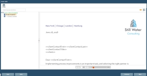
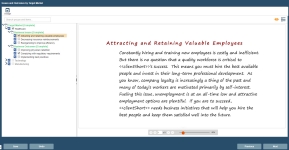
For this component, you can select a predefined number of grouped selection items. The content for the selected item(s) will display in the built document. For example, if a Selection Driven Content component is named "Cover Letters" and architected with five selection items each with cover letter content, on the Cover Letter page, users can select one of these cover letters for use in the project.
Note: When a Dynamic Slide component is architected, grouped items added to the Selection Driven Content component are merged into one or more slides. These selections will display for this component so end users can select the content to display on one or more slides in the document.
Search for Item
- To search for selection items in the tree, enter the text in the search field and press Enter. The item is highlighted in the tree with its content in preview mode.
Complete Group Items
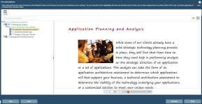
When a selection group's label is red followed by [Incomplete], then you are required to select one or more selection item (item content) for the group. When you check an item's box, it will either complete the selection for the group, turning its label green followed by [Complete]), not complete the group, and/or expand its child items.
- Select parent and child items in a group until you have completed the required selection count.
Note: If the number of available selections matches the minimum number of required selections, the available selections will automatically be chosen. To disable the AutoselectMinSelections setting, see Global settings.
When an item's content has expired, the item's font will change to red and Expired will display to the right of the item. The expiration property for the content will need to be modified.
When an item's content is in an alert state, a red alert triangle displays for the selection item (parent and/or child).
Navigate the component
- Use the Next and Previous buttons at the bottom, or click the component in the left side panel to navigate through the Required components. Once all required fields are complete and saved, a green checkmark displays next to the component.
- To abort all modifications made to this component, click Undo.
Save the component
- To save changes to the component, click Save.
Assign
You can assign users and roles as owners of this component to review, complete, reference, etc.
- Click the Assign
 icon to display the Assigned Users dialog to perform this action.
Preview Item Content and View Item Properties
- To preview an item's content, click to highlight the item and then click the Preview
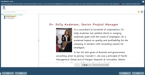
 icon. The content for the selected item displays in the right pane.
- To view an item's properties, click to highlight the item and then click the Properties
 icon. The properties display in the right pane.
Set Printing Order
On the Set Printing Order dialog, you can set the order to print the selected content items for the component.
- Select an item to re-order.
- Click the Up and Down arrows to move the item as required.
- When completed, click Save. The component dialog re-displays. When the component is built, the selected items will print in the order specified.


