Create a Scatter Graph
1. Create Report
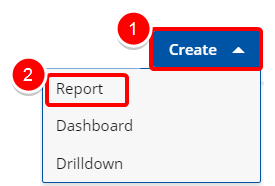
Access the Create Report modal by:
- Click the Create button on the Main Menu Bar.
- Then select Report from the menu.
2. Select your Data Source
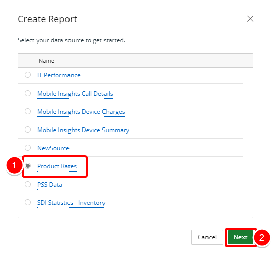
- Select your data source from the list of available data sources to get started.
- Click Next to continue.
3. Add a Report Title
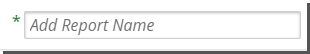
- Click on the Add report name box and type the name of your report.
4. Select a Report Type
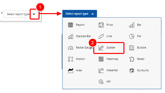
- Click the arrow button next to Select report type.
- Select Scatter from the list of available report types to get started.
5. Select a Folder
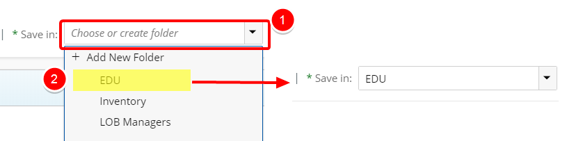
- Click the Save In arrow to view and select an available folder where your graph will be saved.
- Do one of the following to make your selection:
- Choose or create folder: Enter values in this box to filter and find the folder where your graph will be saved.
- Click the arrow and select Add New Folder to create a new folder where your graph will be saved. See Create a Folder below.
6. Filter or Search for Data Fields
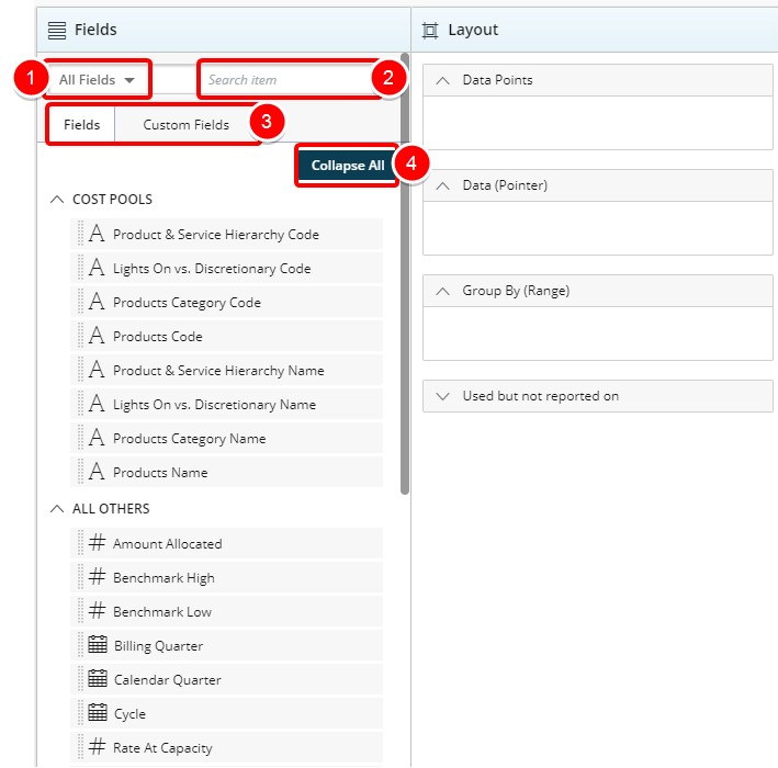
- Select the desired Filter to apply to the list of available Fields. The available options are:
- All Fields
- Dimensions
- Measures
- Date
- Start typing in the Search item box to begin searching for available Fields.
- You can alternate between Fields and Custom Fields by clicking on either one of the tabs. Tip: For more information on how to create and use Custom Fields please refer to: Create and Use Custom Fields
- Click Expand All or Collapse All to view or hide all available options in order to easily narrow down on the desired field(s).
7. Select your Data Field(s)
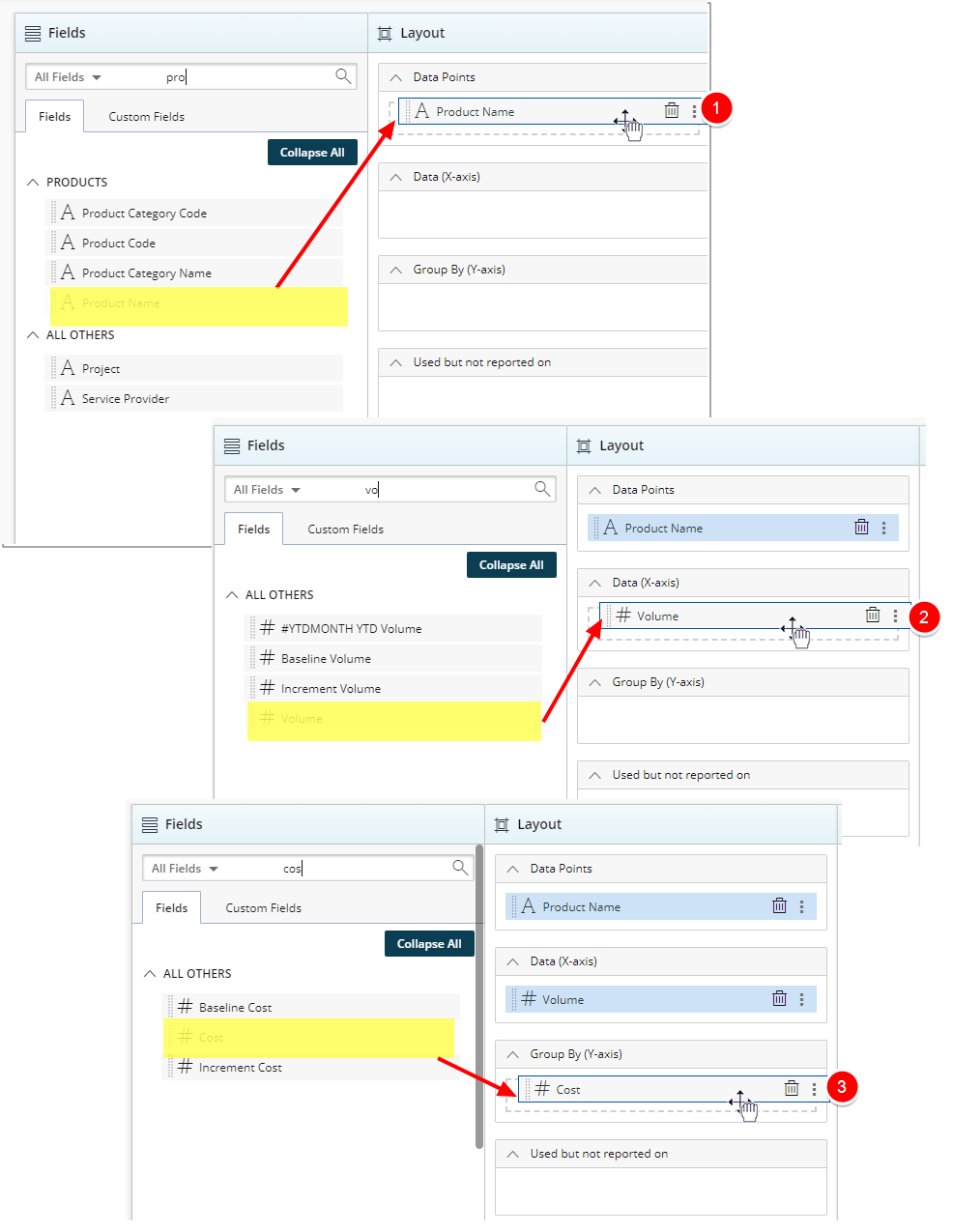
- In the Data Points section drop the non-numeric Field to find the correlation.
- In the Data (X-Axis) section drop one numeric Field to define the values on the X-Axis (horizontally).
- In the Group by section drop one numeric Field to define the values on the Y-Axis (vertically).
8. Add a Filter (Optional)
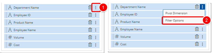
- Click the Ellipsis button of a Field added to Data Points, Data or Group By sections.
- Select Filter Options from the context menu.
9. Add a Pivot (Optional)
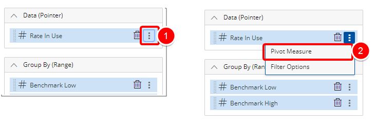
- Click the Ellipsis button of the Field(s) added.
- Select Pivot Measure from the context menu.
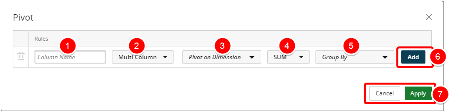
- Begin typing the Alias name of your column in the Column Name box .
- Select one of the following:
- Multi Column: By default, Multi Column is selected. Presents your pivot value within multiple columns.
- Single Column: Presents your pivot value in one column.
- Click or type the desired Pivot on Dimension.
- Click or type the desired measure.
- Click or type the desired Group By.
- Click the Add button to add a new Pivot option.
- Click Apply to save your changes and return to the previous page. Alternately you can Cancel your changes and return to previous page.
10. Preview Report
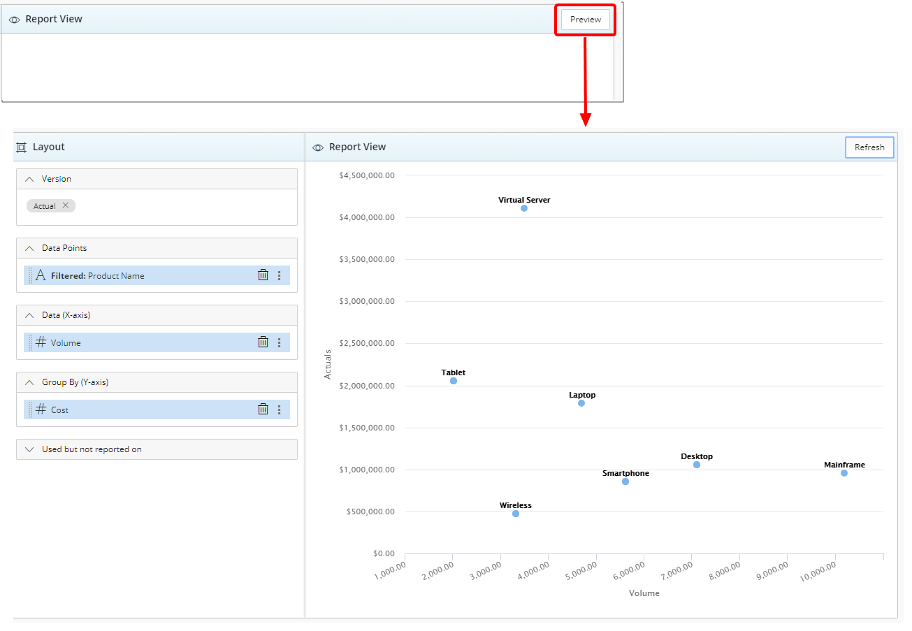
- Click the Preview button to preview your report.
11. Save Report
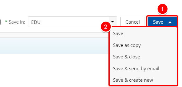
- Click Save to open the Save context menu
- Choose one of the available Save options:
- Save: Selecting this option will save the report without exiting the report edit page.
- Save as copy: Selecting this option will save a copy of the report. You will need to rename the report in the Navigation Menu.
- Save & Close: Selecting this option will save the report and close the report edit page. The report will then run.
- Save & send by email: Selecting this option will save the report and close the report edit page. A modal window will then give you the options to send the report. For more information refer to Email a Graph/Chart.
- Save & Create new: Selecting this option will save the report and close the report edit page giving you the option to create a new report.
Menu