Adding and Styling Buttons
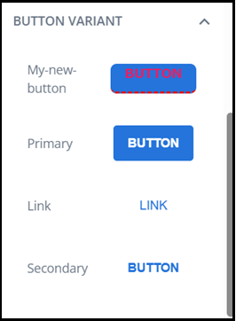
Using Email Designer buttons provides your email with a 'call to action'. There are three styles available by default: Primary, Link, and Secondary.
Functionally, the three button styles perform the same task, i.e. take your customer to a linked URL.
Tip: you can add more button variants and edit default button styling in the Global Settings.
To add buttons to an email:
-
Drag a button variant from the library into your layout.
-
Replace the default text by highlighting and typing over the default text with your own text, e.g. type Register Now for a button that takes people to a webinar sign up form.
-
Apply settings using the button design settings.
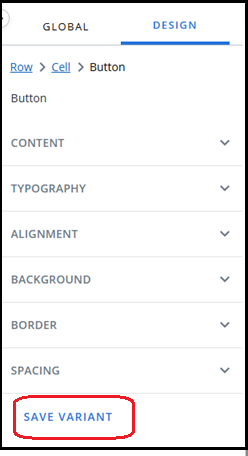
Button design settings
The button design settings become available when you select a button on the canvas.
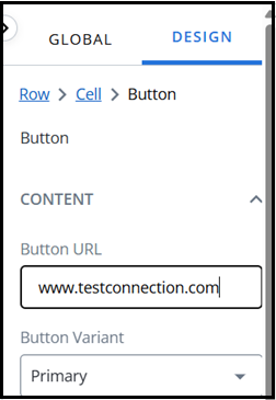
Link URL
For your button to function as a link, add a URL.
-
Go to the Design settings tab.
-
Under Content, enter your link URL into the Button URL field.
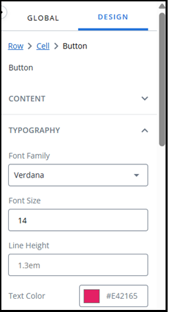
Typography
To edit the formatting of your button text:
-
Go to the Design settings tab.
-
Under Typography:
-
Select a Font Family from the dropdown menu, e.g. Verdana.
-
Type a number into the Font Size field, e.g. 14.
-
Enter a value for the line height in the Line Height field, e.g. 1.3em.
-
Use the color picker to select a text color by:
-
Adjusting the slider and selecting from the color chart, or
-
Entering values in the fields.
Tip: use the up/down arrows to choose between RGB, HSL, or HEX.
-
-
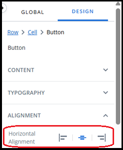
Alignment
To change the horizontal alignment of your button:
-
Go to the Design settings tab.
-
Under Alignment, press one of the three buttons to position the image to the Left, Centre, or Right of your layout container.
To change the vertical alignment of your button:
-
Go to the Design settings tab.
-
Under Alignment, press one of the three buttons to position the image to the Top, Middle, or Bottom of your layout container.
Background
To change the background color of your button:
-
Go to the Design settings tab.
-
Under Background, use the color picker to select a background color by:
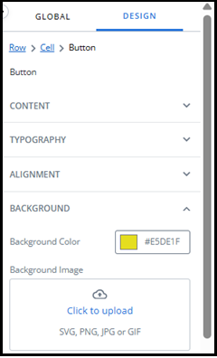
-
Adjusting the slider and selecting from the color chart, or
-
Entering values in the fields.
Tip: use the up/down arrows to choose between RGB, HSL, or HEX.
-
To set an image as your button background:
-
Go to the Design settings tab.
-
Under Background, press the Click to Upload button to open the file manager.
-
In the Select File window, use the Files for dropdown menu to toggle between files at the Project, Workspace, User, and Account level.
-
Locate and select your image from the file list.
-
If you are using folders, select the folder name to navigate through folders.
-
Use the search bar at the top of the window to search for file names.
-
If your image is not present in the file manager, drag and drop it into the file manager.
Note: ensure you have selected the correct level and folder for the file first.
-
-
Press the Okay button.
Border
To add a border to your button:
-
Go to the Design settings tab.
-
Under Border:
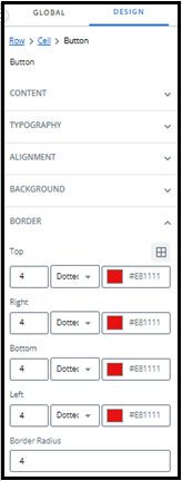
-
Enter a number for your border thickness.
-
Choose a border style from the dropdown menu, e.g. dotted.
-
Use the color picker to select a border color by:
-
Adjusting the slider and selecting from the color chart, or
-
Entering values in the fields.
Tip: use the up/down arrows to choose between RGB, HSL, or HEX.
-
-
-
By default, the border settings are applied to the entire border. Press the custom border icon
 to enable editing of top, right, bottom, and left borders separately.
 -
Enter a number in the Border Radius field to create a button with rounded corners.
Spacing
To add padding to your button:
-
Go to the Design settings tab.
-
Under Spacing:
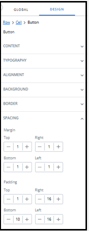
-
Enter a number for your Top padding.
-
Enter a number for your Right padding.
-
Enter a number for your Bottom padding.
-
Enter a number for your Left padding.
-
Save Variant
After customizing your button variant, click Save Variant to save it. The new variant is automatically added to the Button Variants section in the Library tab.