Managing Email Designer Settings
In addition to content specific settings for your text, media, buttons, and headings, the Email Designer has a selection of Global settings that apply to the whole email.
Access all global settings from the Global tab in the settings menu, regardless of which element you have selected on your canvas.
-
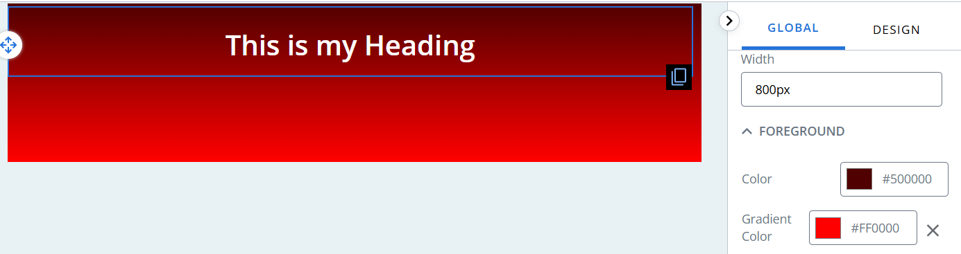
Width - enter a value for the width of your email, e.g. 700px.
-
Foreground - Set the color, gradient for your email.
-
Spacing - set padding for your email. Individual content block padding is set separately.
-
Heading variant - set heading levels.
-
Border - set a border for your email. Individual content block borders are set separately.
-
Button variant - set button color, borders, margins, etc.
-
Text - set font family, size, color, etc.
Note: global settings will apply to items that do not have individual styling applied. For example:
If you customise a text block to have size 16 font and then change the global text settings to size 12 font:
-
The customised text block will stay at 16.
-
All other text blocks will change to size 12 font.
Foreground
To change the foreground of your mailing:
-
Go to the Global settings tab.
-
Under Foreground, use the color picker to select a color by:
-
Adjusting the slider and selecting from the color chart, or
-
Entering values in the fields.
Tip: use the up/down arrows to choose between RGB, HSL, or HEX.
-
-
If you want your foreground to have a top to bottom gradient effect, repeat for the gradient color, e.g. select a dark red for the color and a bright red for the gradient.
Spacing
To add padding to your email:
-
Go to the Global settings tab.
-
Under Spacing:
-
Enter a number for your Top padding.
-
Enter a number for your Right padding.
-
Enter a number for your Bottom padding.
-
Enter a number for your Left padding.
-
Heading variant
To add a heading variant:
-
Go to the Global settings tab.
-
Under Heading Variant:
-
Select the heading level from the drop-down menu.
-
Select a Font Family from the dropdown menu, e.g. Garamond.
-
Choose the font weight from the drop-down menu.
-
Enter a value for the line height in the Line Height field, e.g. 1.5em.
-
Select a line of text from the Text Align drop-down menu and press one of the three alignment buttons to change to: left aligned text, centre aligned text, right aligned text.
-
Choose the text color.
-
Adjust the heading margins - top, right, bottom, and left.
-
Border
To add a border to your email:
-
Go to the Global settings tab.
-
Under Border:
-
Enter a number for your border thickness.
-
Choose a border style from the dropdown menu, e.g. dotted.
-
Use the color picker to select a text color by:
-
Adjusting the slider and selecting from the color chart, or
-
Entering values in the fields.
Tip: use the up/down arrows to choose between RGB, HSL, or HEX.
-
-
-
By default, the border settings are applied to the entire border. Press the custom border icon
 to enable editing of top, right, bottom, and left borders separately.
Button variant
To change the styling of a button variant:
-
Go to the Global settings tab.
-
Under Button Variant, select the variant you wish to edit from the Button Variant dropdown.
-
Select a font from the Font Family dropdown.
-
Enter a px value into the Font Size field, e.g. 20px.
-
Enter a value into the Border Radius field to change the amount of rounding on the button, e.g. 0 for square edges instead of rounded edges.
To add additional button variants:
-
Scroll to the bottom of the Button Variant settings.
-
Press the + Create Variant button.
-
Enter a name for your button in the Button name field.
-
Define your button as if re-styling an existing button.
Tip: the editor displays a preview of your button below the Button name field.
-
Press the Save Variant button.
Setting button borders, colors, and spacing
Button borders
To add a border to your button:
-
Go to the Design settings tab.
-
Under Border:
-
Enter a number for your border thickness.
-
Choose a border style from the dropdown menu, e.g. dotted.
-
Use the color picker to select a border color by:
-
Adjusting the slider and selecting from the color chart, or
-
Entering values in the fields.
Tip: use the up/down arrows to choose between RGB, HSL, or HEX.
-
-
-
By default, the border settings are applied to the entire border. Press the custom border icon
to enable editing of top, right, bottom, and left borders separately. -
Enter a number in the Border Radius field to create a button with rounded corners.
Button colors
To change the background and text color of your button:
- Select the color preview block in the Background Color field.
-
Use the color picker to select a background color by:
-
Adjusting the slider and selecting from the color chart, or
-
Entering values in the fields.
Tip: use the up/down arrows to choose between RGB, HSL, or HEX.
-
- Select the color preview block in the Text Color field.
-
Use the color picker to select a text color by:
-
Adjusting the slider and selecting from the color chart, or
-
Entering values in the fields.
Tip: use the up/down arrows to choose between RGB, HSL, or HEX.
-
Spacing
To add margins and/or padding to your button:
-
Enter a number for your Top padding.
Enter a number for your Right padding.
Enter a number for your Bottom padding.
Enter a number for your Left padding.
-
Enter a number for your Top margin.
Enter a number for your Right margin.
Enter a number for your Bottom margin.
Enter a number for your Left margin.
Text
To change the default styling of text blocks:
-
Go to the Global settings tab.
-
Under Text:
-
Select a Font Family from the dropdown menu, e.g. Garamond.
-
Type a number into the Font Size field, e.g. 12.
-
Enter a value for the line height in the Line Height field, e.g. 1.5em.
-
Use the color picker to select a text color by:
-
Adjusting the slider and selecting from the color chart, or
-
Entering values in the fields.
Tip: use the up/down arrows to choose between RGB, HSL, or HEX.
-
-
Use the color picker to set your link text color by:
-
Adjusting the slider and selecting from the color chart, or
-
Entering values in the fields.
Tip: use the up/down arrows to choose between RGB, HSL, or HEX.
-
-