The Data Entry Screen component is used to create a Data Entry Screen, for a created document or project, in which the users can enter or select values for merge codes. When you add a merge code to the component it adds a field to the page. You can control the layout by arranging the merge codes in one or two columns and adding headers, text and spacers. Merge codes can be configured to allow users to enter text, dates, numeric values, currency, or graphics or select text from a drop-down menu. You can edit the merge codes, add new or existing merge codes, or remove merge codes directly from the Data Entry Screen component.
Example: Common uses for Data Entry Screen components include sender and client contact information, and client logos.
Tip: Improve search results for AutoFill, AI Assist, and Search Mode by mapping custom metadata fields to one or more data entry fields. Once correctly mapped, searches will automatically filter out irrelevant content based on users' Project-level selections that aid in finding the right content, such as: products and/or services, region, industry, and company size.
 Examples
In the example below, the architect of the document type added a Data Entry Screen component, titled it "Client Information", added "Organization's" and "Customer's" headers, merge codes, and spaces, and then created help text to provide additional information to users. Notice that the help text displays under the section's display title.
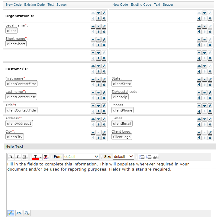
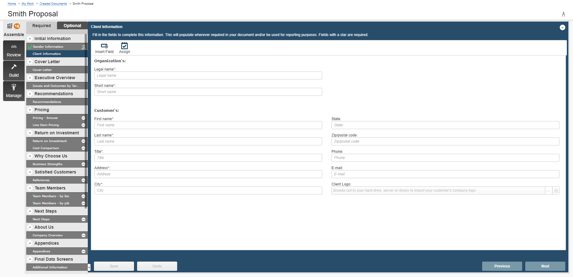
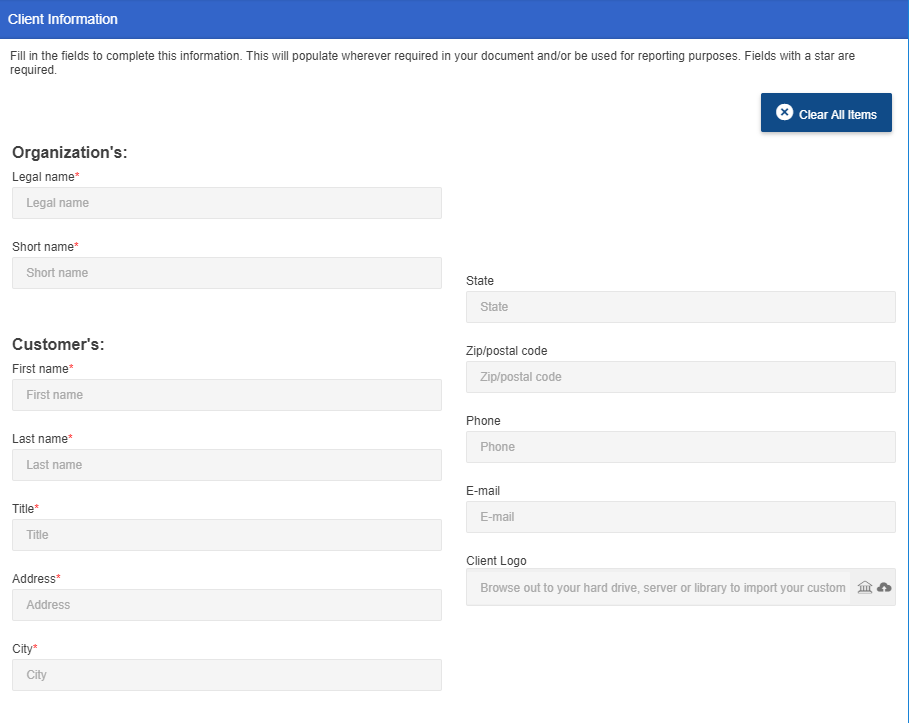
Examples of a Data Entry component (left), and Data Entry Screens as they display to users on the Assemble tab (middle), and in projects (right).
Add a Data Entry Screen component
- From the Toolkit, select Data Entry Screen.
- In the Properties panel, enter the name of the component. This name displays in the navigation panel in the projects and created documents that use the document type.
- Enter the Display Title. This title displays on the created document's Assemble tab.
- Select the number of columns in which the fields should display. If you are creating a Data Entry screen with more than six or seven fields, you may wish to use two columns to make all fields visible to users without scrolling.
- Select one of the following options from the Include drop-down menu:
- Always: Select if you want this subsection required for completion for created documents or projects using the document type.
- Optional: Select if you want this component to be listed in the Optional Tasks panel on a created document's Assemble tab or on a project's navigational panel so that end users have the option of including the component.
- By Inclusion: Select if you want this component automatically included when an optional component is included. The Component / Selection Group tree displays listing the optional component and selection groups for this document type. Check the box for the optional component with which you want to associate this component. When the user includes the associated optional component, the by inclusion component is also included. Check the boxes for each item that you want this component included with a required for completion status.
- Optional or by inclusion: Select if you want this component included either as an optional component or to be included by inclusion of a different optional component. The Subsection / Selection Group tree displays listing the optional components and selection groups for this document type. Check the box for the optional component with which you want to associate this component. When the user includes the associated optional component, the by inclusion component is also included. The component is also listed in the Optional Sections pane on the created document's Assemble tab or on the project’s navigation panel, so that users can select the component in a document build without selecting the component with which it is associated.
- Enter the merge codes for the component, using the options below.
To create and insert a new code, follow the instructions below.
Add a new merge code.- Click New Code.
- Enter the code name. Do not include the double angled brackets. For example, for the <<ClientShort>> merge code, enter ClientShort.
- (Optional) Select the required check box to require users to enter or select a value for the merge code before building.
- Enter a description that will display above the field.
- Select one of the following from the Data Type drop-down menu. This determines the type of data the user can enter in the field.
Text: Users can either enter text, or select an option from a drop-down menu. If you are creating a drop-down menu you must select Text regardless of whether the values are a date, numeric, or currency.
To create a drop-down menu with options from which users can choose, follow the tasks below:- Click Dropdown values to allow users to select from a list of predetermined values. The Drop Down Values dialog displays.
- Click Add.
- Enter the text to display as a drop-down value.
- Click Save.
- Repeat tasks b. through d. to add additional drop-down values from which users can choose.
- Click Save.
- (Optional) Check the Editable check box to allow users to enter a value rather than select one from the list.
- Date: Users can enter a date or select one from a calendar.
- Numeric: Users can enter numbers, decimal points, and plus and minus signs.
- Currency: Users can enter a number with two decimal places. A currency symbol is added in front of the number. The symbol is dependent on their international settings.
- Graphic: Users can select an image from the library or their computer.
- (Optional) Select an option from the Related to drop-down menu to link the field to the user's information or information pulled from a CRM, such as Salesforce.com. For example, if you select sender first name, the field would automatically be populated with the user's first name so it is always filled in for them when they create a new document.
- (Optional) In the Context field, enter any information users may need to further identify the code. For example, the context for the <<CallDate>> code could be “I will call you on ____________ to set up a meeting.” Users will see this text in the field in the Data Entry Screen when building a document. If no context is added, they will see the description. For example, <<CallDate>> merge code does not have any text in the content fields, the users will see "Call Date."
- Click Save.
- To insert an existing code, click Existing Code to display the Insert Merge Code dialog, select one or more merge codes and click Select.
- To insert text or a heading above a code (field) or group of codes on the component, click Text to display the New Text dialog. Indicate the type of text (heading text will be in bold, while text will not), enter the text to appear in the field, and then click Save.
- To insert space above a code (field) or group of codes on the component, click Spacer. A space field is inserted at the bottom; drag this to the desired location.
- (Optional) To delete any field that you've inserted, click
 beside the field.
 - (Optional) To edit a merge code or field that you've inserted, click
 beside the field to display the Merge Code Properties dialog or Text Properties dialog, edit as desired and then click Save.
 - (Optional) Click and drag a field to the desired position to rearrange the order of the fields or use the Up, Down, Left, Right buttons to move the fields into the desired position.
- Click Save.
Note: For more information on downloading merge codes directly from the Library, see Download Merge Codes.
Add help text for users
You can create help text to display at the top of the component to help users complete the fields. In designing the help text, you can work in design mode or HTML text. You can also preview the help text. When the help text first displays, the region is in Design mode. Most users will use this mode to create the help text and use the available standard formatting functions.

- To remove any formatting that you added or that was applied to text pasted from the clipboard, select the text and click the Eraser
 icon to revert to the default Font and Size (Verdana, 10pt).
 - If you want to edit the item in HTML, click the HTML Text
 icon. The formatting toolbar will disappear.
 - To view the help text as it will display on the page, click the Preview
 icon. The help text area will change to view only.
 - To return to design mode, click the Design Mode
 icon.
icon.
Note: Hyperlinks cannot be added to the help text field.
View component usage
The Usage panel, at the bottom of the component, displays how this component is being used in all document types and sections. The associated document types and components are listed as links so that they can be opened from the Navigation panel.
Common functions
The following common functions are listed at the top of the component workspace:
- Test Build: Click to display the created document page where you can see the document type from the user's perspective and run a test build to verify it appears as you intended. For more information, see Test Build.
- Reset Test Build: Click to delete any existing test build associated with the document type so you can start again with a fresh test document. For more information, see Test build a document type.
- Export: Click to export the document type. For more information, see Export a document type.
- Content Tray: Click to display the Content Tray dialog. The content tray is a holding area for content records that you can drag from the tray and drop in the content area for select components. For more information, see Content tray.