Create a Selection Driven Content component
The Selection Driven Content component creates a subsection in a project or created document in which your users can select from grouped items with associated content. By adding a Selection Driven Content component, you give users options to customize their document while still controlling the content they use. Groups are collections of items that can be associated with sentence or list text, a content record, or an uploaded file. You can create a single group at the top level or multiple groups within items to create multiple level selections.
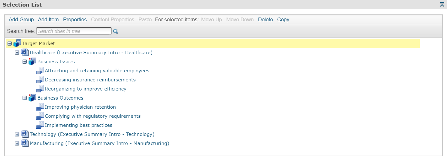
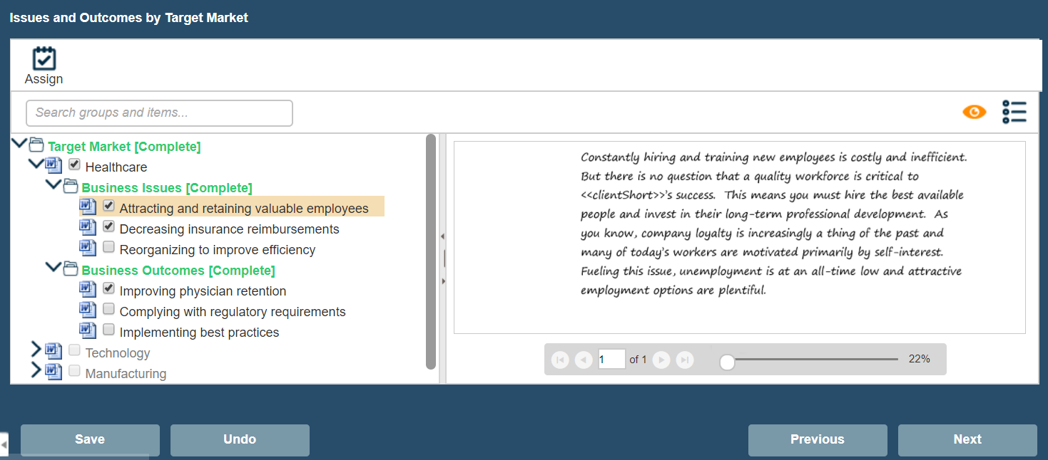
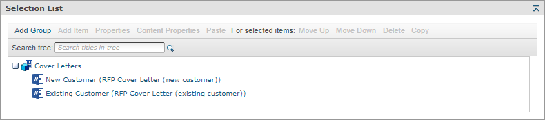
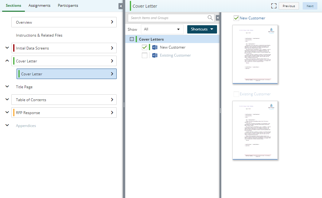

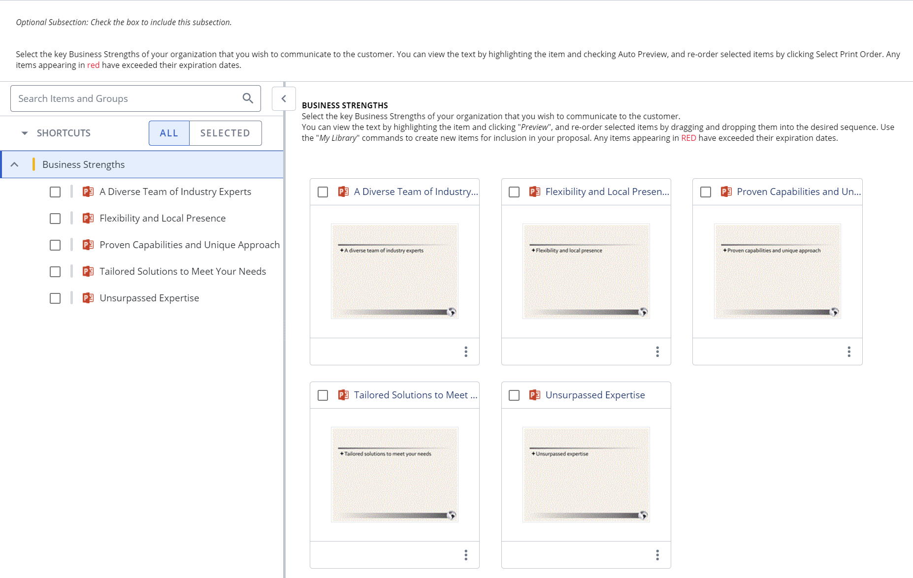
An example of a selection list with multiple groups (top left) and the user's view in the created document workspace (top right), a selection list with one group (middle left) and the user's view in the project workspace (middle right), and a selection list with one group (bottom left) and the user's view in the project workspace (bottom right). Microsoft Word documents and PowerPoint files can be associated with each item. Click to enlarge.
Tip: Improve search results for AutoFill, AI Assist, and Search Mode by mapping custom metadata fields to one or more selection groups. Once correctly mapped, searches will automatically filter out irrelevant content based on users' Project-level selections that aid in finding the right content, such as: products and/or services, region, industry, and company size.
Create a Selection Driven Content component
- From the Toolkit, select Selection Driven Content.
- In the Properties panel, enter the name of the component. This name displays in the navigation panel.
- Enter the display title. This title displays in the created document workspace.
- Select any of the following options as applicable:
- Use for Dynamic Slides: Select this check box if this component is to be used for a Dynamic Slide component.
- Print only the first selection in this subsection location: Select this checkbox if you want to only print the first selection for this component. You may want to select this if you are sharing the page in multiple places.
- Collapse all other tree nodes when expanding a node: Select this checkbox if you want the node for the selection group's items collapsed when the end user selects a different group node. Only the selected node (the group's selection items) will be expanded and all other nodes collapsed.
- Allow assignments and editing in Projects: Select this checkbox if you want to pre-configure starting content that project owners and writers can customize for each project. This allows for more efficient and robust collaboration directly in a project and is an alternative to File List Components in existing Doc Types. The "Allow editing of Static/Selection Content when enabled" permission must be enabled at the user or role level for project participants.
- Select one of the following options from the Include drop-down menu:
- Always: Select if you want this subsection required for completion for created documents or projects using the document type.
- Optional: Select if you want this component to be listed in the Optional Tasks panel on a created document's Assemble tab or on a project's navigational panel so that end users have the option of including the component.
- By Inclusion: Select if you want this component automatically included when an optional component is included. The Component / Selection Group tree displays listing the optional component and selection groups for this document type. Check the box for the optional component with which you want to associate this component. When the user includes the associated optional component, the by inclusion component is also included. Check the boxes for each item that you want this component included with a required for completion status.
- Optional or by inclusion: Select if you want this component included either as an optional component or to be included by inclusion of a different optional component. The Subsection / Selection Group tree displays listing the optional components and selection groups for this document type. Check the box for the optional component with which you want to associate this component. When the user includes the associated optional component, the by inclusion component is also included. The component is also listed in the Optional Sections pane on the created document's Assemble tab or on the project’s navigation panel, so that users can select the component in a document build without selecting the component with which it is associated.
- In the Selection List panel, click Add Group.
- Select the group, and then click Properties. The Selection Group Properties dialog box displays.
- Enter the group name.
- (Optional) Select the Automatically sort Items alphabetically check box. To display the Items in alphabetical order in the architecture. Items will always display alphabetically to the end user.
- If applicable, select the Allow selections to be used in sentence and list merge codes check box. All selections (items) for this group can be used in sentence or List Merge Codes.
- Enter the total number of selections allowed (Minimum and Maximum number of items an end user can select for this group). "0" is allowed (no minimum or maximum).
- Select the Enable check box to enable this list under all parent selection items. In previous versions of Upland Qvidian, groups were independent of selections, meaning a child group automatically existed under every parent item. Now child groups can differ based on parent item, which provides greater flexibility. When the check box is selected, the selection group is automatically duplicated for every parent item. For example: when creating an "Issues" group as a child group to the first "Target Market" item, every Target Market item has an "Issues" child group under it. Any change made to one will affect all of them as they are shared groups.
- Beside the Include field, select one of the following:
- Always: Select if you want this selection group required for completion when using the selected document type.
- Optional: Select if you want this component to be optional by checking a box to include the subsection in Projects and/or listed in the Optional Tasks panel on a created document's Assemble tab allowing end users the option of using this component in a document build. The minimum and maximum requirements will not be enforced unless the user chooses to include that group.
- By Inclusion: Select if you want this group included as required for completion. The Subsection / Selection Group tree displays listing the optional subsections and selection groups for this document type. Check the box for each component and/or selection group that you would like to include if this selection group is included.
- Optional or by inclusion: Select if you want this group included as an optional group and associated with another optional group or subsection. The Subsection / Selection Group tree displays listing the optional components and selection groups for this document type. Check the boxes for each item that you would like to include if this selection group is included.
- (Optional) Click Help Text and enter text that will help users when making their selections. This text displays as a tool tip when the user hovers the cursor over a group title.
- Click Save.
- Select the group and then click Add Item. The item is added and to the group.
- Select the item and then click Properties. The Selection Item Properties dialog box displays.
- Select the Enabled check box to make the item available for selection by end users.
- Enter the item name and any comments.
- (Optional) Select the Include paragraph marker after document check box. When inserting more than one selection item in a document, including a paragraph marker after an item allows the next item to be inserted after a paragraph return. If this check box is clear, multiple selection items will be grouped together as one paragraph.
(Optional) Enter the Sentence Merge Code Text.
Note: For more information on using sentence and list merge codes, including examples and screen shots, on see Merge codes.
- (Optional) Enter List Merge Code Text.
- Click Content to expand the Content panel, and then do one of the following to add content to the item:
- Select an item, click Content Tray, and add it to the item.
- Select an item, click Upload Document, enter a name for the file, click the ellipsis to browse and select a file, and then click Save. Files uploaded using this option are also automatically stored in the library in the default content folder indicated in the document type properties.
- (Optional) Click Permissions to expand the Permissions panel, and select the check box to give permission to select this item to specific roles.
- (Optional) To add another item below an existing item at the same level, select an item, click Add Item, and then repeat task 9 to configure the item. The item is added below the selected item at the same level.
- (Optional) To add another group at the same level as an existing group, select a group, and then repeat task 8.
- (Optional) To add a group at the same level as an existing item, select a group, and then repeat task 8.
- Click Save.
Additional actions
Groups and items
To copy groups or items:
- Select the group or item, click Copy, and then click Paste. You are prompted to select if you want to include associated content.
If you copied a group, the group and all its items are pasted below the existing group or within the existing item. If you copied an item, the item and all its groups and items are pasted within the existing group or below the existing item.
To edit group and item properties:
- Select the group or item, and then click Properties. See tasks 7 and 9 in "Create a Selection Driven Content component" (above) for more information on the properties.
To reorder groups or items:
- To change the order of groups or items, select a group or item, then click Move Up or Move Down to move the group or item up or down one position at a time.
To search for group or item:
- In the selection panel, enter a group or item title in the Search tree field, then click
 . The first match is highlighted.
To delete groups or items:
- Select the group or item and click Delete, or right-click on the group or item and select Delete. The Confirm Deletion dialog displays.
- Select one of the options below:
- Remove link(s) to content: Select if you just want to remove all links to the content you are deleting.
- Remove link(s) to content, and, if permissioned, delete content from the Library: Select if you want to remove all links to the content and delete the content stored in the library.
- Click Yes.
Content
To edit content attached to an item, do one of the following:
- From the Content panel in the Selection Item Properties dialog box, click Edit.
-
From the Selection List panel, right click an item and select Content > Edit.
Any modifications made to the content without using the Qvidian toolbar will not be saved.
To cancel an edit, do one of the following:
- From the Selection Item Properties dialog box, click Cancel Edit.
- From the Selection List panel, right click an item and select Content > Cancel Edit.
When item content is opened or saved to Word or PowerPoint via the Edit function, the Cancel Edit link is enabled and a padlock icon overlays the Word or PowerPoint icon for the item in the list. Any changes must be saved via the Save to Qvidian button on the Qvidian Add-in Toolbar.
To view or edit content properties:
- From the Content panel in the Selection Item Properties dialog box, select the content, and then click Properties.
- From the Selection List panel, right click an item and select Content > Properties.
The library opens and the Content Record Properties dialog displays for the content item.
To preview content as an image, do one of the following:
- From the Content panel in the Selection Item Properties dialog box, click the content title.
- From the Selection List panel, right click an item and select Content > Preview Image.
To save content to the content tray:
- From the Selection List panel, right-click an item and select Content > Save to Content Tray. The content for the selected items are added to the Content Tray.
To add content to an item from the content tray:
- From the Content panel in the Selection Item Properties dialog box, select an item, select Content Tray, and then click the Add link next to the desired content from the Content Tray to the desired item.
- From the Selection List panel, right click an item, select Content Tray, and then click the Add link next to the desired content from the Content Tray to the desired item.
To upload content for an item:
- From the Content panel in the Selection Item Properties dialog box, select the item, and then click Upload Document.
- From the Selection List panel, right click an item and select Content > Upload Document.
To delete content:
- From the Content panel in the Selection Item Properties dialog box, select the content, and then click Delete.
- From the Selection List panel, right click an item and select Content > Delete.
Add help text for users
You can create help text to display at the top of the component to help users complete the fields. In designing the help text, you can work in design mode or HTML text. You can also preview the help text. When the help text first displays, the region is in Design mode. Most users will use this mode to create the help text and use the available standard formatting functions.

- To remove any formatting that you added or that was applied to text pasted from the clipboard, select the text and click the Eraser
 icon to revert to the default Font and Size (Verdana, 10pt).
 - If you want to edit the item in HTML, click the HTML Text
 icon. The formatting toolbar will disappear.
 - To view the help text as it will display on the page, click the Preview
 icon. The help text area will change to view only.
 - To return to design mode, click the Design Mode
 icon.
icon.
Note: Hyperlinks cannot be added to the help text field.
View component usage
The Usage panel, at the bottom of the component, displays how this component is being used in all document types and sections. The associated document types and components are listed as links so that they can be opened from the Navigation panel.
Common functions
The following common functions are listed at the top of the component workspace:
- Test Build: Click to display the created document page where you can see the document type from the user's perspective and run a test build to verify it appears as you intended. For more information, see Test Build.
- Reset Test Build: Click to delete any existing test build associated with the document type so you can start again with a fresh test document. For more information, see Test build a document type.
- Export: Click to export the document type. For more information, see Export a document type.
- Content Tray: Click to display the Content Tray dialog. The content tray is a holding area for content records that you can drag from the tray and drop in the content area for select components. For more information, see Content tray.