Navigating the Dashboard - Widgets
To learn more about Widgets, watch the demo video here.
View your Fast Feedback widgets on the dashboard overview tab, alongside the message ticker and at a glance panel.
Each widget displays the output from the sentiment engine in an appropriate, easy to read graphic, e.g. on a radial display, as a graph, etc.
Saving the Layout
Users can customize and save a dashboard layout according to their preferences.
To create a new layout, follow the steps below:
-
Once you make changes to the widgets, click Edit Layout.
-
Go to the Saved View tab and click Save.
-
In the Name field, enter a name for the layout.
-
Choose your sharing options: Public or Private.

-
Click Save.
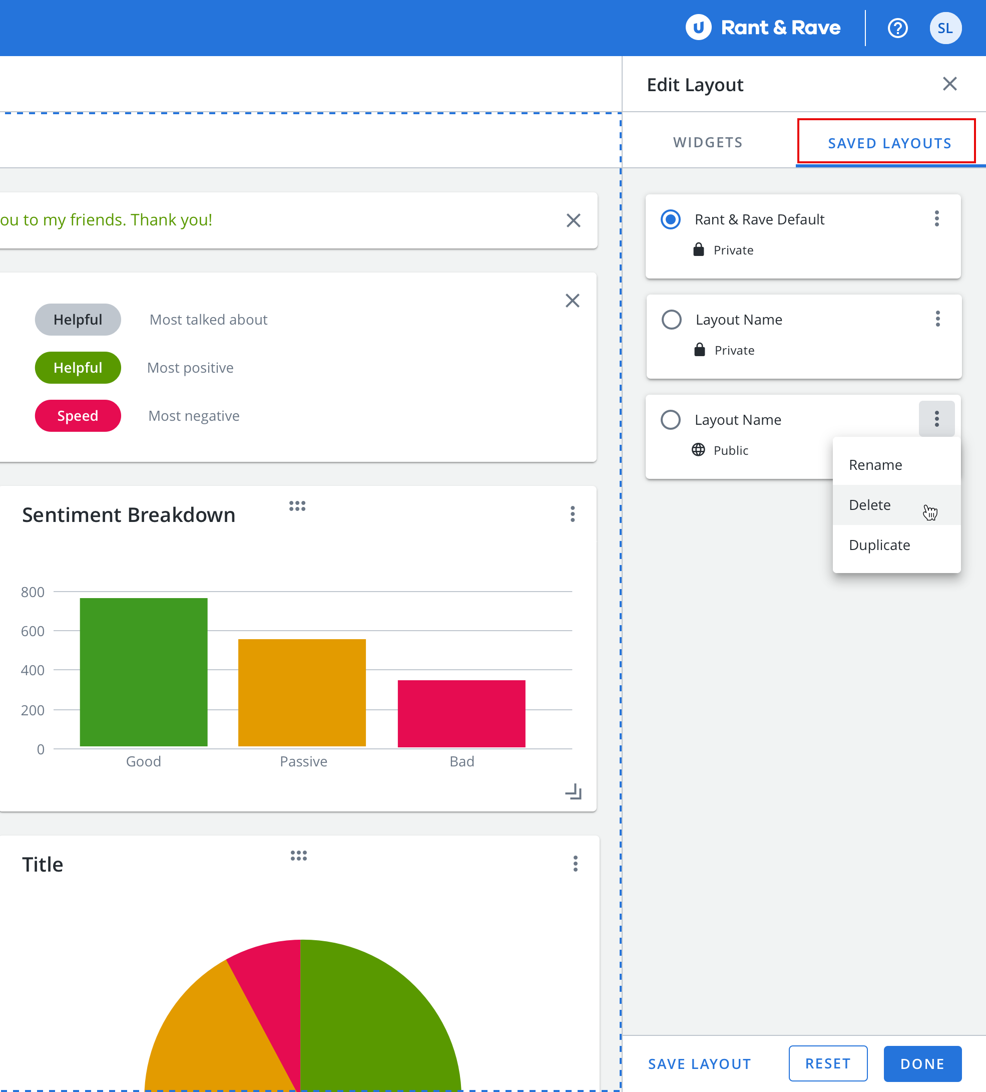
To modify the existing layout, follow the steps below:
-
Click Edit Layouts and go to Saved View tab.
-
Locate the layout you want to modify and select its checkbox.
-
Click Apply to view the layout.
-
Click on
 icon and choose from the following actions:
-
Save: Save changes made to the layout.
-
Edit: Update the layout name and sharing permissions.
-
Delete: Remove the layout permanently.
-
-
Click Reset to restore the layout to its default state.
Configuring the Widgets
Users can add or remove widgets from the dashboard.
-
Click Edit Layouts to open the widget selection panel.
-
Drag and drop widgets between the configuration panel and the dashboard to add or remove them.
In the configuration panel:
-
Widgets displayed in blue are currently active on the dashboard.
-
Widgets displayed in grey are inactive on the dashboard.

Once you have set up the widgets on the dashboard, you can customize them further:
-
Resize the widgets: Click and drag the resize icon
 to adjust the size of the widgets according to your screen's layout.
 -
Reorder the widgets: Click and drag the six dots
 to relocate the widget within the grid, arranging them to your preferred locations.
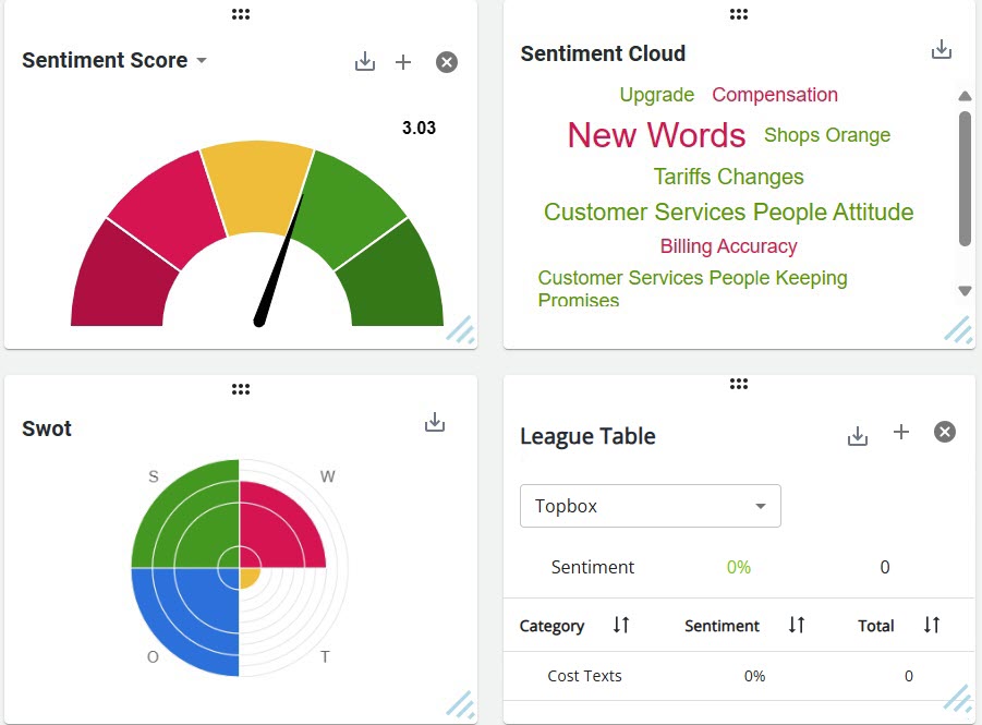
Widgets
Each widget is tailored to present:
-
The At A Glance panel.
-
Your average sentiment score.
-
Your grouped, feedback breakdown.
-
The most popular sentiments from your feedback.
-
Your top talking points.
-
Your Net Promoter Score (NPS) and the its trend over time (NPS Over Time).
-
Your strengths, weaknesses, opportunities, and threats (SWOT).
-
A league table of your ranked feedback.
-
The most popular insights from your feedback.
-
The time trend graph.
At a Glance Panel
Upon signing into the Rant & Rave dashboard, you will be presented with the overview tab by default. Here you will find the "At a Glance" panel, alongside the message ticker and your widgets. This panel can be relocated to any other location within the page to adjust it to your screen layout by clicking and dragging the 6 dots on the widget.
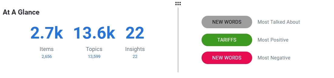
The "At a Glance" panel shows you how much feedback you have received, the most talked about topics, which topics are most positively discussed, and which topics are most negatively discussed.
Selecting a topic will apply a filter to the dashboard for that topic, e.g. selecting a topic called payments will filter the dashboard for feedback about payments.
Note: The filter is applied to the entire dashboard, not just the at a glance panel, i.e. the widgets will also be filtered.
The Ravometer
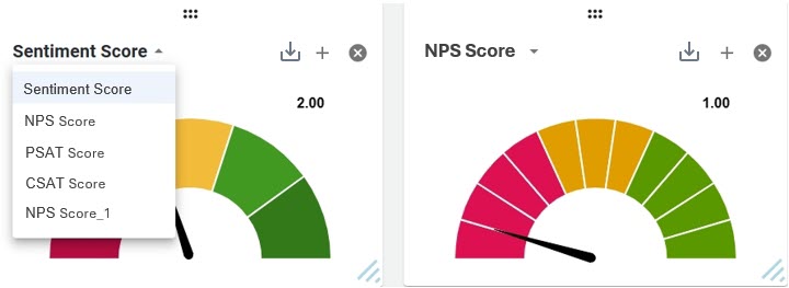
The sentiment ravometer displays your average score against a color-coded radial graphic. By default, each segment corresponds to an integer on the scale of 1 to 5, e.g. the arrow pointing to the second segment from the left indicates an average score of 2 which is displayed on the widget.
Selecting a segment of the ravometer will apply a filter to the dashboard for that score, e.g. selecting the second segment from the left will filter the dashboard for sentiment score = 2.
You can add multiple Ravometers to show different scores by clicking + icon on the widget. To remove the widget from the screen, click x mark on the widget.
You can download the image of the widget by clicking the ![]() icon.
icon.
Note: The filter is applied to the entire dashboard, not just the sentiment score widget, i.e. the at a glance panel and all other widgets will also be filtered.
To add a new score ravometer, the customer will need to log a ticket into support with the following information:
-
The score field they want to add
-
A friendly name for the field, if required
-
Bandings for the score including colours for each band (Green/Amber/Red)
These are the prerequisites to ensure it is available for selection within Dashboard 2.0.
The Sentiment Breakdown Widget
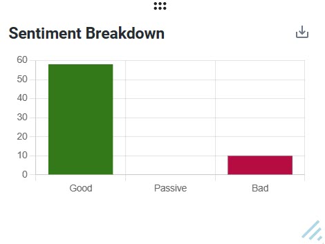
The sentiment breakdown widget tallies the scores generated by the sentiment engine and presents them in a bar chart based on being:
-
Good (scores above the sentiment range's midpoint, i.e. 4 or 5).
-
Passive (scores at the midpoint of the sentiment range, i.e. 3).
-
Bad (scores below the sentiment range's midpoint, i.e. 2 or 1).
Selecting a column of the bar chart will apply a filter to the dashboard for that band, e.g. selecting the good column will filter the dashboard for sentiment scores = 4 or 5.
You can download the image of the widget by clicking the![]() icon.
icon.
Note: The filter is applied to the entire dashboard, not just the sentiment breakdown widget, i.e. the at a glance panel and all other widgets will also be filtered.
Tip: Hover over a column to display a tooltip showing the number of feedback in the column.
The Sentiment Cloud Widget
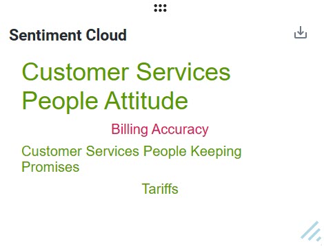
The sentiment cloud widget pulls the sentiments from your feedback into a color-coded word cloud where:
-
Positive sentiments are green
-
Negative sentiments are red
-
Neutral sentiments are yellow
-
And the font size increases the more frequently it occurs.
Selecting a word or phrase in the word cloud will apply a filter to the dashboard for that item, e.g. selecting a sentiment about helpful agents will filter the dashboard to show you feedback related to your helpfulness.
You can download the image of the widget by clicking the![]() icon.
icon.
Note: The filter is applied to the entire dashboard, not just the sentiment cloud widget, i.e. the at a glance panel and all other widgets will also be filtered.
Tip: Hover over a word or phrase to see its sentiment score and the number of times it has occurred in your feedback.
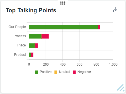
The Top Talking Points Widget
The top talking points widget sorts your feedback according to your taxonomy categories, i.e. people, process, place, and product, and shows the total number of positive (green) and negative (red) customer responses in each category.
Selecting a segment of the chart will apply a filter to the dashboard for that sentiment and topic, e.g. selecting the good process segment will filter the dashboard for feedback about your processes with sentiment scores = 4 or 5.
You can download the image of the widget by clicking the![]() icon.
icon.
Note: The filter is applied to the entire dashboard, not just the top talking points widget, i.e. the at a glance panel and all other widgets will also be filtered.
Tip: Hover over a segment to see how many responses you received in that category.
The NPS Widget
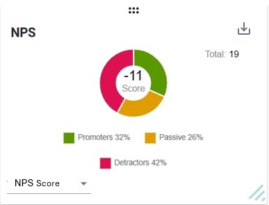
The NPS widget compares your positive and negative feedback to calculate how likely your customers are to recommend you.
The NPS Raveometer shows the average rating for every item of feedback which includes an answer in the NPS field (on a scale of 1-10).
Selecting a segment will apply a filter to the dashboard for that segment, e.g. selecting the positive segment will filter the dashboard to show you feedback with positive sentiments.
You can download the image of the widget by clicking the![]() icon.
icon.
Note: The filter is applied to the entire dashboard, not just the NPS widget, i.e. the at a glance panel and all other widgets will also be filtered.
The NPS Over Time Widget
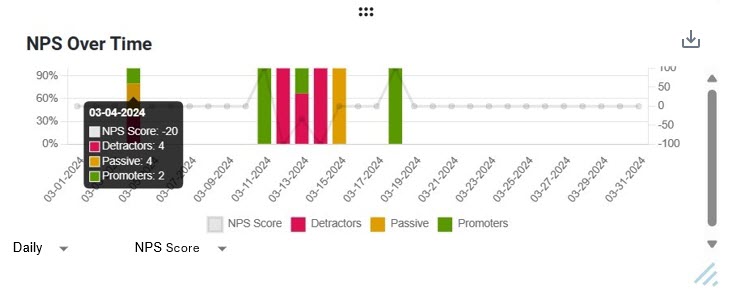
The NPS Over Time widget shows the trend of the NPS score, month-on-month. Promoters are shown in green, detractors in red, passive customers in orange, and NPS score in grey. Hovering over the graph displays the exact date and the values.
A drop-down is added to toggle between viewing Daily, Weekly, Monthly, or Quarterly trends. Additionally, another drop-down menu allows you to select the specific NPS score you want to analyze.
You can download the image of the widget by clicking the![]() icon.
icon.
The SWOT Widget
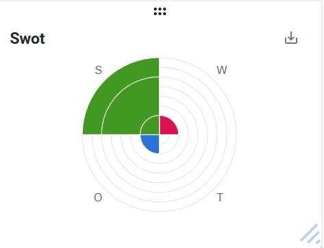
The SWOT widget displays your organization's strengths, weaknesses, opportunities, and threats as quadrants in a radial display. Each segment within a quadrant represents that quadrant's popular subcategories, with the largest being the most popular.
Selecting a segment of the display will apply a filter to the dashboard for that segment, e.g. if delivery is your largest strength, selecting the largest strength segment will filter the dashboard to show you feedback with positive sentiments about your deliveries.
You can download the image of the widget by clicking the![]() icon.
icon.
Note: The filter is applied to the entire dashboard, not just the SWOT widget, i.e. the at a glance panel and all other widgets will also be filtered.
Tip: Hover over a segment to see the name of the category it represents and the number of insights which relate to that category.
The League Table Widget
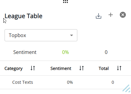
The league table displays the number of items of feedback for a particular Structured Field or Category, and the average scores. The league table can be used to filter on a customer piece of meta data i.e. location, product type, call code etc. It also allows you to rank your performance by:
-
Feedback categories.
-
Sentiment.
-
Total feedback.
At the top of the table, the total Topbox score and the total number of responses for the selected score are displayed in green. The selected score is also used as the header under the TopBox drop-down menu.
You can sort the columns by ascending/descending order by pressing the arrow next to a table header, e.g. select the arrow next to sentiment to sort by ascending sentiment scores.
Selecting an item in the table will apply a filter to the dashboard for that item, e.g. selecting the helpful category will filter the dashboard to show you feedback related to helpfulness.
You can add multiple tables to show different scores by clicking + icon on the widget. To remove the widget from the screen, click x mark on the widget.
You can download the image of the widget by clicking the![]() icon.
icon.
Note: The filter is applied to the entire dashboard, not just the league table widget, i.e. the at a glance panel and all other widgets will also be filtered.
The Insight Cloud Widget
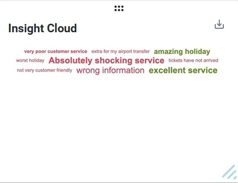
The insight cloud widget pulls the insights from your feedback into a color-coded word cloud where:
-
Positive insights are green
-
Negative insights are red
-
And the font size increases the more frequently it occurs.
Hover over an insight to see its score and the number of times it has occurred in your feedback.
Selecting an insight in the word cloud will apply a filter to the dashboard for that item, e.g. selecting an insight about waiting for an adviser will filter the dashboard to show you feedback related to your speed of service.
You can download the image of the widget by clicking the![]() icon.
icon.
Note: The filter is applied to the entire dashboard, not just the insight cloud widget, i.e. the at a glance panel and all other widgets will also be filtered.
The Time Trend Widget
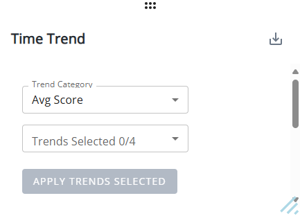
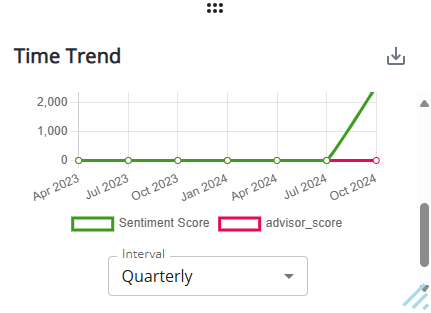
The Time Trend widgets displays the same features and capabilities as that on the Time Trend tab.
You can download the image of the widget by clicking the![]() icon.
icon.
To learn more about this functionality, refer to Time Trend.