The toolbox contains all of the controls that can be added to a web form. Controls are added to forms using a drag-and-drop operation.
Text and Input Tools
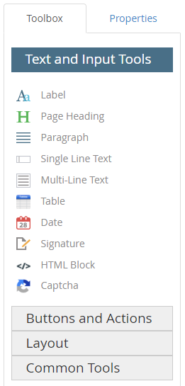
The label control can be used to define the fields on a web form. Once a label control has been added to a form, you can configure it using the options on the Properties tab. See Label control properties for more information.

The page heading control is used to add a title to a web form. Once a page heading control has been added to a form, you can configure it using the options on the Properties tab. See Page Heading control properties for more information.

The paragraph control is used to add a hard coded block of text to a web form. Once a paragraph control has been added to a form, you can configure it using the options on the Properties tab. See Paragraph control properties for more information.
The single line text control can be used when you want users to input a single line of text on a web form. Once a single line text control has been added to a form, you can configure it using the options on the Properties tab. See Single Line Text control properties for more information.

The multi-line text control can be used when you want to allow users to input multiple lines of text on a web form. This is useful in scenarios where a user might want to provide additional information for the form, and you do not want to limit their response. Allowing customers a place to provide their feedback or to answer open-ended form questions are great use cases for this field. Once a multi-line text control has been added to a form, you can configure it using the options on the Properties tab. See Multi-Line Text control properties for more information.

The table control can be used when you want users to enter information into a standard entry table on a web form. Once a table control has been added to a form, you can configure it using the options on the Properties tab. See Table control properties for more information.

The date control can be used when you want users to enter a date into a field on a web form. Once a date control has been added to a form, you can configure it using the options on the Properties tab. See Date control properties for more information.

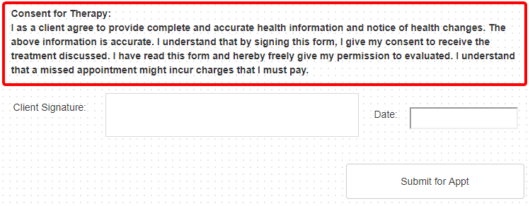
The signature control can be used when you want users to add their signature to a web form. Once a signature control has been added to a form, you can configure it using the options on the Properties tab. See Signature control properties for more information.

The HTML block control allows you to enter custom HTML during web form design. Once an HTML block control has been added to a form, you can configure it using the options on the Properties tab. See HTML Block properties for more information.
The Captcha control can be used when you want to require users to answer a Captcha prior to submitting a web form. Once a captcha control has been added to a form, you can configure it using the options on the Properties tab. See Captcha control properties for more information.
reCAPTCHA functionality only works for forms that are available on the Forms Portal. It is not supported in the viewers or on forms in the Forms menu.
A System Administrator has to configure the Recaptcha integration before a Captcha control can be added to a form. See reCAPTCHA integration for more information.
Buttons and Actions
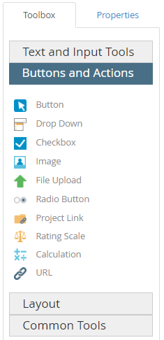
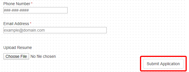
The button control allows you to add a button to a web form. There are four different types of buttons:
- Regular
- Reset
- Save
Once a button control has been added to a form, you can configure it using the options on the Properties tab. See Button control properties for more information.
The drop down control can be used when you want users to select an option from a list of preconfigured options. Once a drop down control has been added to a form, you can configure it using the options on the Properties tab. See Drop Down control properties for more information.
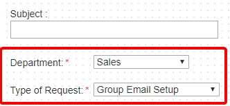
The checkbox control can be used when you want users to select one or more options from a predefined set of options. Once a checkbox control has been added to a form, you can configure it using the options on the Properties tab. See Checkbox control properties for more information.
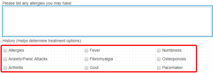
The image control is used as a placeholder for an image on a web form. Once an image control has been added to a form, you can configure it using the options on the Properties tab. See Image control properties for more information.
The file upload control can be used when you want users to be able to upload files when submitting a web form. Allowing potential employees to upload their resume when filling out a job application is a great use case for this field. Once a file upload control has been added to a form, you can configure it using the options on the Properties tab. See File Upload control properties for more information.

The radio button control can be used when you want users to select only one option from a predefined set of options. Once a radio button control has been added to a form, you can configure it using the options on the Properties tab. See Radio button control properties for more information.

The project link control can be used when you want users to select from a list of key values from a linked project. For example, on the job application form pictured below, the Position list will populate the list of available jobs from the linked Open Positions project. Once a project link control has been added to a form, you can configure it using the options on the Properties tab. See Project Link control properties for more information.

A rating scale control is a group of radio buttons that a user can select in response to a question. This can be used to analyze the answers to questions, to see if people are satisfied or dissatisfied. A rating scale control is mainly used to conduct surveys and get feedback from users. Once a rating scale control has been added to a form, you can configure it using the options on the Properties tab. See Rating Scale control properties for more information.

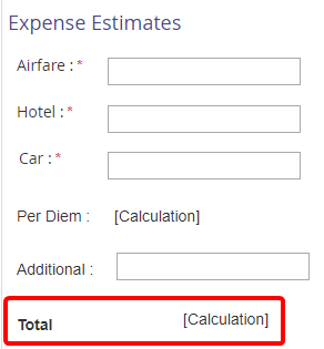
You can use a calculation control for performing mathematical operations on a set of fields and storing the result in another field. For example, on a form, you can add two numeric type field values and display the result in another numeric type field. Once a calculation control has been added to a form, you can configure it using the options on the Properties tab. See Calculation control properties for more information.
A URL control can be used to add a link to a URL on a web form. Once a URL control has been added to a form, you can configure it using the options on the Properties tab. See URL control properties for more information.
Layout
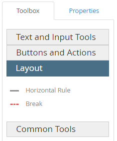
A horizontal rule control can be used to add a horizontal line on a web form. Once a horizontal rule control has been added to a form, you can configure it using the options on the Properties tab. See Horizontal Rule control properties for more information.
A break control can be used to print or display the web form content below the break on a new page. Once a break control has been added to a form, you can configure it using the options on the Properties tab. See Break control properties for more information.

Common Tools
FileBound provides preconfigured blocks that allow you to add multiple fields in a single operation. Using preconfigured blocks can save you considerable time and effort while designing a form.
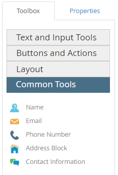
The Name control adds two fields to a form - First Name and Last Name. These are single line text fields that enable users to provide their first name and last name on the web form. The fields and labels are set to required by default. Once a name control has been added to a form, you can configure each of the fields within the name control using the options on the Properties tab. See Single Line Text control properties for more information.

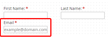
The Email control includes a single line text field and a label and allows users to type an email address on the web form. The field and label are set to required by default. Once an email control has been added to a form, you can configure each of the fields within the email control using the options on the Properties tab. See Single Line Text control properties for more information.
The phone number control includes a single line text field and a label and allows users to type a phone number on the web form. The field and label are set to required by default. Once a phone number control has been added to a form, you can configure it using the options on the Properties tab. See Single Line Text control properties for more information.

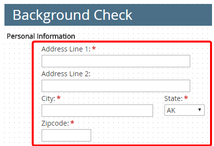
The address block control includes fields for Address, City, State, and Zip Code. The State field is a drop-down that is preconfigured with a list of the US states and all other fields are single line text fields. All of the fields and labels are set to required by default. Once an address block control has been added to a form, you can configure each of the fields within the address block control using the options on the Properties tab. See Single Line Text control properties and Drop Down control properties for more information.
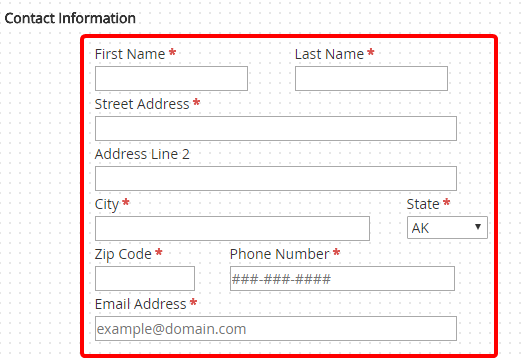
The contact information control includes fields for Name, Email, Phone Number, Address, City, State, Zip Code, Phone Number, and Email Address. The State field is a drop-down that is preconfigured with a list of the US states and all other fields are single line text fields. All of the fields and labels are set to required by default. Once a contact information control has been added to a form, you can configure each of the fields within the contact information control using the options on the Properties tab. See Single Line Text control properties and Drop Down control properties for more information.
Menu