The library
The Upland Qvidian library stores the content for use in proposals, RFPs or presentations. Each chunk of content is called a content record. A content record consists of the content source (stored in a Word, PowerPoint, PDF or other file formats) and properties. The content record's properties determine how the content can be searched, viewed and used.
Depending on your role and the permissions granted, you can perform the following tasks in the library.
- Find content records by browsing the folders or by searching. You can use your own search criteria, those provided by Qvidian, or use searches saved by you or by other users.
- Use content records by accepting them into a document, or copy content from the records for other uses, or export the content records or download the content records.
- Manage content records. Some of the manage tasks include creating new records, setting permissions on the new and existing records, revising the existing records, sending them to SMEs for review, updating existing records and deleting records.
- Create and manage folders in the library. Some of the manage folder tasks include: creating, copying, or moving and deleting folders.
- Setting access permissions on files and folders in the library. You can grant folder and content record permissions to roles and to individual users. Depending on the permissions granted you can view and work with folders and content records in the folders.
Accessing the Library
Opening the Library
You can open the library in a new browser tab or a window. You can open as many library instances as you need at the same time, each displayed in a new browser tab or window. The full library functionality is available on each library page. You can open bundles, one or more selected folders, saved searches, suggested searches, search history and other content from the library.
Tip: Use tabs if you are working with a single monitor. If you have multiple monitors, then you can open the library in new windows. You can also use a combination of tabs and windows. The full functionality of the library is available in each of them. You can set your preference to launch the library in a new tab or window. To specify your preference, see Launch Library Preference.
You can open the library page in one of the following ways:
- Library Button: Click the Library
 icon in the left navigation panel on the Upland Qvidian home page.
 - Open a new Library tab/window Button: Click the New Library Tab/Window
 icon to launch a fresh library page in a new window or tab. This button is available on the top right corner of the library page and other relevant pages like the Edit Content Properties page. This is useful when you want to view additional information about content records or folder while completing a task in another library page or window.
Example: When moving or copying a folder to another parent folder, it might be useful to view the parent folder permissions in a fresh library page before you inherit or merge the parent folder permissions to the new child folder.
- Search Bar: Use the search bar on the Upland Qvidian home page header to launch a new library window or tab. Each new search opens a new instance of the library page in a new tab or window. This ensures that any search already in progress in an existing library instance is not interrupted.
- Searching from Projects: Run a search from a project to open the library page in a separate window or tab that is pinned to the project. Subsequent searches from the project will continue to use the same library window or tab. This ensures that any folders and filters you select will continue to be used.
- Run search from a Home page panel: Running a search from a homepage panel launches a new library instance for each search. This ensures that a new search does not interfere with a search already in progress in an existing library instance.
Note: A new library page always opens using your personal default workspace. If you do not have a personal default workspace then it opens in your role's default workspace set by your administrator, and if a role default is not available then it opens in the Qvidian default workspace. To learn more about creating a personal workspace, see Library Workspaces
Closing the Library
All library instances are closed when you log out of the Upland Qvidian application or the application times out.
Library User Interface
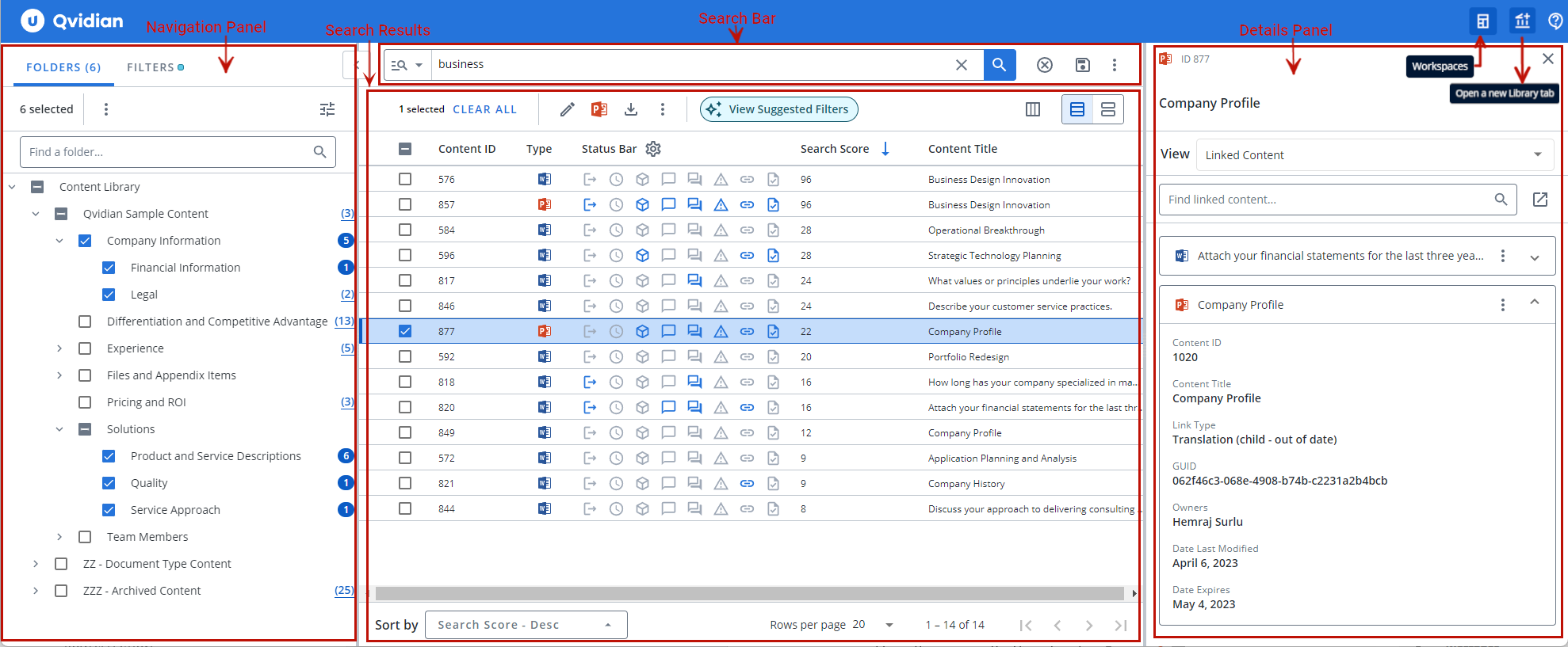
Sample Library page. To the left, Navigation panel with Folders and Filters tabs. In the middle, Search Bar and Search Results. To the right, the Details panel showing the Linked Content information.
Library User Interface: Click-through Demo
Navigation panel
The Navigation panel is located to the left of the Library page and contains the Folders and Filters tabs. The Folders tab lists the folders in the library that organize and contain the library content records. The Filters tab lists the Standard filters and Suggested filters. You can search and apply filters from a list of standard filters. You can activate and deactivate filters to refine your search results. Suggested filters are filters recommended by the Library to differentiate the search results. Upland Qvidian Library analyzes your search results and recommends filters based on the custom metadata fields.
 Folders tab
The Folders tab shows the library folders in a tree structure. You can select the folders you want to search or view all files in the folders. The number of items in a folder are shown in parenthesis beside the folder name. After running a search the folders that contain a search term can be easily identified by the blue bubble with the number of records in the folder containing the search terms. You can change folder settings to auto-select subfolders and auto-run a search when you select a new folder. You can also find folders by searching for them.
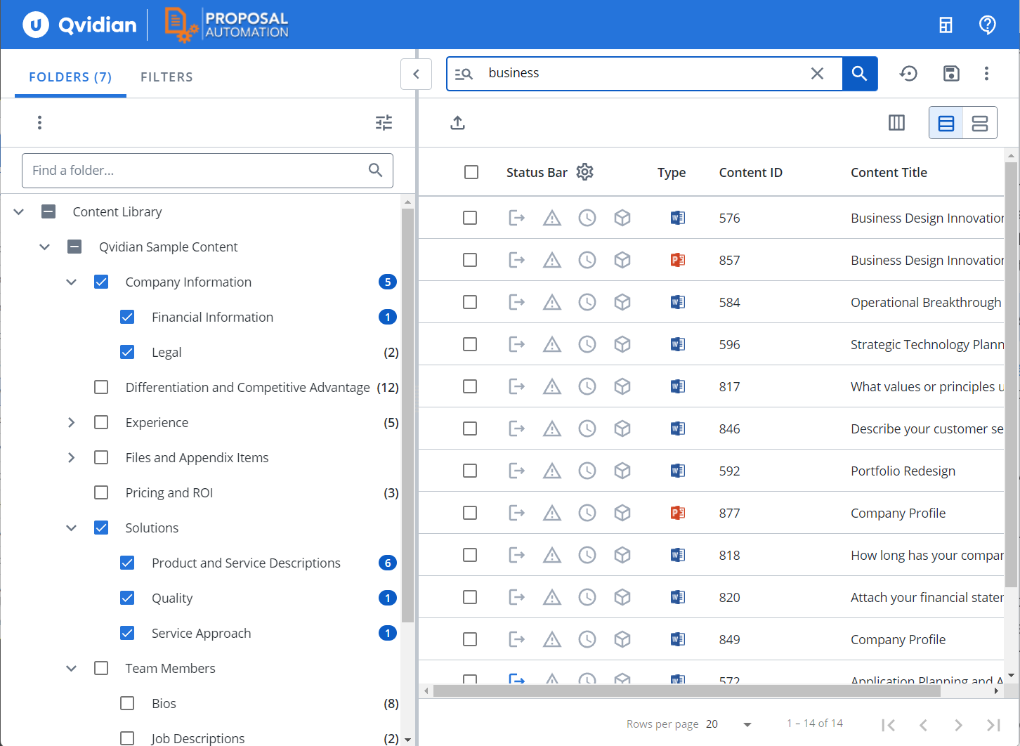
Example of the Folders tab showing selected folders with search results for the search term "business" .
Note: The "Auto-Select Subfolders" option will be enabled for any users that do not currently have a preference set or have reset their preferences.
Tip: To learn more about browsing the folders, see Browse the Library Folders.
Filters tab
The filters tab allows you to select and apply common filters based on content record properties and refine the search results. You can filter records based on record fields that match specific values. You can apply multiple filters and the records in the search results would satisfy all the filter conditions.
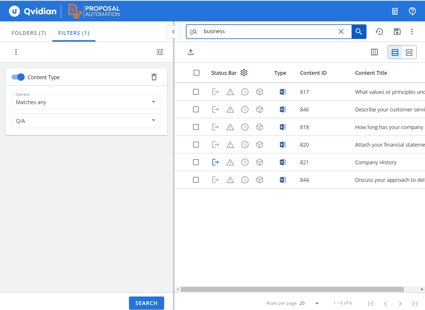
Example of the Filters tab further refining the search results to only display the Question and Answer (Q/A) type records.
Tip: To learn more about narrowing your search results by applying filters, see Filter the Search Results.
Search Panel
The Search panel is in the middle of the Library page. It contains the search bar at the top and the search results are displayed below the search bar. The search results section displays the content records returned by a search in a grid view by default. You can switch between the grid view and the card view. The search bar area contains:
- Clear folder selections, filters, search terms: Use this button to clear currently selected folders, applied filters, search terms, and search results. You get a fresh library page to perform a new search.
- Saved Searches: Use this menu to save a search or update an existing saved search.
- More Options Menu: Use this menu to configure your search settings, download Word or PowerPoint style templates, or download merge code lists.
Details Panel
The Details panel is context sensitive and displays the properties of a content record you select from the search results list, such as: Content Summary, Feedback, Library References, Linked Content, Preview, Review Job History, Revisions, Similar Content, and Usage. The Details panel does not display by default; to open the display panel either double-click the content record or select More Options> Open Details Panel. You can change the property to display from the View dropdown list. The Details panel is re-sizable and auto-adjusts to fit the content displayed. The Content ID and Title of the selected record display at the top of the Details panel. To close the panel, click X at the top right of the panel.
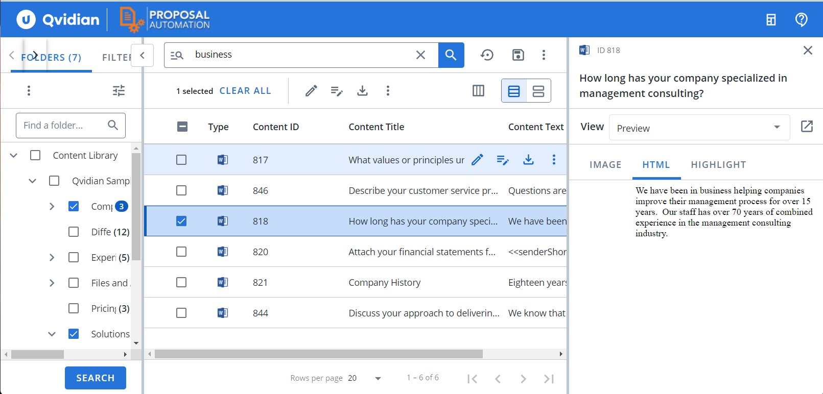
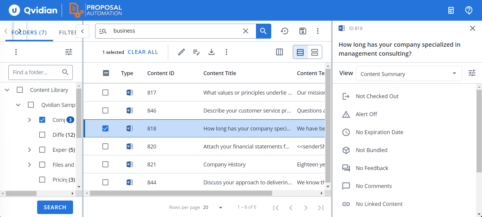
Examples of the Details panel: the Preview (left) and Content Summary (right) View of a content record.
Next tasks:
Now that you are familiar with the library, you can