Display Format Options
There are several display format options available for selection when creating a Report.

|
|

|
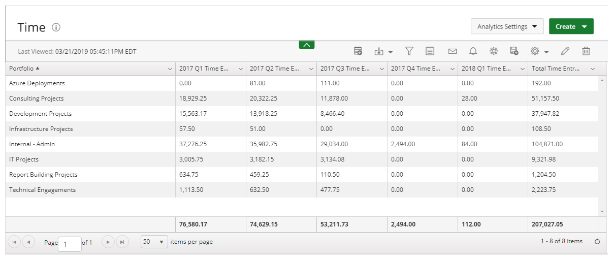
Pivot |

|
Bar |

|
Stacked-Bar |

|
Line |

|
Pie |

|
Radial Gauge |

|
Scatter |

|
Bubble |

|
Motion |

|
Heatmap |

|
Radar |

|
Area |

|
Waterfall |

|
Sunburst |

|
KPIs | 
|
Gantt |
1. Report
Report: Most commonly used to summarize your data fields within a summary or pivot format.
The following Dimensions are available for a Summary Format:
- Columns
- Filters
2. Pivot
Pivot Table: A Pivot Table is an interactive way to quickly summarize large amounts of data.
The following Dimensions are available for a Pivot Format:
- Columns
- Filters
- Rows
- Measures
3. Bar
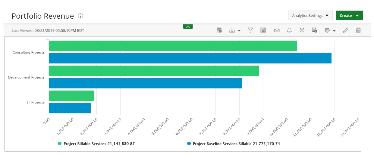
Bar Graph: Presents your data in either horizontal or vertical bars to show comparisons of your data fields.
The following Dimensions are available for this Display Format:
- Data Points
- Data
- Filters
4. Stacked-Bar
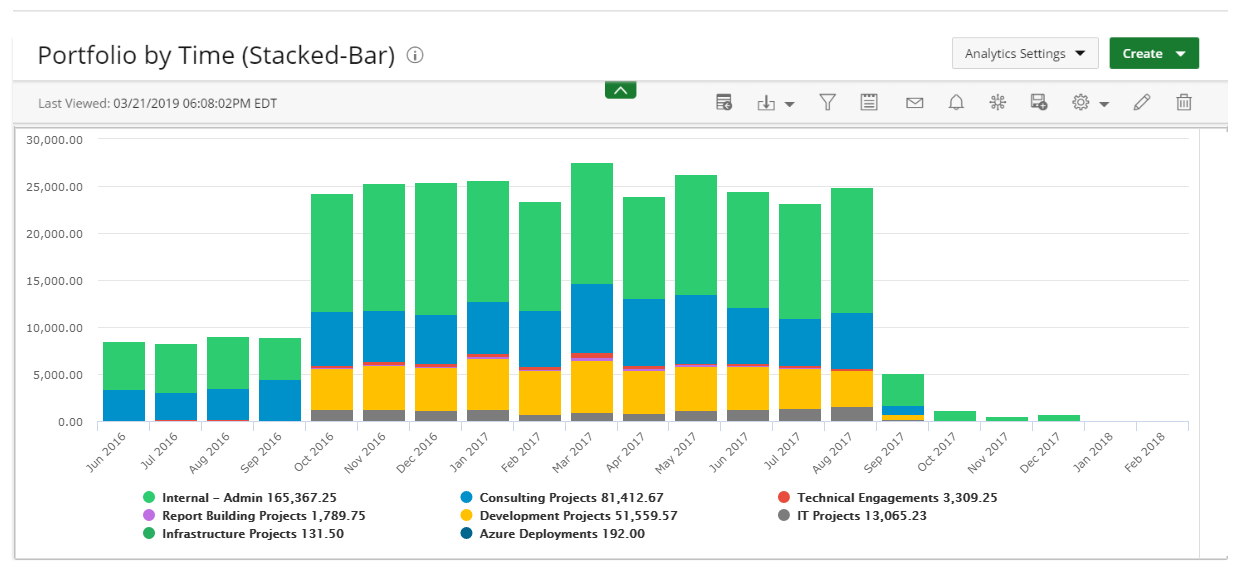
Stacked-Bar Graph: Compares your data fields to the whole and are divided into categories.
The following Dimensions are available for this Display Format:
- Data Points
- Data
- Stack Data By
- Filters
5. Line
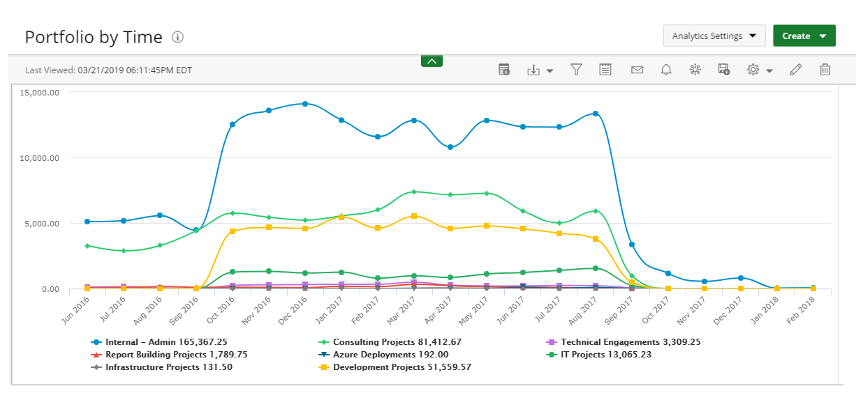
Line Graph: Displays your data within a series as points connected by straight line segments on two axes and helps determine the relationship between two sets of values.
The following Dimensions are available for this Display Format:
- Data Points Data
- Data
- Group By
- Filter
6. Pie
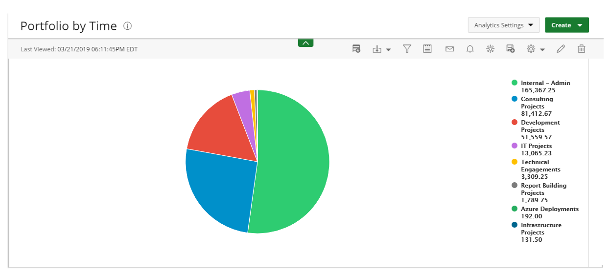
Pie Graph: Displays your data in percentages of several data fields divided in several portions to show related information.
The following Dimensions are available for this Display Format:
- Data Points
- Data
- Filters
7. Radial
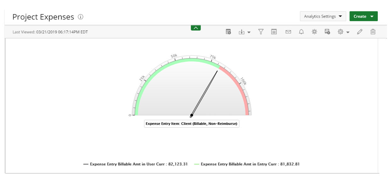
Radial Gauge: Presented in a semi-circular scale with a needle indicator that displays the maximum value of your data or key performance indicators (KPIs).
The following Dimensions are available for this Display Format:
- Data Points
- Data (Pointer)
- Data (Range)
- Filters
8. Scatter
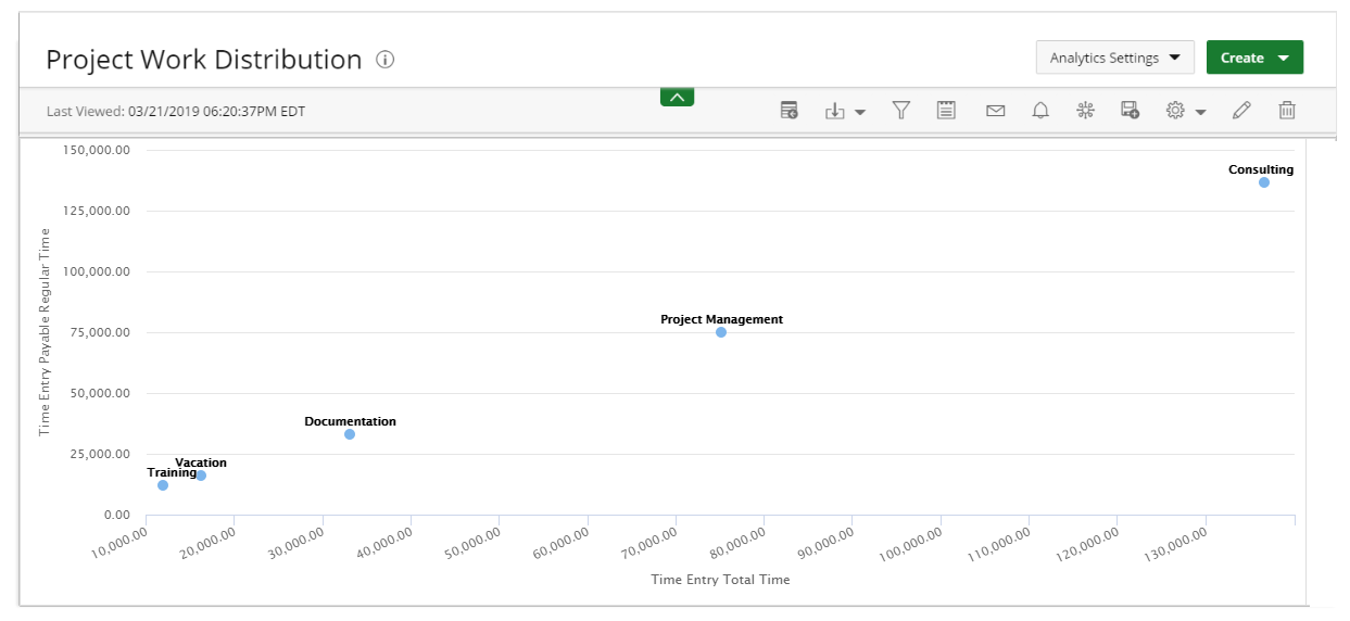
Scatter Chart: Displays two data fields as a collection of points each having one coordinate on the horizontal axis and one on the vertical axis.
The following Dimensions are available for this Display Format:
- Data Points
- Data (X-axis)
- Group By (Y-axis)
- Filters
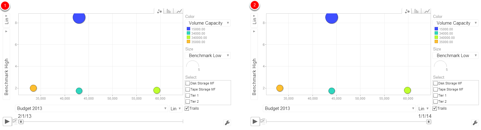
9. Bubble
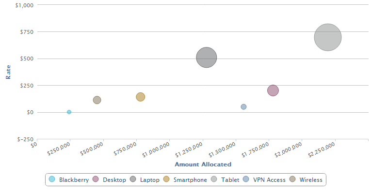
Bubble Chart: Displays the relationship between three data fields.
The following Dimensions are available for this Display Format:
- Data Points
- Data (X, Y, Size)
- Filters
10. Motion
Motion Chart: A dynamic display that is used to explore several data fields over time.
The following Dimensions are available for this Display Format:
- Data Points
- Filters
- Year - Column type: 'number'. Example: 2008. Month, day and year - Column type: 'date'; values should be javascript Date instances. Week number-
- Column type: 'string'; values should use the pattern YYYYWww, which conforms to ISO 8601. Example: '2008W03'.
- Quarter - Column type: 'string'; the values should have the pattern YYYYQq, which conforms to ISO 8601. Example: '2008Q3'.
11. Heatmap
Heatmap: An interactive display that is used to view the total cost consumption in different sizes and colors.
The following Dimensions are available for this Display Format:
- Data Points
- Data (size of rectangle)
- Group By (color of rectangle)
- Filters
12. Radar
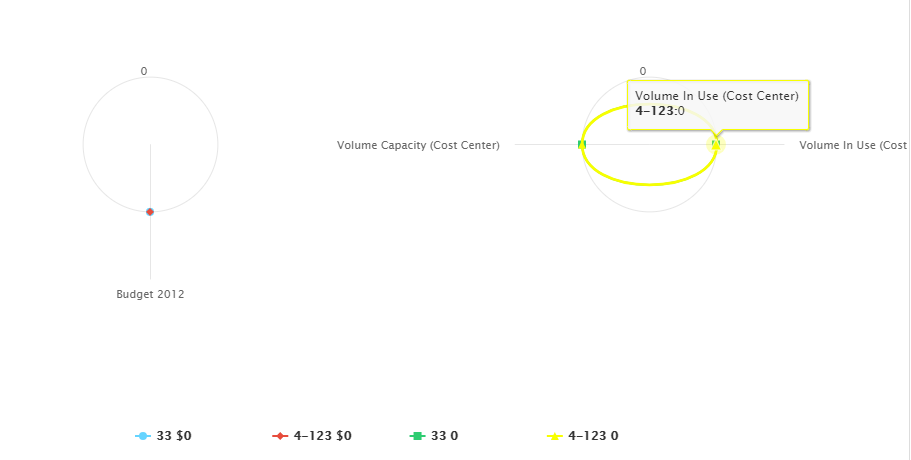
Radar Graph: A Radar Graph displays a series as a circular line or area.
The following Dimensions are available for this Display Format:
- Data Points
- Data
- Filters
13. Area
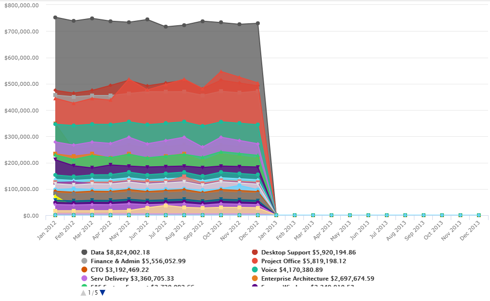
Area Graph: An Area Graph is basically a line chart, but the space between the x-axis and the line is filled with a color or pattern. It is useful for showing part-to-whole relations.
The following Dimensions are available for this Display Format:
- Data Points
- Data
- Group By
- Filters
14. Waterfall
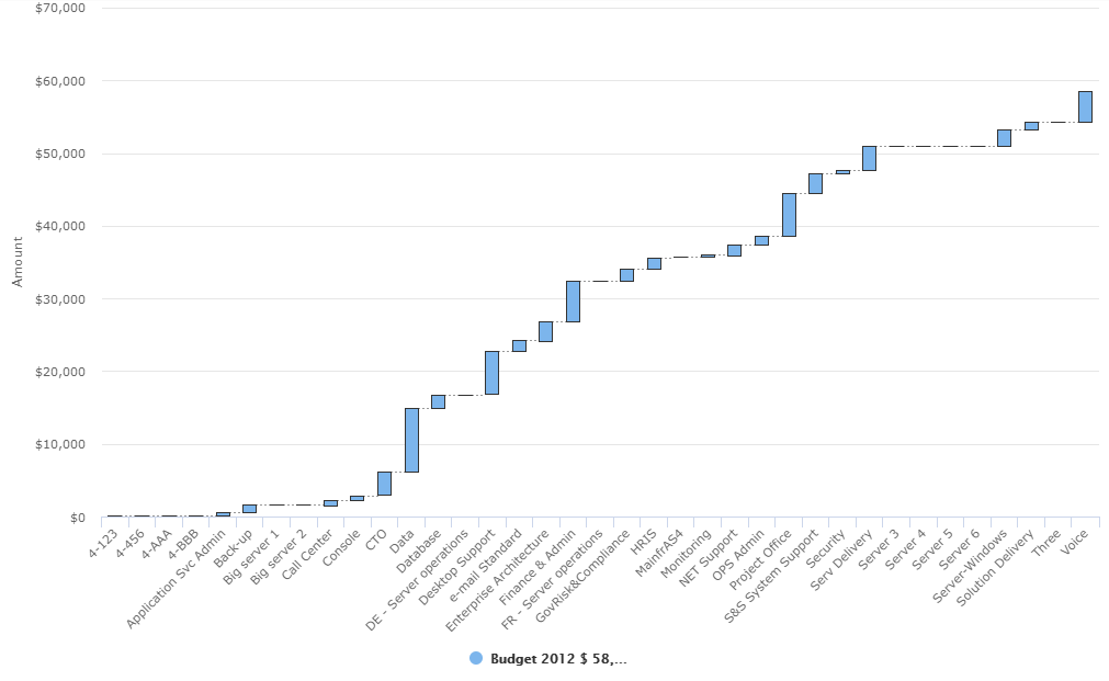
Waterfall Chart: A waterfall chart is a type of bar graph, similar to a Stacked-Bar chart except that bars don't overlap and the origin of each bar starts where the previous bar ended, allowing negative values to be readily depicted.
The following Dimensions are available for this Display Format:
- Data Points
- Data
- Filters
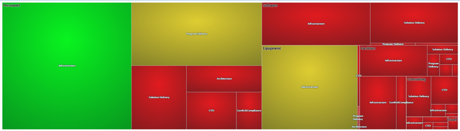
15. Sunburst
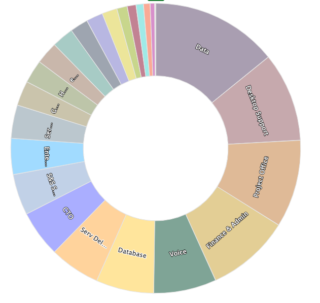
Sunburst: The Sunburst chart is ideal for displaying hierarchical data. Each level of the hierarchy is represented by one ring or circle with the innermost circle as the top of the hierarchy. A sunburst chart without any hierarchical data (one level of categories), looks similar to a doughnut chart.
The following Dimensions are available for this Display Format:
- Data Points
- Data
- Filters
16. KPI
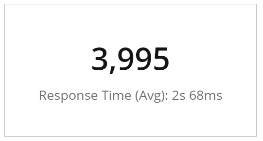
KPI: A Key Performance Indicator (KPI) is a measurable value that demonstrates how effectively a company is achieving key business objectives. Organizations use KPIs to evaluate their success at reaching targets. Selecting the right one will depend on your industry and which part of the business you are looking to track. Each department will use different KPI types to measure success based on specific business goals and targets.
The following Dimensions are available for this Display Format:
- Measures
- Filters
17. Gantt
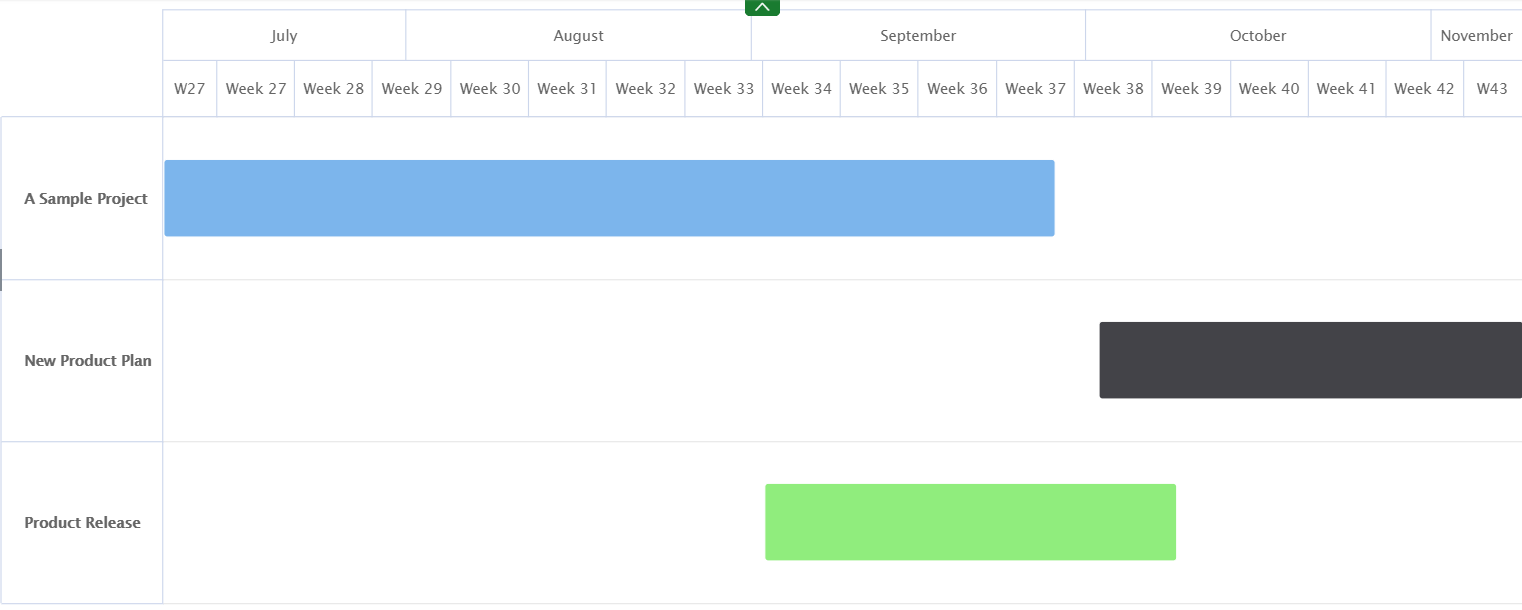
Gantt: A Gantt chart is a type of bar chart that illustrates a project schedule. This chart lists the tasks to be performed on the vertical axis, and time intervals on the horizontal axis.
The following Dimensions are available for this Display Format:
- Data Points
- Filters
Menu