Tenrox 2019 R1 SP4 - Product Enhancements
The Product Enhancements herein are minor enhancements added to 2019 R1 SP4
- Customer Requests / Enhancement Requests
- Leave Request
- Mobile
- Upland Analytics
- Organization Breakdown Structure (OBS)
- Resource Management
- REST API/SDK
2019R1SP4-1398.13.06.2019.V1.EB
Note:
- Expand/collapse icons (+/-) appear next to titles that contain a container with content. A plus (+) icon means that the container is collapsed and the content is hidden from view. A minus (-) icon means that the container is expanded and the content is visible under the title.
- You can also expand (
 ) or collapse all (
 ) containers to view or hide all content. Click on
  to expand all containers, making all hidden content visible or click on
  to collapse all containers, hiding all content.
 - This page could be updated as new information becomes available.
Customer Requests / Enhancement Requests
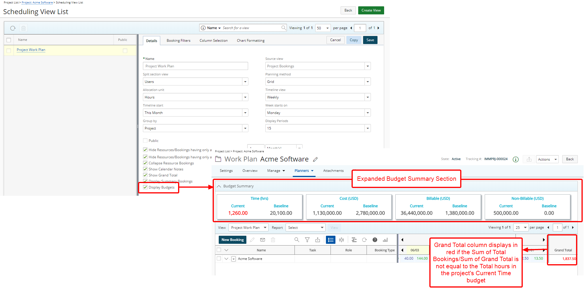
Description: The new section Budget Summary can now be added on top of the Project Work Plan upon selecting Display Budgets when editing or creating a new View for the Project Work Plan. When the section is expanded, you can see the Project Time, Cost, Billable and Non-Billable information.
Upon selecting Show Grand Total and Display Budgets options, The Grand Total column will then include the Sum of Grand Total of all bookings on the entire project when the Work Plan is in Group by Project display and will show in red if the Sum of Total Bookings/Sum of Grand Total is not equal to the Total hours in the project's Current Time budget.
Benefit: Users can now easily access and view the budgeted hours as well as a sum of the total planned hours within the Work Plan.
Note:
-
The new Display Budgets option will be available when editing the details of a View, if the Budget License was granted.
-
If Budget License is granted but the Billing or Cost licenses are not enabled, then the Display Budgets option will be available when editing the details of a View, however the Budget Summary section will only contain the parts that are licensed.
-
The Display Budgets option, available only for the Project Work Plan, is cleared by default.
-
Upon selecting FTE as the Allocation unit at the Workforce Planning System settings, the Sum of the Grand Total of all bookings will not be displayed on the project header.
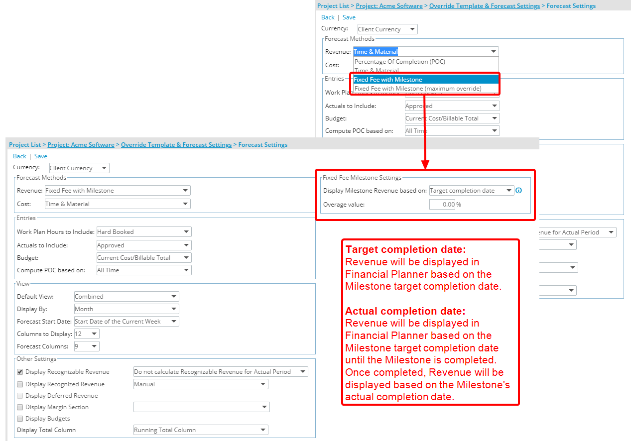
Description: Fixed Fee Milestone Settings has been added to the Forecast Settings page available only when either the Revenue Methods Fixed Fee with Milestone or Fixed Fee with Milestone (maximum override) option is selected either at the Project Level or Company level.
Fixed Fee Milestone Settings include:
-
Display Milestone Revenue based on, with the following options
- Target completion date: Selecting Target Completion Date will base the Revenue on the Target completion date.Note: Target completion date is selected by default for all existing Financial Planners settings (default behaviour in previous version of Financial Planner).
- Actual completion date: With the selection of Actual completion date, the Revenue will be based on the Target completion date until the Milestone is completed upon which it will be based on the Actual completion date.
- Overage value: The Overage value setting, previously located under Forecast Methods section as an unlabeled box directly associated with the Fixed Fee with Milestone (maximum override) option, was moved to the Fixed Fee Milestone Settings section.
Benefit: This eliminates the need to change the Target Completion Date manually when a Milestone is Completed
Note: If the Billing Milestone Currency is different from the Base Currency, regardless of which Fixed Fee Milestone Settings option is selected, the amounts calculated and displayed will take the Exchange rate into consideration.
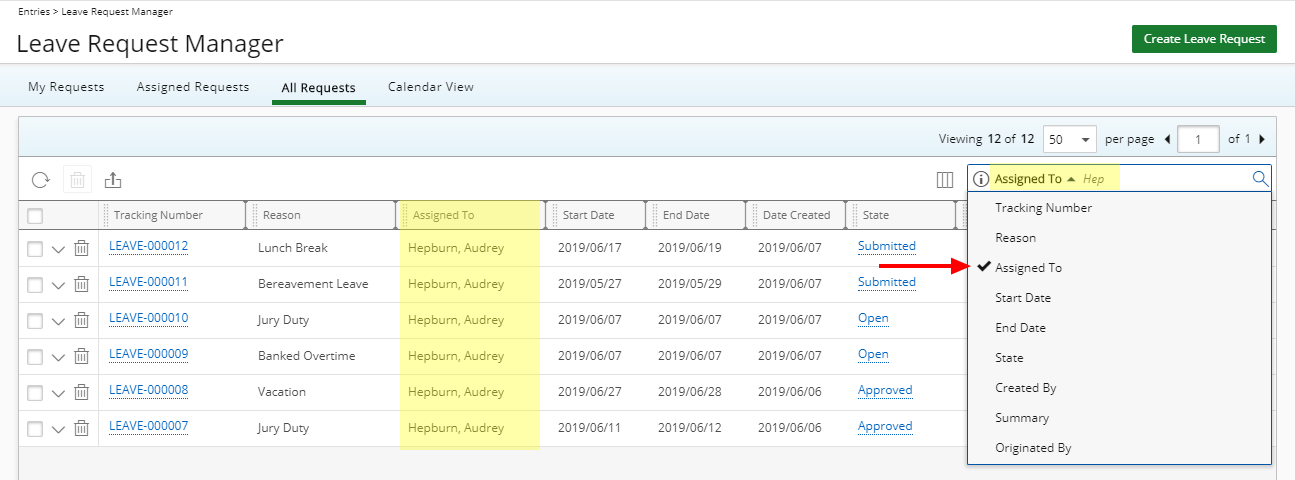
Description: With the addition of the option to search for Leave Request(s) based on the Assigned To Search Criteria it is now possible to easily find the Leave Requests assigned to a specific user.
Benefit: Users can perform searches on more items in Tenrox, based on full or partial entries.
For more information on:
- Available Options from the Leave Request Manager (Entries) click here.
Description: The following Live Link email notification parameters are now available for users bypassing SSO login:
%EXPENSEREPORT_LINK_NOSSO%%INVOICE_LINK_NOSSO%%WORKFLOWENTRY_LINK_NOSSO%
Benefit: Users who are not part of a company’s domain can now click either on the Expense Report, Invoice or Workflow Entry Live Link in an email notification to access the alternative login page. Upon using their Tenrox credentials they will be redirected to the Expense Report, Invoice or Workflow Entry pages.
For more information on:
- Email Notification Parameters, click here.
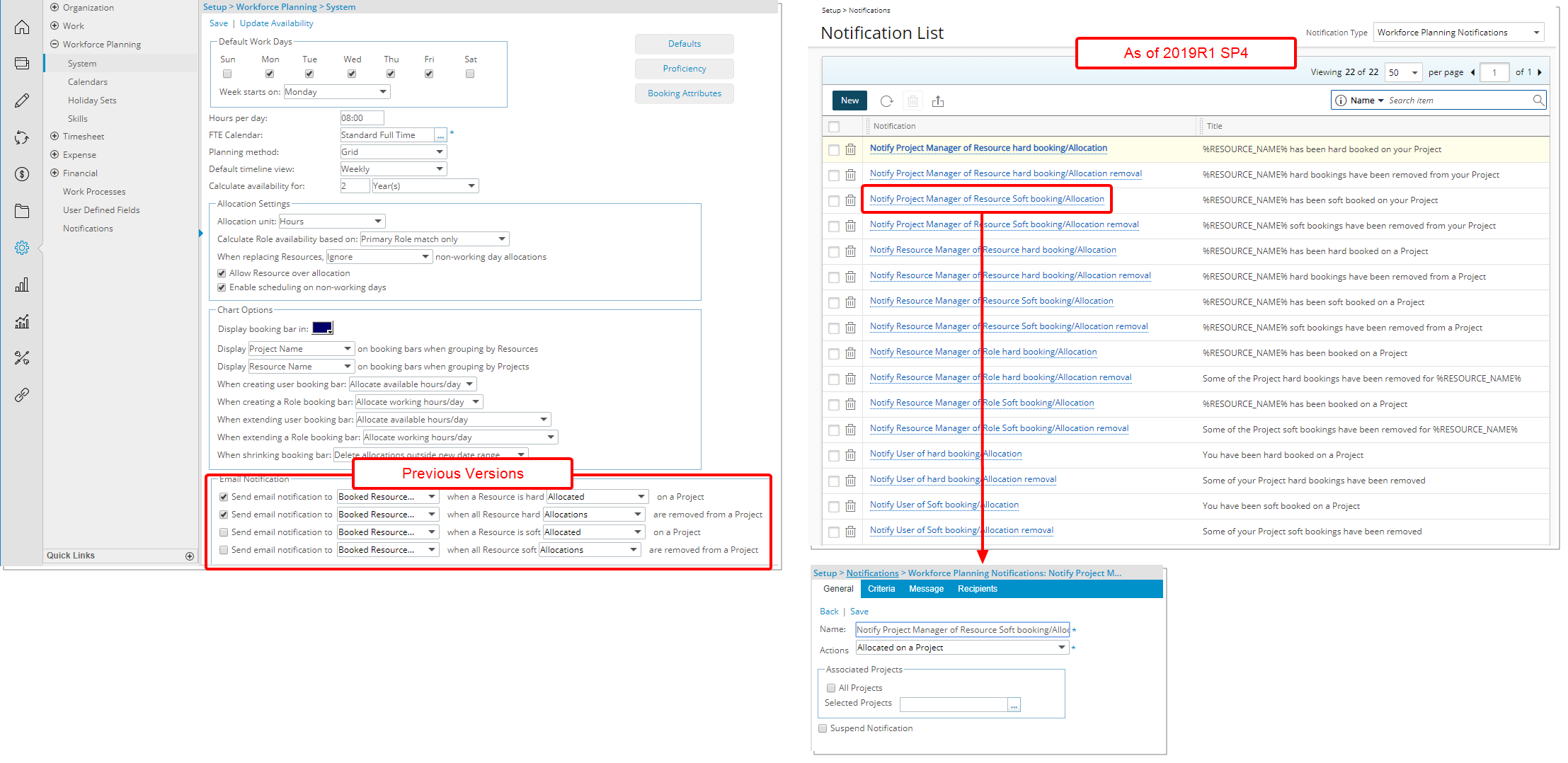
Description: The accessibility and management of Resource Planning Notifications has been relocated to a centralized location (Setup > Notifications). Selecting Workforce Planning Notifications, as the Notification Type, will open the Workforce Planning Notifications page. From this page you may Create, Edit, Delete and configure Workforce Planning Notification at the system level, improving the User experience with the reduced need to navigate to different pages to access and manage notifications as they now fall under one centralized area. Moreover, having a system level Resource Planning Notification allows for it to be used across multiple projects, reducing the effort to create the same notification multiple times.
- From within the General tab choose the general options such as the Action(s) (Allocated on a Project, Booked on a Project, Allocations removed or Bookings removed) and then choose to apply the Action(s) either on All Project or selected Projects.
- From the Criteria tab you select the Criteria that trigger the Email Notification. In addition to any associated Project UDFs, and any defined Custom Booking Attributes the following options are available: Project Name, Project Id, Project Code, Project Manager, Project Start, Project End, Project Health, Project Parent, Project Is Active, Project Priority, Project state Attribute, Project state, Client Name, Client Id, Portfolio Name, Portfolio Id, Portfolio Code, Portfolio Manager, Task Name, Task Id, Task Start, Task End, User Name, User Id, Master Site, Active Site, Primary Role, Alternate Role, Role Name, Role Id, Booking Start, Booking End, Booking Role, Booking Role Id, Booking Type, Booking Is Billable, Booking Allocation Hours, Total Allocated Hours, Hard Booked Hours, Billable Hard Booked Hours, Soft Booked Hours, Billable Soft Booked Hours, Resource Group Name, Resource Group, Resource Group Manager, Role Type, Booking Role Type and Total Billable Allocated Hours.
- From the Message tab you customize the Message that will be sent when the Criteria is/are met.
- Recipients can be chosen within the Recipients tab, from the following options: Group Manager, Project Manager, User, Custom, Booked User, Resource Manager, Functional Manager and Portfolio Manager.
Because of this move, the Email Notification section under Setup > Workforce Planning > System has been deprecated.
Benefit: Improved User experience with the reduced need to navigate to different pages to access and manage the notifications as they now fall under one centralized area.
Note: Existing Booking Notifications are migrated to this new area upon the upgrade.
For more information on:
- Workforce Planning Notifications click here.
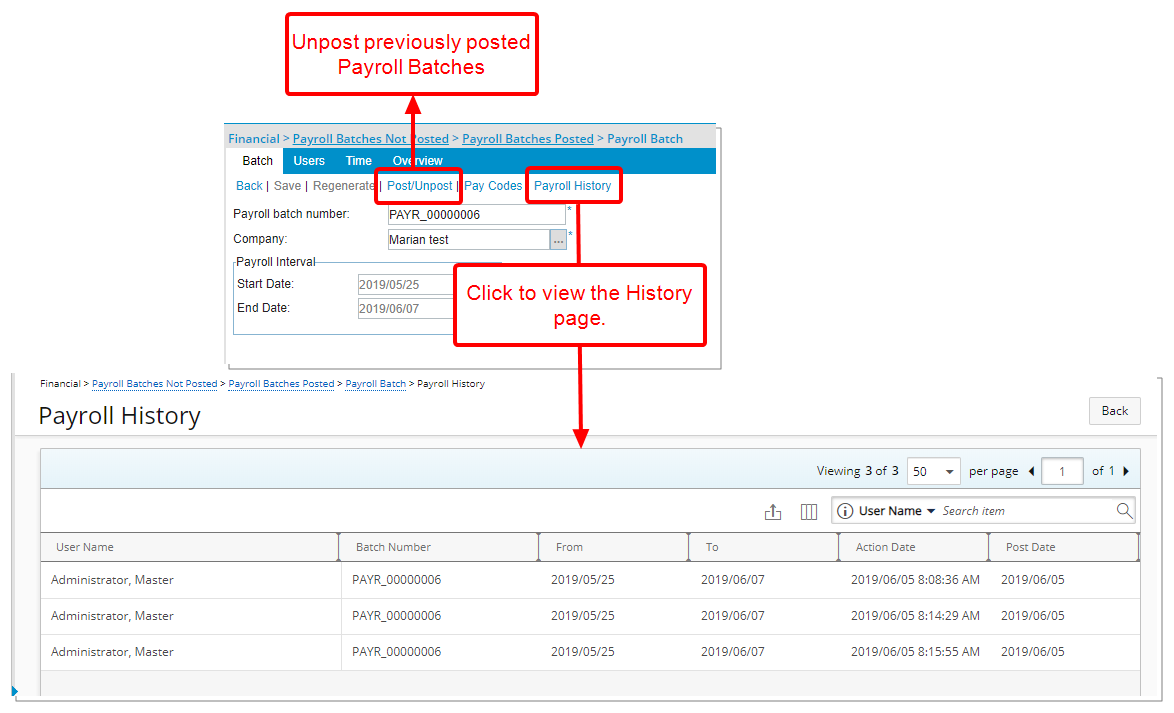
Description: It is now possible to Unpost previously posted Payroll Batches. The addition of a History page allows you to easily track the posting/unposting actions performed on a Payroll Batch.
Within the Payroll History page (accessed from Financial > Payroll Batches Not Posted > Payroll Batch > Payroll History), you can select the following Columns to view changes that were made and also to perform searches where necessary: Action, Action Date, Batch Number, Currency, From, Post Date, To, Total Hours, Total money charges Total net cost of Time, Total Payroll with Taxes and Deductions and User Name.
Benefit: Should there be any errors in the Posted Payroll Batches, they can easily be unposted allowing for necessary corrections to be made. An easy to use Export option allows you to export the History to excel for auditing purposes.
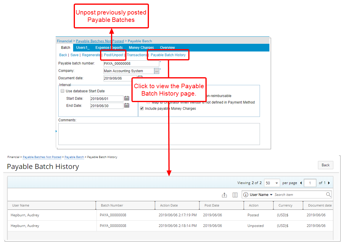
Description: It is now possible to Unpost previously posted Payable Batches. The addition of a History page allows you to easily track the posting/unposting actions performed on a Payable Batch.
Within the Payable Batch History page (accessed from Financial > Payable Batches Not Posted > Payable Batches Posted > Payable Batch > Payable Batch History), you can select the following Columns to view changes that were made as well as to perform searches where necessary: Action, Action Date, Batch Number, Currency, Document Date, From, Post Date, To, Total expenses, Total money charges, Total, and User Name.
Benefit: Should there be any errors in the Posted Payroll Batches, they can easily be unposted allowing for necessary corrections to be made. An easy to use Export option allows you to export the History to excel for auditing purposes.
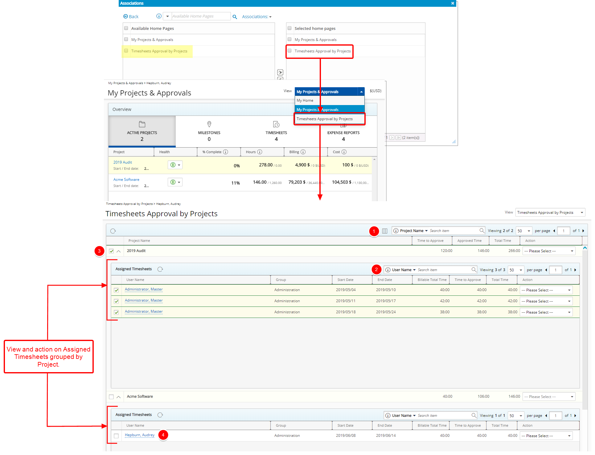
Description: From the Timesheets Approval by Projects Home Page View it is now possible to view and action on Assigned Timesheets grouped by Project.
The new Timesheets Approval by Projects Home page is by default not associated to any Security Profile. You can easily associate this Home page from the Associations page of a given Security Profile (Setup > Organization > System > Security > Security Profile: >Associations) the option will then be available to the Users when they navigate to their Home Page and click on View.
- From the Columns selection choose the columns you wish to display at the Project level such as Project Name, Time to Approve, Approved Time, Total Time, Action, Billable Approved Time, Billable Time to Approve, Billable Total Time, End Date, Project Code, Project Id and Start Date. You can perform search based on the following Search criteria: Project Name, Project Code or Project Id. Note: At the Project level, only the Project Name column is sortable.
- Within the Assigned Timesheets section, you can view the Username, Group, Start Date, End Date, Billable Time, Time to Approve, Total Time and Action columns and perform a Search based on User Name or Group criteria.
- Simply mass approve all Timesheets by Project by selecting the Project and then actioning at the Project Level or by selecting an individual Timesheet and actioning at the Assigned Timesheets level.
- Should the need arise, you can easily click on a User Name and access the individual Timesheet for further details.
- Upon approving all assigned Timesheets associated to a Project, the Project will be removed from the list.
Benefit: Timesheets Approval by Projects Home Page View allows the Project managers to quickly and easily view and Action on Time Entries against their Projects without the need to open User Timesheets.
Note:
- The Timesheets Approval by Projects Home page View is by default not associated to any Security Profile.
- When an assigned Timesheet contains already approved Time Entries by the logged user, an icon will be displayed next to the User Name. Upon hovering over the icon, you can readily see the Approved Time and Rejected Time.
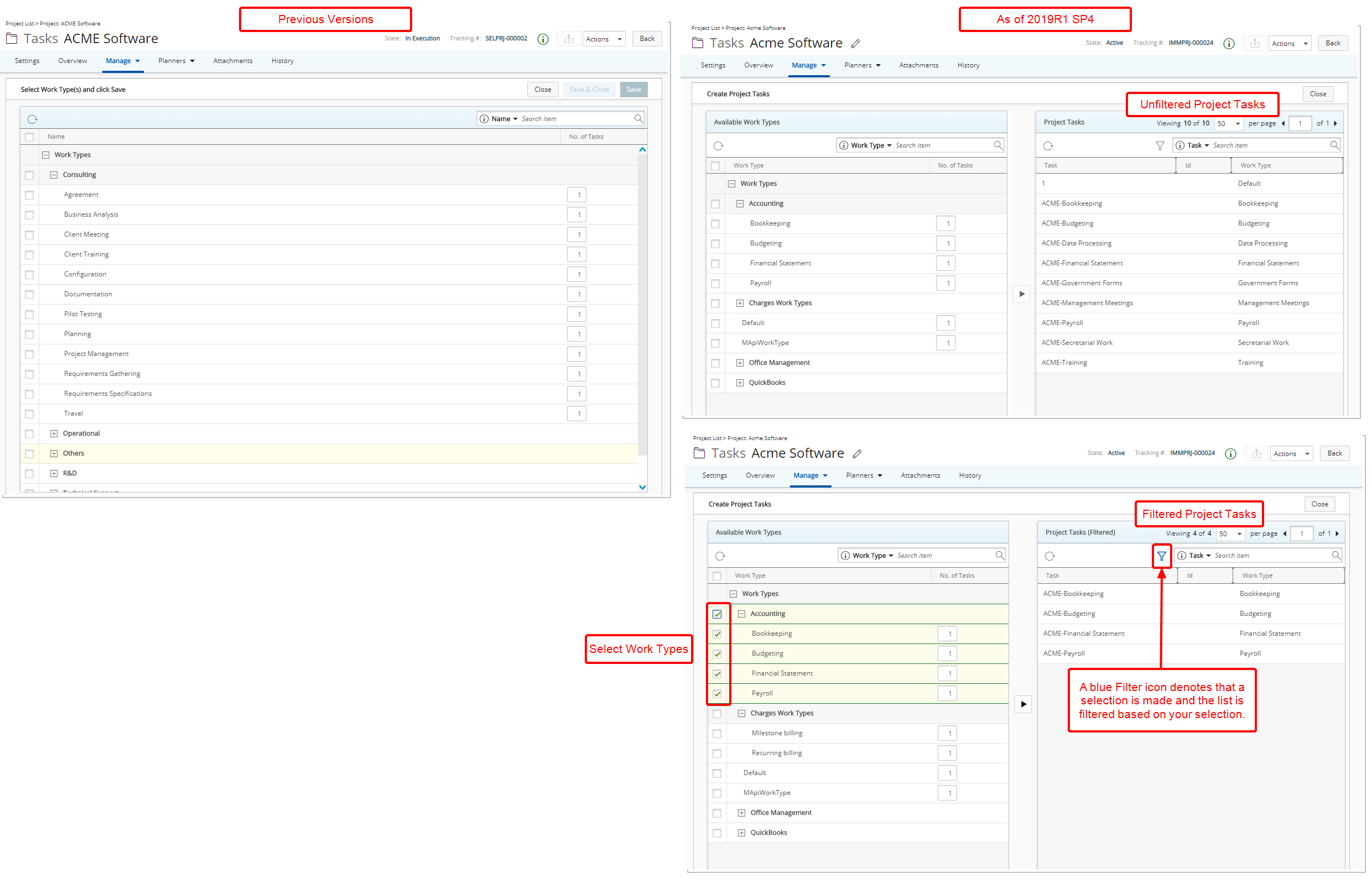
Description: The layout of the Create Project Tasks page, under Project Edit, has been further improved to allow users to see which Tasks have already been added to the Project.
Users can select from the Available Work Types table, found on the left side of the page, which is displayed in a tree structure, click the Create Project Tasks button, and the selection(s) is/are added to the Project Tasks table on the right side. The Project Tasks table includes the Name, Id and Work type columns.
Upon selecting an Available Work Type from the left section, a filter based on the selected Work Type(s) is/are applied to the Project Tasks. Note that the Filter icon changes to blue and the section header reads Project Tasks (Filtered). When the Filter is on, upon searching for a Project Task, the search will return only the filtered Task list. You can easily remove the filter simply by clicking on the Filter icon.
The Project Tasks are saved upon clicking the Create Project Task Button (arrow), as a result the Save and Save And Close buttons are deprecated.
Furthermore, the page title was renamed from Select Work Type(s) and click Save to Create Project Tasks.
Benefit: Users can now see which Tasks have already been added to the Project.
Note: The Add button to create Project Tasks will remain dimmed until a Work Type is selected from the Available Work Type section.
For more information on:
- Creating Tasks through the Project Edit click here.
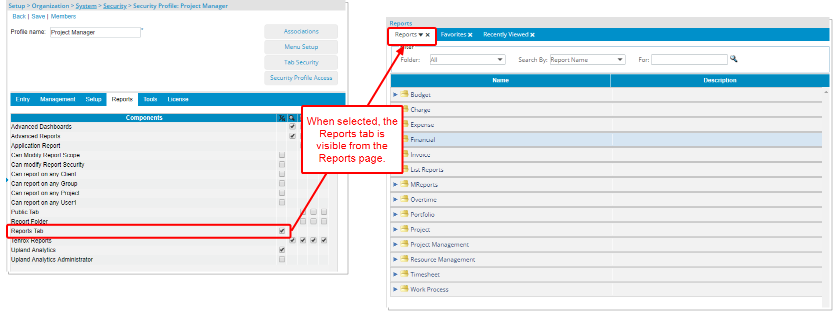
Description: A new Security Profile Component; Reports Tab, has been added to Setup > Organization > System > Security > Security Profile: > Reports, giving the option whether or not to show the main Reports tab. When selected, the Reports tab will be visible from the Reports page.
Benefit: This security options allow for a more refined control over access to the Reports tab.
Note: The Reports tab option is checked by default for all existing security profile(s) and unchecked for newly created Security profile(s).
For more information on:
- Granting the security access to the main Reports tab click here.
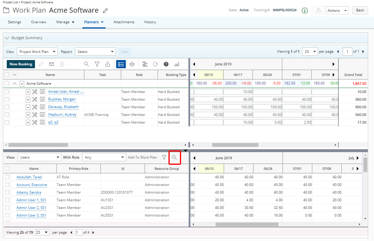
Description: A Search option is added to the bottom section of the Work Plan allowing you to Search by name within the selected View for Users, Roles, Projects, Matching Resources, Project Team Members, Group Members etc depending on the Work Plan being used.
Furthermore, any filters applied to the bottom section of the Work Plan is remembered upon navigating away from the page and will be automatically reapplied on subsequent visits until modified.
Benefit: Users can perform searches on more items in Tenrox, based on full or partial entries.
When copying a View from the Work Plans such as My Work Plan, Resource Scheduling and Project Scheduling all configurations from the Filters, Booking Filters as well as the Chart formatting tabs are now copied from the source View to the copied View.
Description: The default placeholder text “No available Transitions” is now displayed when no Actions are available for the logged User, clearly identifying it within the Project, Project List, Expense Manager and Leave Request Manager pages.
Benefit: It is now clearly identified that no Actions are available for the logged User within the Project, Project List, Expense Manager and Leave Request Manager pages.
For more information on:
- Transitioning a Project through the Project List click here.
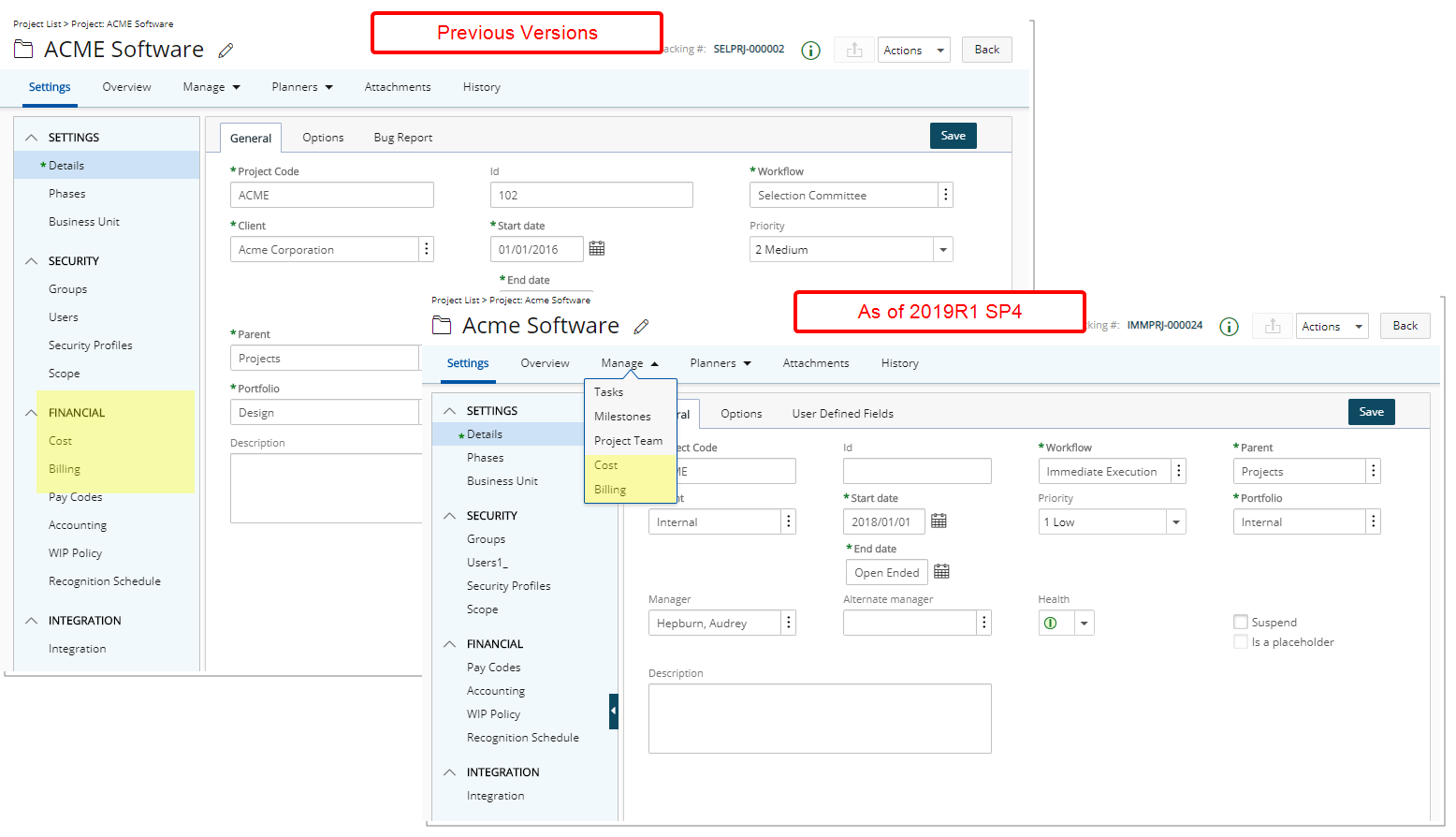
Description: The Cost and Billing menu items previously accessible through the Project Edit left menu, under the Financial heading, have been moved under the Manage tab.
Benefit: One can work on a project more efficiently with the easy access to Project Cost and Billing pages by simply hovering over the top menus.
Note: The Cost and Billing links will be hidden from view for Placeholder Projects.
For more information on:
- The Cost and Billing menu items click here.
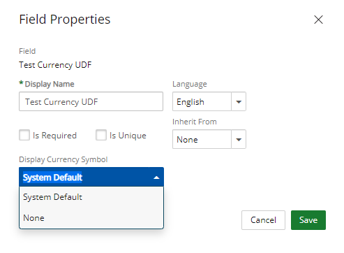
Description: When associating UDFs of Type Currency, it is now possible to choose whether to show or hide the Currency Symbol on the associated page.
The available options are None and System Default. When System Default is selected the Currency Symbol will remain visible and when None is selected the Currency Symbol will be hidden from view.
Benefit: Users can now choose whether to have the Currency symbol displayed for UDFs of Type Currency.
For more information on:
- How to hide the Currency Symbol on the associated page when associating UDF(s) of Type Currency click here.
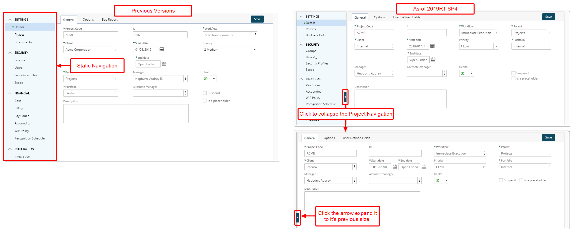
Description: The Project navigation menu can now be completely collapsed, thus allowing for optimal usage of the available space. Upon collapsing the menu, your choice will be remembered until navigating away from the Project Edit.
Benefit: By collapsing and hiding the Navigation Menu Users can now take advantage of the extra available space.
Note: You can easily expand the Project navigation menu simply by clicking the arrow button again.
For more information on:
- The Improved left hand side Project navigation menu click here.
Description: A fourth Layout column has been added to the User Defined Fields layout for the Project.
The Project Details General, Options, and User Defined Field tabs now have a four-column layout. The spacing of various elements on these tabs have been further improved to accommodate for the additional column.
For more information on:
- Associating User Defined Fields click here.
Leave Request
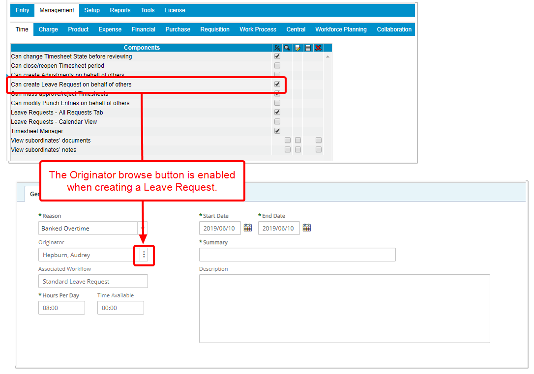
Description: A new Security Profile Component; Can create leave request on behalf of others, has been added to Setup > Organization > System > Security > Security Profile: > Management (1st tier tab) > Time (2nd tier tab), giving the option to allow users to create Leave Requests for others.
Upon granting the Can create leave request on behalf of others right:
- The Originator browse button will be available when creating a Leave Request. You can click it to access the User List to choose an Originator.
Note: The Can create leave request on behalf of others option is enabled by default for the Administrator security profile and disabled for all other profiles.
Description: Addition of the following Email Notification Parameters within the Leave Request Workflow:
%WORKFLOW_ASSIGNED_USER%%WORKFLOW_CURRENT_STATE%%WORKFLOW_END_DATE%%WORKFLOW_START_DATE%%WORKFLOW_REQUEST_REASON%%WORKFLOW_HOURS_PERDAY%%WORKFLOW_TIME_AVAILABLE%
Benefit: Additional information can now be dynamically included in a Leave Request email notification.
For more information on: Email Notification Parameters click here.
Mobile
Several User Interface (UI) and User Experience (UX) improvements have been made, all intended to improve and update the look and feel of the app, and to elevate the user's experience with Tenrox Mobile. The improved look, Buttons, Options, Dialog Boxes, Icons, message bars and Search all fall in line with the upgraded standards.
For more information on: Tenrox Mobile click here.
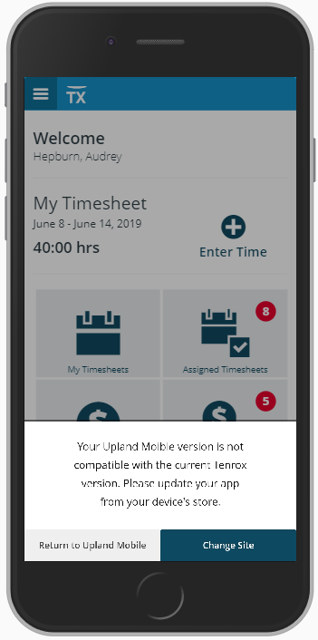
When accessing Tenox Mobile and upon selecting or adding a new Organization, the app will verify that the latest version of Upland Mobile has been installed.
- If the latest Upland mobile is not detected on your device, a message will be displayed informing you that “Your Upland Mobile version is not compatible with the current Tenrox Version. Please update your app from your device’s store.” You will have the option to either: Change Site or to Return to Upland Mobile.
- If the latest Upland Mobile is detected on your device, you will be able to proceed and access the Overview screen.
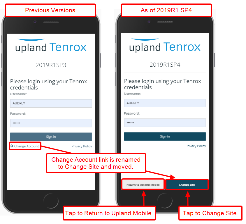
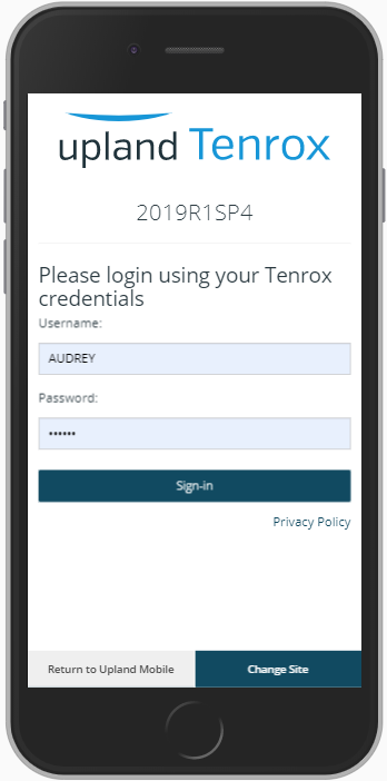
The interface of the login screen has been improved for a more streamlined and easier experience, in keeping with the UplandOne standards.
Furthermore, the improved login screen allows users to quickly login, change site or return to the Upland Mobile screen.
- The Change Account link previously located under the login button was renamed to Change Site and moved to the bottom right corner of the screen as a button.
- The Return to Upland Mobile button has been added to the left of the Change Site, allowing users to readily access the Upland Mobile screen at any time.
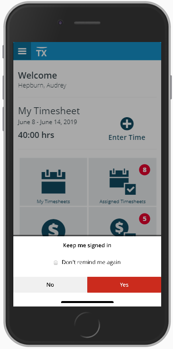
A confirmation box appears upon login, where you can confirm whether to be kept logged in to your organization or not with an option not to be reminded again.
- Upon selecting Yes, you will be automatically logged in to the Tenrox mobile App the next time you access your organization on your device provided you do not log out of the app by clicking Logout. The confirmation box will no longer appear.
- Upon selecting No, your session will expire on the device after the current use and the next time you open the Tenrox app you will be redirected to the last visited organization Login Screen and you will be prompted to enter your credentials. The confirmation message box will then appear, prompting you to choose whether to be kept logged in or not, with the option not to be reminded again.
- Upon selecting No and choosing Don’t remind me again, your session will expire on the device after the current use and the next time you open the Tenrox app you will be redirected to the last visited organization Login Screen and you will be prompted to enter your credentials. The confirmation message box will no longer appear.
Selecting Change Site: When changing site for the first time, you will be presented with the Keep me signed in confirmation box where you can choose to bypass the login screen or not. Depending on your choices you can refer to the steps 1-3 above. Upon any subsequent switching between sites your choices will be remembered.
Selecting Logout: Upon clicking Logout, your session will expire. Upon a subsequent login you will be required to enter your credentials and depending on your choices you can refer to the steps 1-3 above.
Note: SSO users will be presented the Organization list and their session will be remembered. Upon clicking Logout, the session will expire.
Decommissioned or suspended Users: Any current session will expire automatically for any Decommissioned or Suspended users and they will be kicked out of their organization.
Return to Upland Mobile: Upon clicking Return to Upland Mobile you will be presented the Upland Mobile landing page where you can select Tenrox Mobile. After selecting Tenrox Mobile followed by selecting an Organization, the next time you open the Upland Mobile app you will be logged in to your last visited organization provided you have opted to be kept signed in. Otherwise, you will be presented with the Login screen and prompted with the Keep me signed in confirmation box.
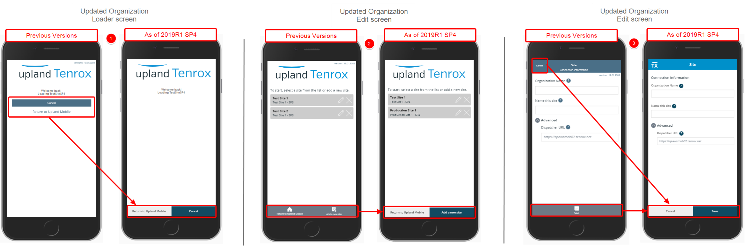
The improved Site list and Site Edit screens allow users to quickly login, change sites or return to the Upland Mobile screen.
- Changes to the Site list screen:
- The Create button has been moved to the bottom right corner.
- The Return to Upland Mobile button previously located under the Create button has been moved to the bottom left corner of the screen.
- Changes to the Site Edit screen:
- The look of the Add a new site button has improved.
- The look of the Return to Upland Mobile button has been improved.
- Changes to the Site screen:
- The Cancel link has been moved to the bottom left corner of the screen as a button.
- The Save button has been moved to the bottom right corner of the screen.
The last site that was accessed is remembered and automatically opened on subsequent access to the Mobile app until a different site is chosen and accessed.
Note:
-
You will be redirected to the Tenrox Sites list page where you can choose an Organization upon your next visit, if you tapped on Change Site but did not choose to access an Organization from the list.
- You will be redirected to the Upland Mobile apps list upon your next visit, if you tapped Return to Upland Mobile.
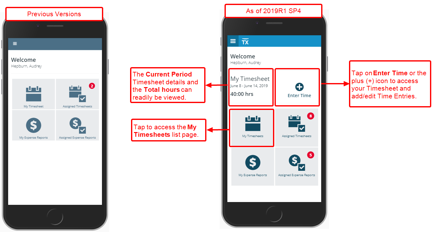
With the addition of My Timesheet section on the Overview page, immediately under the Welcome banner, the Timesheet Period readily available and the Total hours already entered for this period display.
You can now easily tap on Enter Time or the plus (+) icon to access your Timesheet and add/edit Time Entries.
Furthermore, My Timesheet button has been renamed to now read My Timesheets, which now opens the new My Timesheets list page.
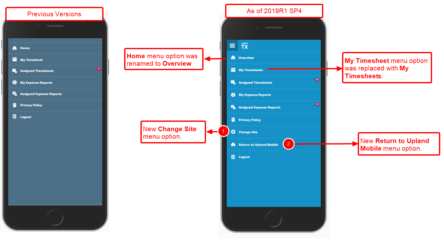
Two new menu option have been added to the Tenrox Mobile menu:
- Return to Upland Mobile: When tapped, you are redirected to the Upland Mobile screen while remaining logged in.
- Change Site: When tapped, you are redirected to the Site Loader screen where a new site can be added, or you can return to the Upland Mobile screen.
Furthermore, the Home menu option has been renamed to Overview. Upon clicking it the user is redirected to the Overview screen, while the My Timesheet menu option has been renamed to My Timesheets.
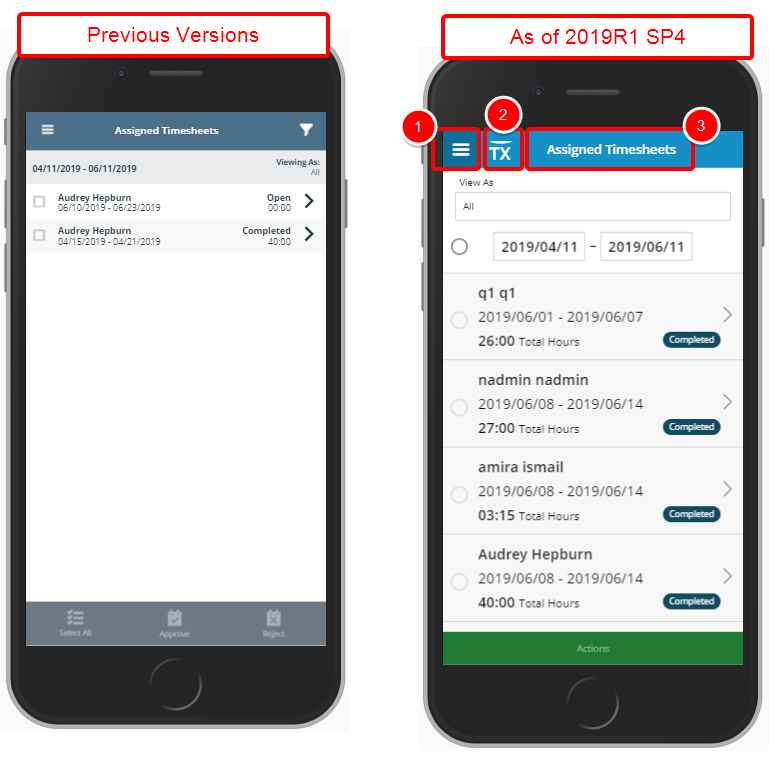
The top banner colour has been changed to that of the Upland blue, in keeping with the UplandOne standards. Furthermore, the following improvements are intended for a more streamlined and easier experience:
- The Navigation menu icon located at the top left corner of screens maintains a darker blue background contrary to the lighter blue applied to the rest of the top banner.
- The Tenrox logo icon has been added to the right of the Navigation menu icon.
- The page name is clearly identified, in bigger font size, at the top banner.
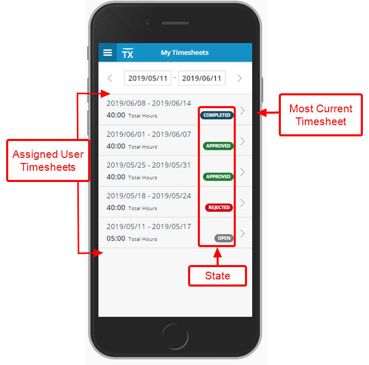
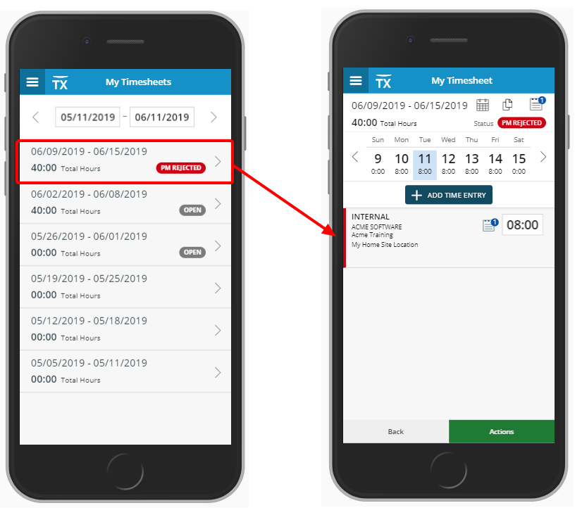
The new My Timesheets list page can now be accessed from the Overview screen or through the Menu by clicking My Timesheets. The My Timesheets list includes all assigned user Timesheets for the past month with the most current Timesheet period listed as the first item on the list. You can easily change the period by clicking on the date carousel.
The User Timesheet period date, State and Total Hours are clearly visible. Upon clicking on a period, the user can then access the My Timesheet page.
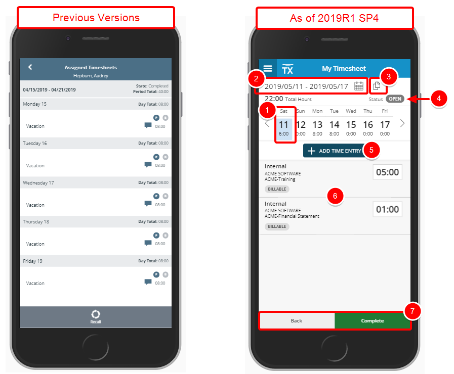
As a Timesheet Mobile user, you can now easily and quickly access and edit your Timesheet simply by clicking on a period from the My Timesheets list page.
- Upon accessing My Timesheet the current period is open and the Current Date is identified with a light blue background.
- The Timesheet period remains visible on the top of the screen. A calendar icon next to it allows users to access the date picker and select a different Time period.
- The new Copy Timesheet button is readily available next to the Calendar icon.
- The Status is displayed as a pill and is easily identified at a glance.
- By Tapping the Add Time Entry button you can easily enter time upon selecting the appropriate Client, Project and Task.
- Your Timesheet Assignments are listed and can easily be accessed.
- The Back and Complete buttons are located at the bottom of the screen
If you already have Timesheet Assignments:
- Your Timesheet Assignments will be listed on My Timesheet. Upon clicking a Timesheet Assignment, you are redirected to the Add Time Entry screen and the Client, Project Task as well as the Attributes will be shown pre-populated.
- Upon clicking Cancel, the time entries will not be saved, and you will be redirected to the My Timesheet screen.
- Upon clicking Save, the time entries will be saved, and you will be redirected to the My Timesheet screen.
If you don’t have any Timesheet Assignments:
- Simply pick a date from the Date Carrousel, tap the Add Time Entry button and upon selecting the appropriate Client, Project and Task, enter your incurred Regular time. You can then mark your entries as Billable or Payable, add any Notes and tap Save or Save + Copy to save your changes.
- Upon returning to the My Timesheet screen you will see your newly entered time for the selected day.
Note: A maximum of 25 Assignments are displayed. If the logged User has more than 25 Assignments, a message is displayed at the bottom of the list, informing them to tap Add Time Entry to search for more.
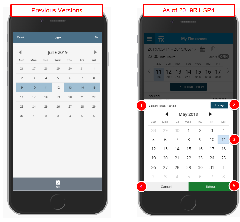
The layout, and color scheme of the date picker has been improved thought the application for a more streamlined and easier experience and in keeping with the UplandOne standards.
In addition to the improved layout, fonts and color scheme, the following improvements have been made:
- A title was added to the Date picker easily identifying its purpose.
- You can now easily go to the current date by tapping the Today button.
- The background of selected date is now in light blue.
- The Cancel button previously located on the top left corner of the screen was moved to the bottom left corner.
- The Set button was renamed to Select and moved to the bottom right corner of the screen.
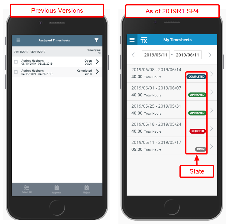
The layout, and color scheme of the Timesheet State has been improved for a more streamlined and easier experience and in keeping with the UplandOne standards:
The States are now displaced in a pill format and each has a distinct background colour for easy identification:
- Open State: Grey
- Submitted State: Navy blue
- Approved State: Green
- Rejected State: Red
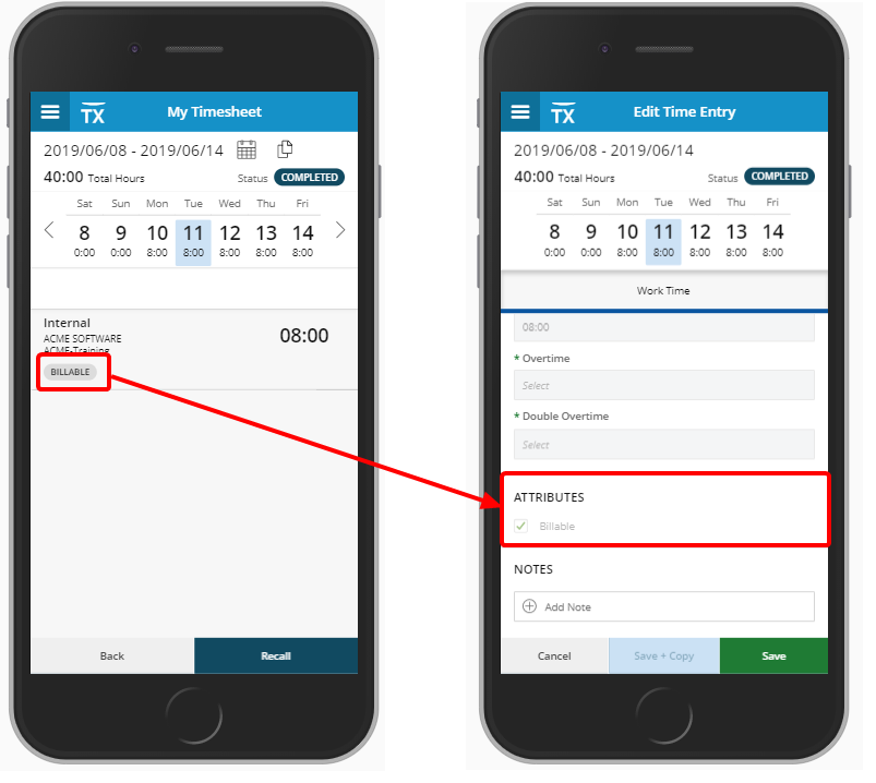
You can now easily and quickly view the Timesheet Attributes such as Billable, Payable, Funded, Capitalized and R&D from My Timesheet as well as Add Time Entry screens.
If an Attribute is selected, it will be displayed in the Add/Edit Time Entry under the Attributes section. Upon deselecting an Attribute from the Add/Edit Time Entry Screen it will no longer be visible on My Timesheet.
Note: Timesheet attributes will not be displayed for Leave Time.
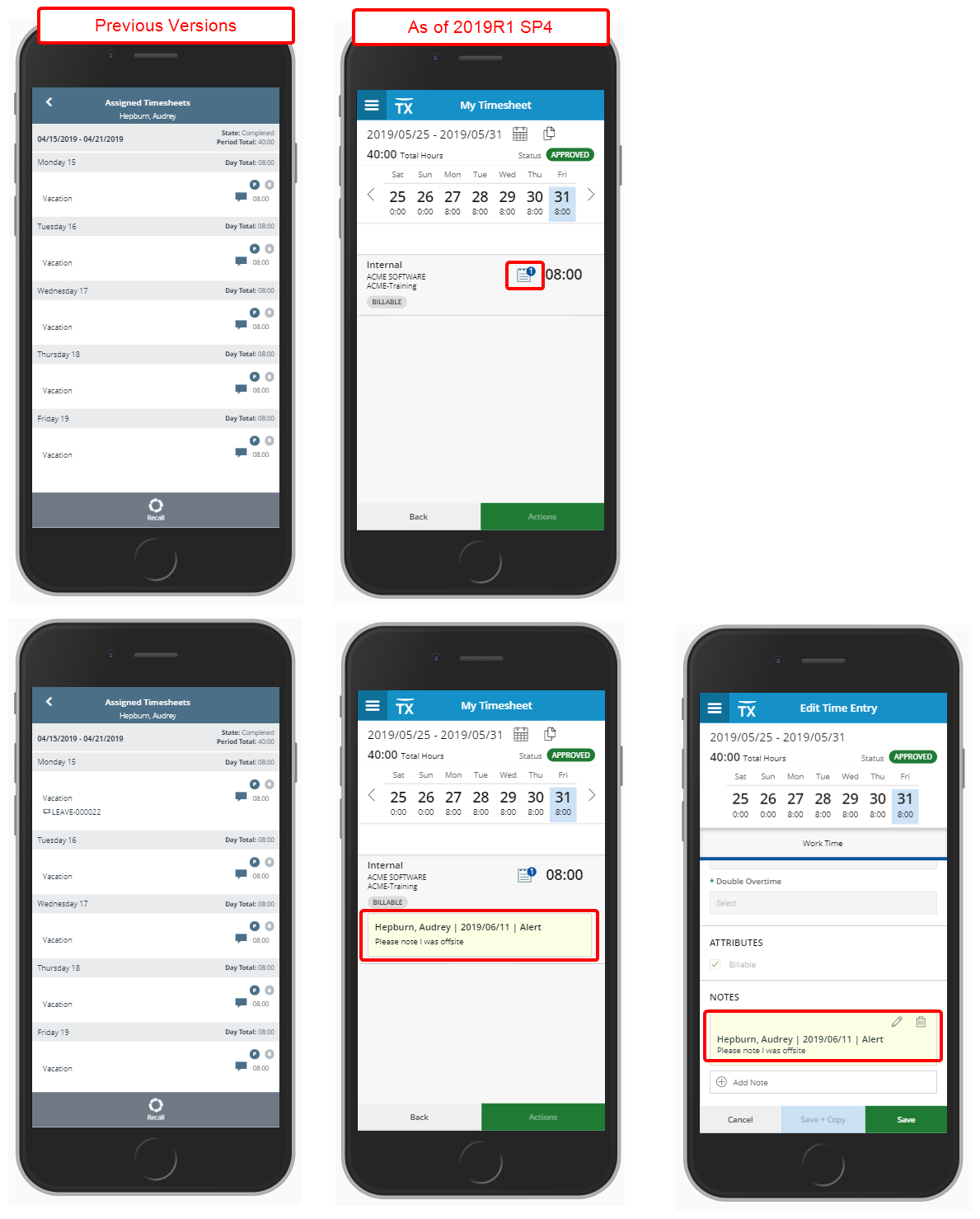
The layout as well as the color scheme of the Notes within the My Timesheet have been improved for a more streamlined and easier experience and in keeping with the UplandOne standards
Furthermore, the Note icon has been updated with a new one and a counter is displayed, indicating the number of Notes present. Clicking on the icon will show a yellow box below the Time Entry where you can clearly see the User Name, the Date when the Note was created, the Note Type as well as its content.
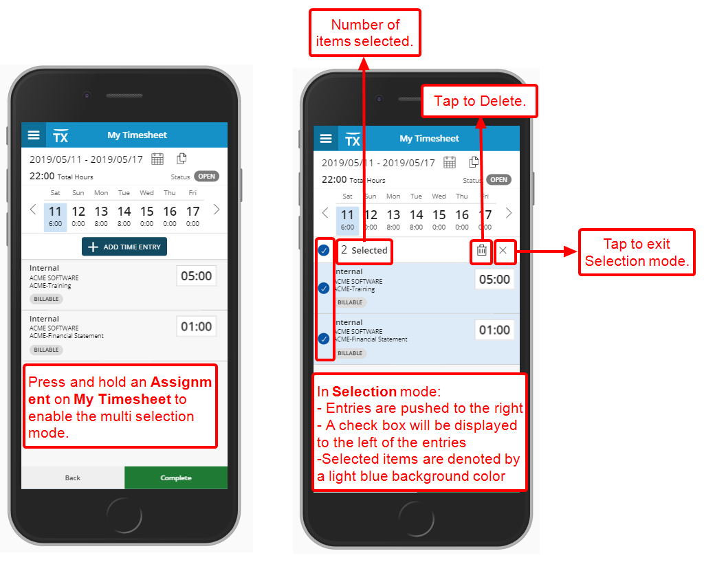
With the addition of the ability to Multi select Time Entries you can now press and hold an Assignment on My Timesheet to enable the multi selection mode.
While n Selection mode, you will notice that all entries will be pushed to the right and a check box will be displayed to the left of the entries. You can now either select individual entries or select the Select All entries box located in the header.
The number of Entries selected is reflected in the counter located in the header.
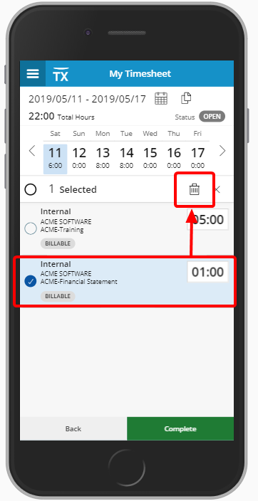
With the addition of the ability to delete Time Entries you can select the Entries you wish to delete after entering the Selection mode and tap on the Delete icon located in the header which will result in the deletion of the selected Entries. A message will be displayed informing you of the number of Entries that were deleted.
If an Entry is rejected, a red line indicator will be displayed identifying it clearly.
Note: The selection mode will be canceled, and you will return to My Timesheet upon:
- Selecting a different Date
- Pressing and holding an Assignment
- Deleting entries
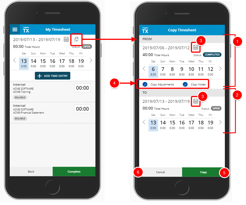
Description: The new functionality to Copy a Timesheet has been added to the Tenrox mobile app.
Upon tapping the Copy icon located on My Timesheet you can access the Copy Timesheet screen where you can select the Timesheet Period you wish to copy from to the current one.
- The From section period is defaulted to the last period.
- The To Section period is defaulted to Current Period.
- You can easily click the Calendar icon located in each From and To sections to choose different periods than the default ones.
- You have the option to choose to Copy Adjustments and Notes. Selecting either one of these options will result in the copying of existing Adjustments and Notes from the source Period to the selected period.
- Tapping the Copy button will result in the creation of the copied Timesheet and you will be redirected to My Timesheet screen.
- Tapping the Cancel button will result in the cancelation of the copy action and you will be redirected to My Timesheet screen.
Benefit: With this addition, a Timesheet can now be easily copied, powering up user productivity.
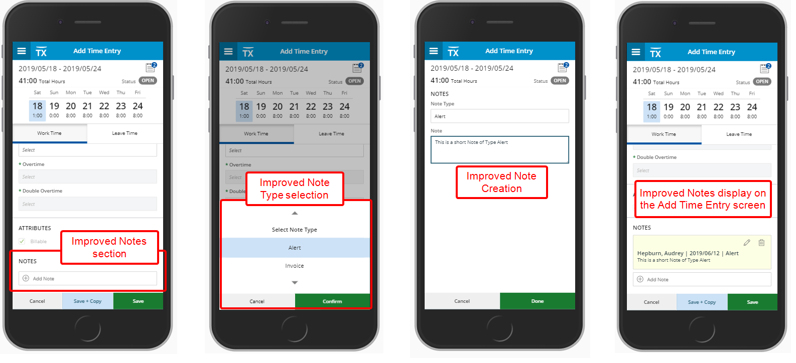
Description: The Time Entry Note section has been redesigned for a better user experience. You can now tap the Add Note icon which will trigger the Select Note Type carrousel. Upon making your selection and tapping the confirm button the Edit Time Entry screen will be displayed where you can clearly see the Period, Total Hours, Timesheet Status and the Note Type. You can then enter the Note and tap Done to save your changes and return to the Notes section of Edit Time Entry Screen.
Benefit: The Timesheet Notes are clearly identified under the Notes section when editing a Time Entry in a light-yellow background.
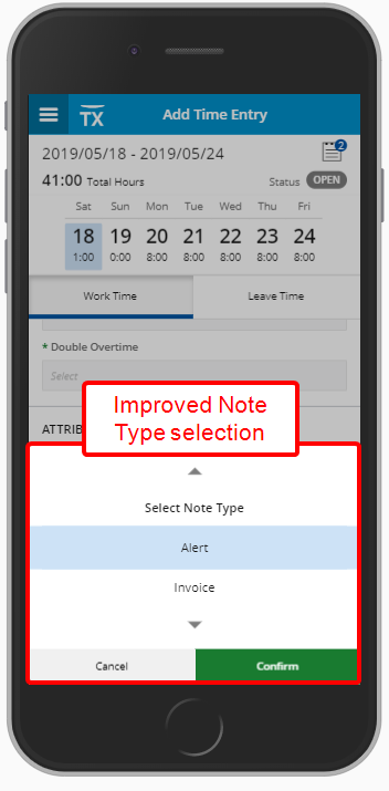
The interface of selecting a Note Type has been further improved for a more streamlined and easier experience, in keeping with the UplandOne standards.
A light blue background has been added to denote the selection being made. Spacing of the Note Type options have been further improved and the buttons have been styled to match the new standards in size and color.
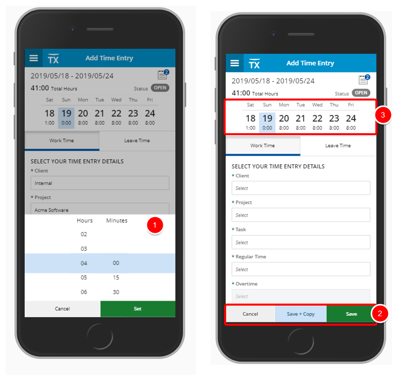
The Add Time Entry screen has been redesigned to improve overall user experience and establish consistency across all pages. The following updates have been made:
- Updated Time Picker
- Updated button colors and placement
- Addition of the ability to navigate between the weeks in Add Time Entry
With the addition of the ability to navigate between the weeks in Add Time Entry it is now possible to navigate to the next or previous weeks where the Period span is more than one week.Note:
- It is not possible to navigate to a different Period from the Add Time Entry screen.
- Upon reaching the start of the Period, the left arrow is disabled while the right arrow is enabled.
- Upon reaching the end of the Period, the right arrow is disabled while the left arrow is enabled
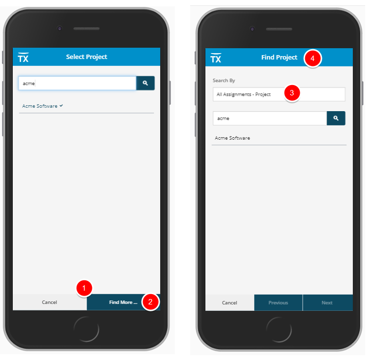
The Search functionality accessed from the Add Time Entry Screens have been redesigned to improve overall user experience and establish consistency across all pages. The following updates have been made:
- Updated button colors and placements.
- The Find more on Server button has been renamed to Find More.
- Addition of Search By option.
- Updated screen Titles when searching for more Tasks, Projects
- Updated wrapping of search results
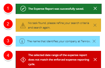
The Success, Warning, Info and Error messages now appear on top of the screens. The user can clearly and distinctly understand, and easily recognize the message and see, if any, action is required.
- Success notification banners are highlighted in green.
- Warning notification banners are highlighted in yellow.
- Info notification banners are highlighted in light blue.
- Error notification banners are highlighted in red.
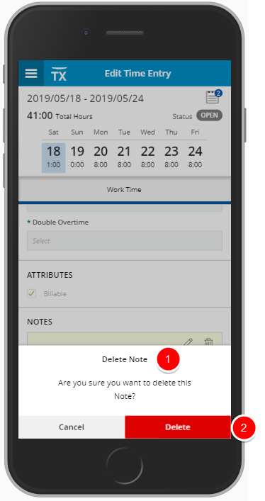
The overlay confirmation messages have been further improved and display at the bottom of the pages for a more streamlined and easier experience, in keeping with the UplandOne standards.
- A title has been added to the boxes clearly identifying the confirmation box.
- The Delete button has been moved to the bottom right corner of the screen and the Cancel button to the bottom left, allowing for and improved user experience and a better use of space.
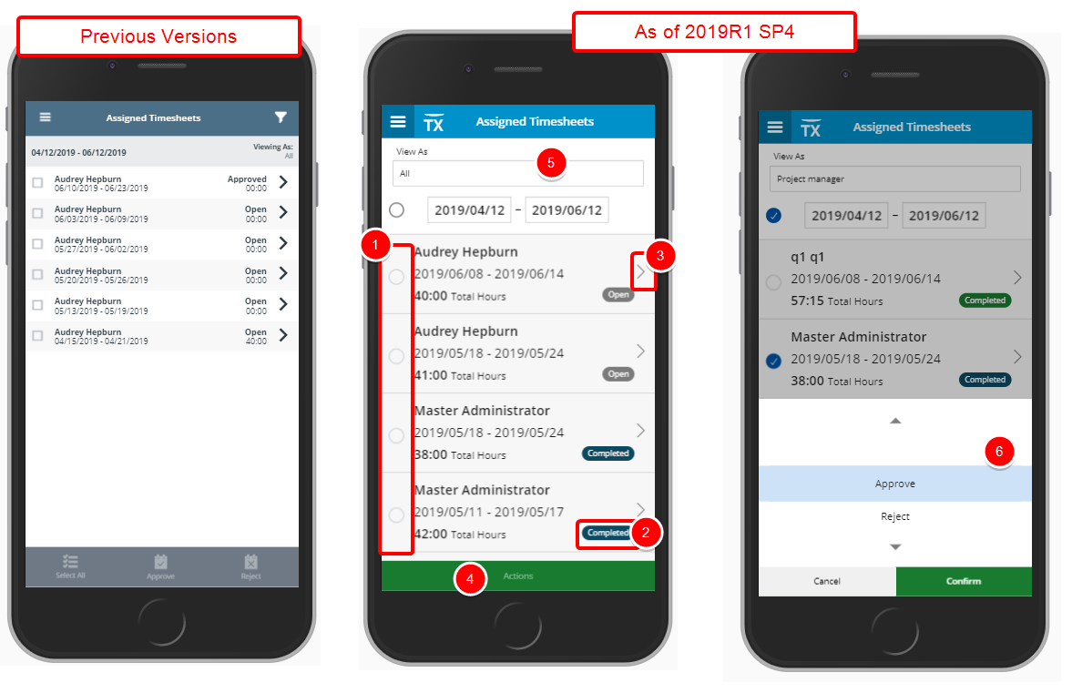
The layout, fonts as well as the color scheme of the Assigned Timesheets screen have been improved for a more streamlined and easier user experience and in keeping with the UplandOne standards
The following improvements have been made:
- The square boxes have been replaced with round ones
- The various States now appear within pills and the background colours allow you to identify them at a glance.
- The arrow icons were replaced with new ones and are now clickable
- The button styles as well as the placement of the various buttons within the screen now follow the new UplandOne standard.
- The Filter option previously available on the top banner has been replaced with a newly redesigned Filtering functionality where you can select the View As option directly from the Assigned Timesheet Screen and then select the period simply by clicking on the date boxes, to access the newly re-designed Date Picker.
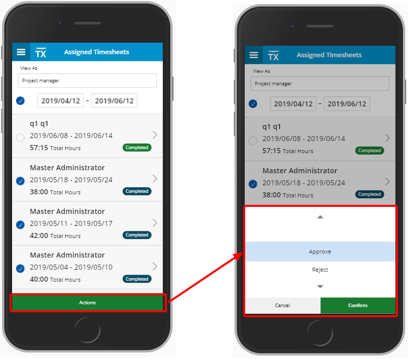
- The Approve and Reject Actions can now easily be accessed through the Actions button.
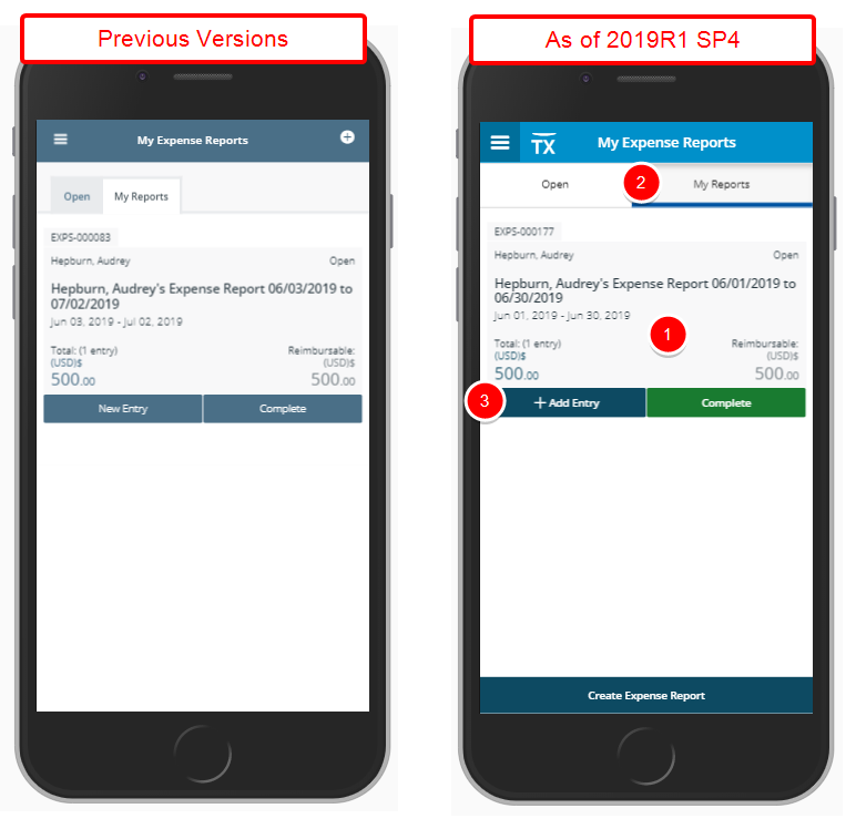
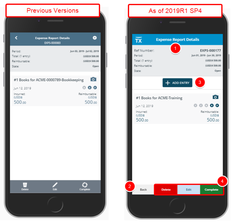
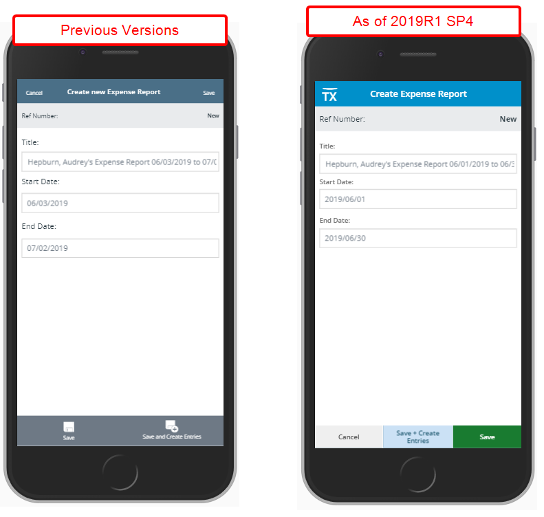
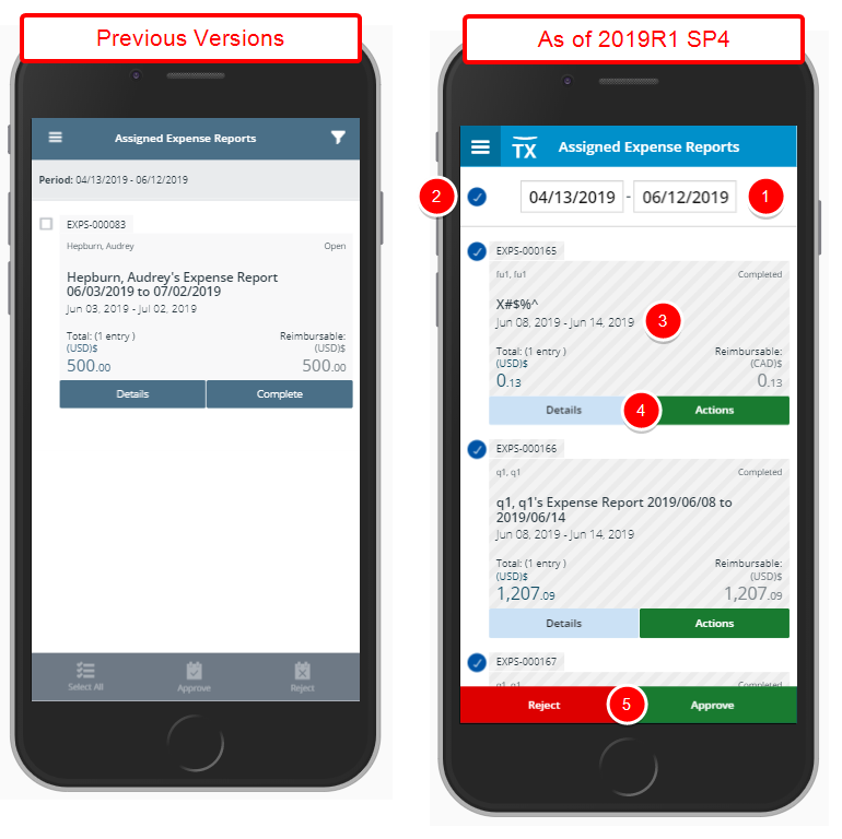
Several User Interface (UI) and User Experience (UX) improvements have been made, all intended to improve and update the look and feel of the Expense Report and Expense Entry screens, and to elevate the user's experience while working with Tenrox Mobile. The improved look, Buttons, Options, Dialog Boxes, Icons, message bars and Search all fall in line with the upgraded standards.
Changes to My Expense Reports screen include:
- Improved fonts and spacing of various elements
- Redesigned Open and My Reports tabs
- The previously plus (+) icon located on top right corner of the screen has been replaced by a Create Expense Report button located at the bottom of the screen
Changes to Expense Report Details screen include:
- Improved fonts and spacing of various elements
- The back arrow previously located on top right corner has been replaced with a Back button and moved to the bottom left corner of the screen
- The previously plus (+) icon located on top right corner of the screen had been replaced by a Add Entry button located below the Expense Report information box
- The Complete, Edit and Delete icons have been replaced by buttons
Changes to Create an Expense Entry screen include:
- Improved fonts and spacing of various elements
- Addition of a Ref Number on top of the screen just below the header.
- The cancel link previously located on top right corner has been replaced with a Cancel button and moved to the bottom left corner of the screen
- The previously Back to Report and Next arrows have been replaced by buttons
Changes to Assigned Expense Reports screen include:
- The Filter button has been replaced with a date picker
- The Select all button has been replaced with a Select all option located to the left of the Date Picker,
- Improved fonts and spacing of various elements
- Updated Details and Actions buttons.
- Updated Reject and Approve buttons
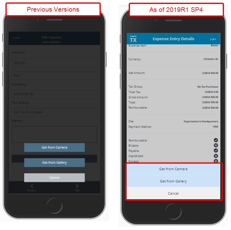
Changes to the Add Receipts include:
- Updated buttons Get from Camera, Get from Gallery and Cancel
Upland Analytics
The latest Upland Analytics release features many powerful new enhancements as well as improvements to user experience. For more information on the latest version of Upland Analytics click here: Upland Analytics 2018 R1.5 Release Notes.
Further details can be found in the Upland Analytics help center.
Addition of Financial Planner Combined Data Source with the following Views: Base currency, Client, Client currency, Creator, Financial planner budget, Financial planner calendar periods, Financial planner combined detail, Financial planner combined summary, Portfolio, Project and Project manager.
Scoping is available for: All projects, Available projects and My projects.
For more information on:
- Upland Analytics Financial Planner Combined Data Source and Views click here.
Addition of Revenue Batch Data Source with the following Views: Base currency, Client, Client currency, Company currency, Portfolio, project, Project manager, Revenue batch, Revenue batch details and Revenue batch entry details.
Scoping is available for: All projects, Available projects and My projects.
For more information on:
- Upland Analytics Revenue Batch Data Source and Views click here.
Addition of WIP Data Source with the following Views: Base currency, Client, Client currency, Company currency, Milestone, Portfolio, Project, Project manager, WIP accrual batch, WIP project details and WIP project policy.
Scoping is available for: All projects, Available projects and My projects.
For more information on:
- Upland Analytics WIP Data Source and Views click here.
Addition of a new Security Access Rights View to the Organization Data Source.
For more information on:
- Upland Analytics Organization Data Source and the Security Access Rights View click here.
Addition of:
- Project Can Be Invoiced field to the Project View
- User Name (Last Name, First Name), Suspended, Decommissioned, Gender, Can report on any client, Can report on any group, Can report on any project and Can report on any user fields to the User View.
- Client Default Workflow, Client Default Workflow is specified and Client Invoice Report Template fields to the Client View
- Task Is Suspended and Task Is Decommissioned fields to the Task View
- Invoice Report Template field to the Invoice Summary View
For more information:
- On the various Data Sources and Views click here.
Upon adding new or removing existing User Defined Fields the Upland Analytics Views are automatically updated eliminating the need to manually synching any changes.
Note: Any Updates made to an existing UDF (example changing the display name of a UDF) are not automatically reflected on Upland Analytics View and require the user to manually remove the field and then update the schema.
For more information on:
- Automatic synching of newly associated or disassociated User Defined Fields to Upland Analytics Views click here.
Organization Breakdown Structure (OBS)
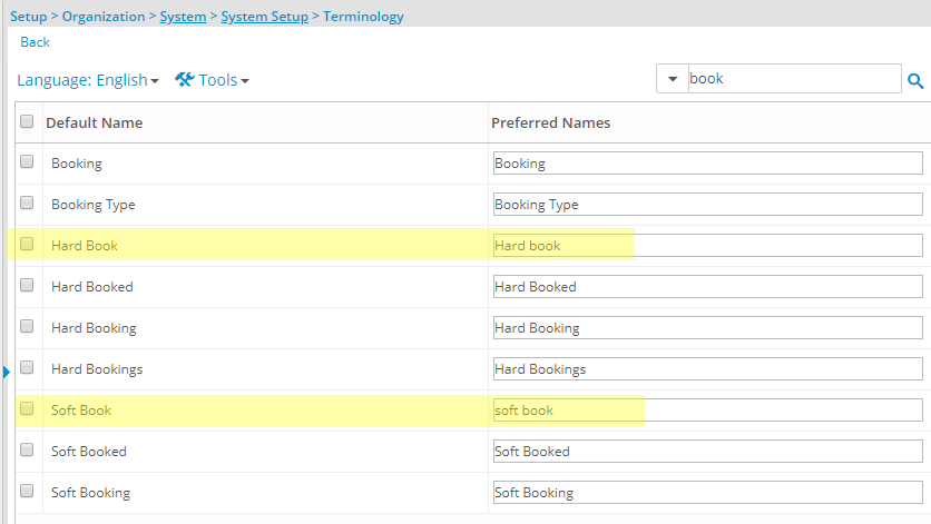
Description: There is now the ability to have the terminology, for Soft Book and Hard Book set, as required, on the Terminology page and applied accordingly.
Benefit: Organizations that have a different term for Soft Book and Hard Book can now have their own Preferred Names displayed as necessary.
For more information:
- On Terminology Setup click here.
Resource Management
Description: User Interface (UI) and User Experience (UX) improvements have been made, all intended to improve and update the look and feel of the application, and to elevate the user's experience while working with the Resource management module. The following improvements have been made to the Work Plans:
- Updated Arrow located on the separator between the top and bottom grids to match the arrows used within the application
- Updated background color and width of the splitter
- Double clicking the splitter will now expand the bottom section eliminating the need to drag and drop it in order to view its content.
Benefit: The look and feel are further improved as well in keeping with the UplandOne mindset, wherein the layout of various elements within the Work Plans support the unified experience across Upland products.
REST API/SDK
It is now possible to Create, Edit, Delete and Query a Payment Method via the API.
This enables technical clients to build tools for their user base to consume a webservice for creating, editing and searching for a Payment Method and automate processes that currently require manual intervention. Moreover, the API will enable the development of seamless integrations to 3rd party systems by connecting endpoints together for data exchange.
Note: Click here for more information on how to access the REST API documentation.
It is now possible to POST and PUT WIP Rule, Revenue Account, and WIP Account Properties via the API.
This enables technical clients to build tools for their user base for creating and of WIP Rule, Revenue Account, and WIP Account Properties as well as to automate processes that currently require manual intervention. Moreover, the API will enable the development of seamless integrations to 3rd party systems by connecting endpoints together for data exchange.
Note: Click here for more information on how to access the REST API documentation.
